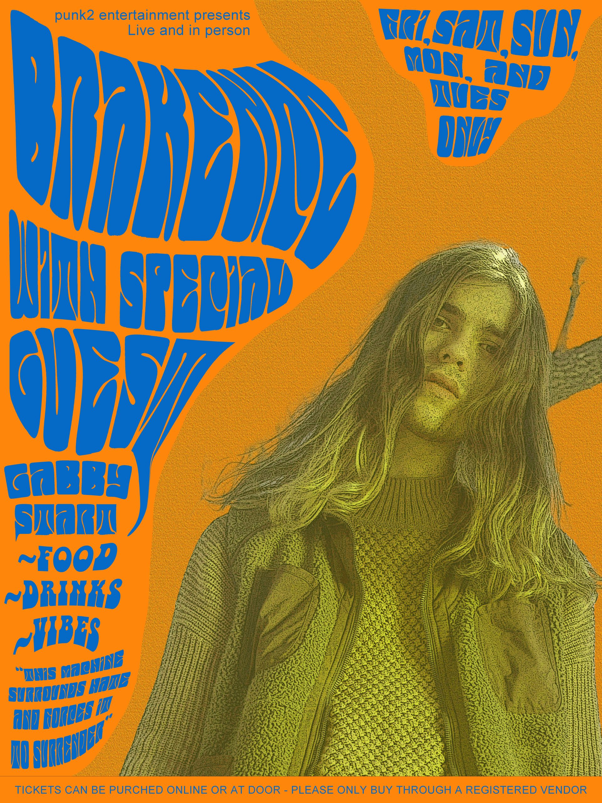
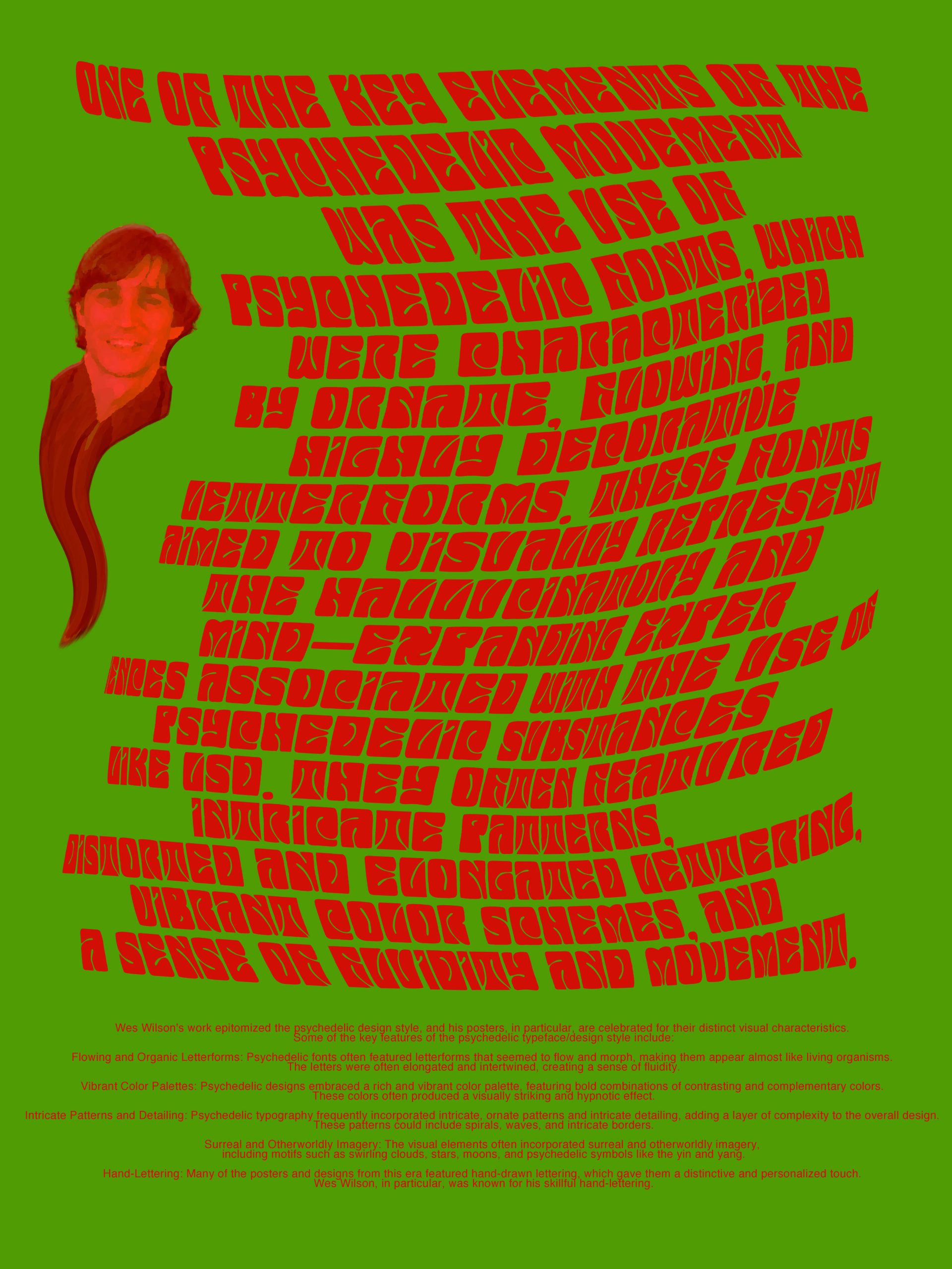
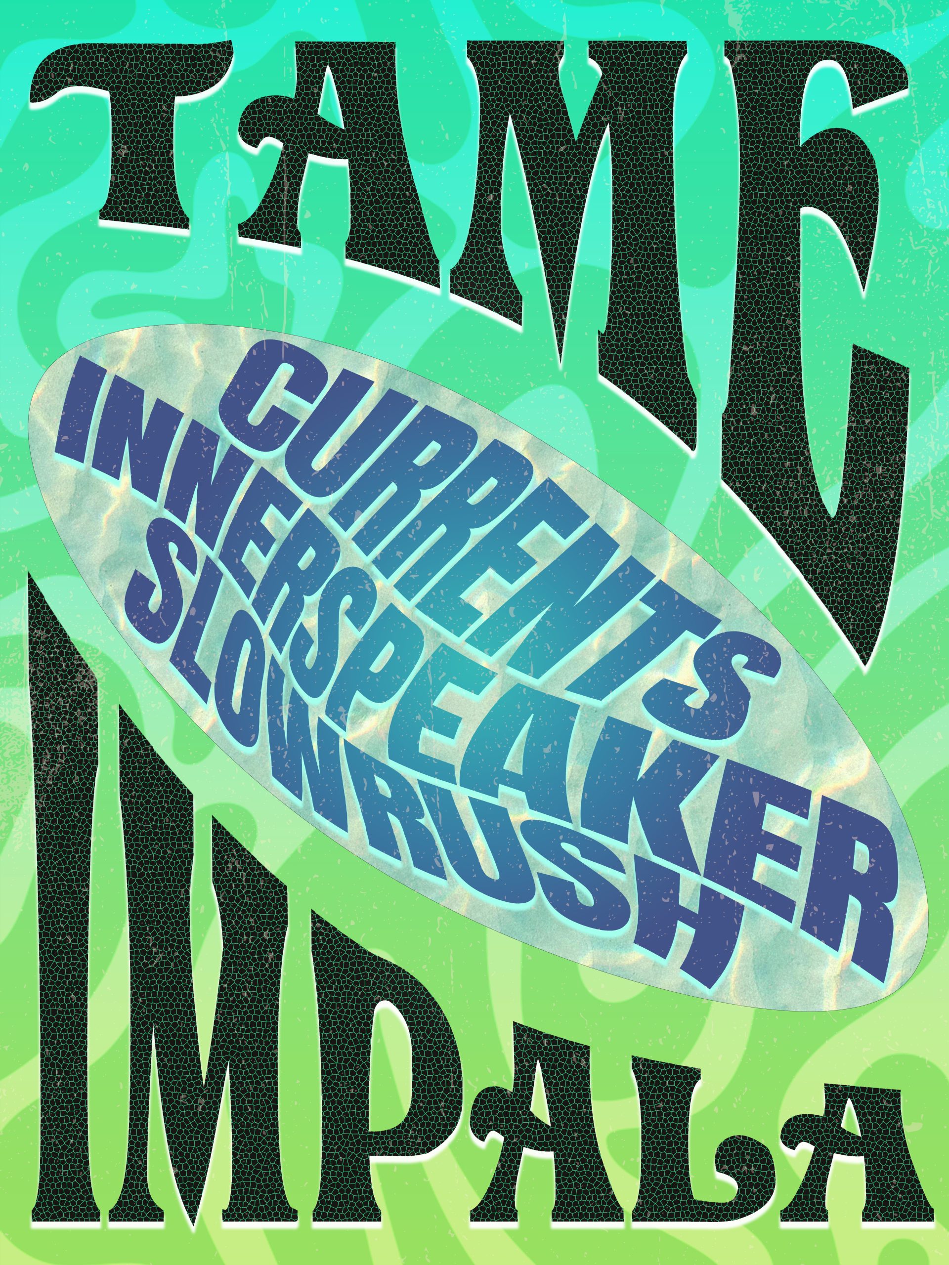
I chose to work with 1960s psychedelic fonts. One of the pioneers of this scene was graphic designer Wes Wilson, who created many posters for bands and groups at the fore front of the west coast counterculture movement of the 60s and 70s. I used Wes Wilsons own font, sometimes called psychedelia, that was his trademark font throughout his poster series. It is a very “swooshy” font that is intentionally made this way, so it is easier to bend and wrap around other words. I noticed that frequently more traditional serif fonts were also used in these posters, to highlight more important details that may be more difficult to make out in the overstimulated hippie-esque fonts that made up most of the poster surface. So, I also incorporated Arial around the edges to fuse the two font groups and create a more dynamic poster layout. It was difficult to fit all the requirements for the project into just one poster, so I made 3. The first two are posters in the style of Wes Wilson for musical artists that I like, and the third is a more general informative poster for the font and design style as a whole.