What did you learn? I learned how to better apply the use of colors to art. I learned about the use of the color wheel and how the use of certain color schemes (Triadic or split-complementary for example) can be used to create a sense of depth and make art stand art. I got a better look at how this was applied to art used in advertising and art used for other purposes.
What was easy? Once I got my color schemes figured out, constructing the designs overall was pretty easy. I had a clear picture of what I wanted to create in my head and I am satisfied with the results. I did not struggle too much with the use of color, as in how I applied it into each piece in the art. Also, creating basic shapes and turning them into complex-looking ones got easier as I advanced through the project through the use of tutorials and playing around with Figma.
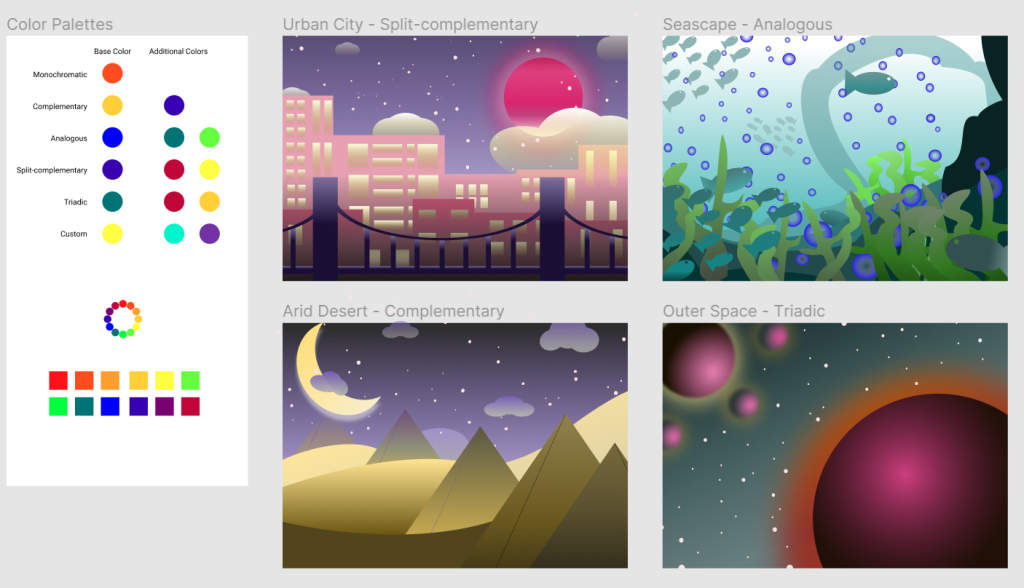
What was challenging? Creating a sense of depth using colors and determining which colors to use in each color scheme was most difficult. It took me a while to fully understand how to pick colors using the color wheel. I did not fully understand the color wheel at the start but my understanding has since improved. While I created the art fine, creating depth was harder. I mainly used layering and color gradients to do the trick. The pieces in the foreground are darker and less saturated while I played with lighter tints and more saturation for the background elements. I had to go back and make the foreground elements larger than the background elements.
How could I improve the assignment for the next class? My use of depth could probably be better, as it took me a while to fix and understand. I think my colors are nicely applied overall, but the outer space design and seascape designs could maybe be improved. Also, some of my shapes are pretty basic but I tried to not overthink it so I could spend more time working with color, which was more important in this assignment than the actual shapes used.
How might you apply your knowledge in future assignments or work scenarios? Although this project mainly dealt with color, I learned that gradients can make flat shapes look like 3D ones. For example, the planets in the Outer Space design started as flat circles, but became spheres once I applied a couple of radial gradients. This was extremely useful and I will definitely apply it to future designs. Plus, I see now how complementary color schemes make a design pop. This too can be useful, especially for designs that convey an important message.
How did a specific reading or video inspire or help you? Although I did not really use a separate reading, I must admit that I used previous class examples as inspiration. I looked through older blog posts plus older student examples that were provided in the directions document by the professor to gather ideas. This inspired my Seascape and Arid Desert designs the most. Also, looking back at the class videos greatly helped me remember how to create certain shapes and helped me better understand the color wheel.