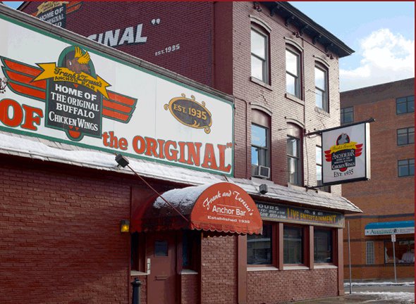
Here is a sample of some of the landmarks I have discovered since moving back to Buffalo.
(Click link for more information)


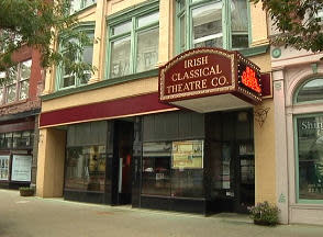


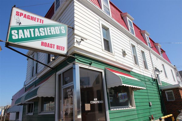

Here is a sample of some of the landmarks I have discovered since moving back to Buffalo.
(Click link for more information)
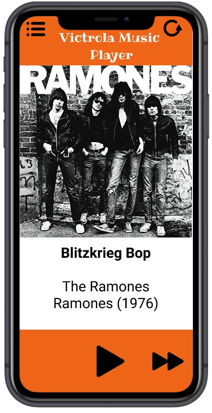
For this project, we were to design a Media Player. I took some ideas from an article I read in GQ, where the Apple Ipod is rising again in popularity. People are buying Ipods on Ebay, then retrofitting them with new SD cards to hold media, (A 30 GB Ipod from 2004 can be adapted to hold 1 TB, for example) and using the Ipod as a modified external Hard Drive. People can watch movies and listen to music without an internet connection (useful if you are overseas or stationed in the military). Although Itunes is heavily scorned my music purists and most techies (and Apple discontinued Itunes a few years ago), the platform is still heavily used in Europe and Asia. Most club DJs use Itunes for their music. After reading the article, I was thinking about getting an old smartphone and retrofitting it to hold 1TB of media.
One of the features I used to like about Itunes was when you bought an album. you would occasionally get several different covers for the album, and cover art for singles. An album with twelve tracks might have a US cover and a British Cover (or the original cover and the modified G-rated family friendly cover). If the album had 7 singles, you would also get the cover art from the singles, so you could customize the display of the Ipod when you played the track. I really like album art and concert Tshirts, so I wanted to make a media player, which also focused on album art.
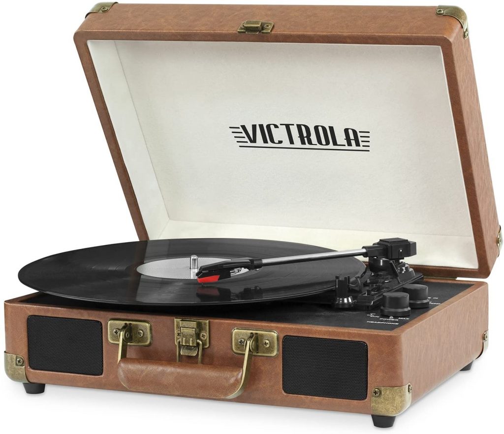
As I am the oldest student in the history of Canisius College, I naturally used a record player for my logo. I found this stock image and used it for the logo.
My media player contains five tracks from one album (an exceptionally simple media player): The 1976 debut release from the New York band, the Ramones:
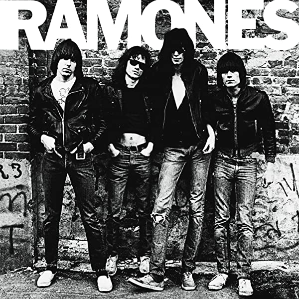
There is no shortage of literature about the history of the band and their influence in the 1970s New York punk scene. What I do like, however, is the story of the album cover. The band established a residency at CBGB’s in the Bowery, playing on Sunday nights. The woman who worked the coat check at CBGB was named Roberta Bayley, who was a friend of the band. The Ramones got a record deal from Sire Records for their first record, and had a budget of four thousand dollars.
At this time, cameras were an expensive luxury, and Roberta was the only person they knew who owned a camera. They convinced her to take their album picture. They went to a playground basketball court near CBGB’s and Roberta took pictures of the band until “they got bored and wandered off.”. This was the photograph for the 1976 debut release, Roberta Bayley was paid $125 and went on to have a career as an accomplished concert photographer.
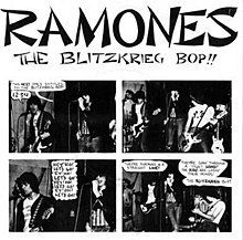
The tracks I picked were singles, so I found some cover art and used them for the animations.
Using Professor Dunkles recommendations, the user will click on the album cover, the front of the album will animate to the single (using position and scale) then also display the back of the album and the liner notes. This is a really nice effect,I am happy how it turned out.
One thing I learned about this project is the importance of my sketchbook. I kept coming up with new ideas or changes and making sketches of the ideas and concepts I wanted to use. I usually make a basic sketch at the beginning, but when I start working with Figma, I stay with Figma. This project I used my sketchbook for the entire project.
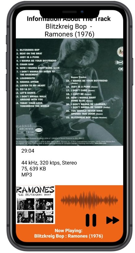
One challenge I had was I originally had an idea of what I wanted, but once I had the prototypes, I couldn’t get it to work the way I had intended. Originally, I wanted the animation to be a seamless transition from one cover art to another cover art. I kept experimenting with the smart animate feature, but could not get the effects that I wanted. After some feedback and suggestions from my professor, I changed the design. Instead of flowing from one cover to another, I used the animation techniques of position and scale for the animation. When the user clicks on the large cover art, it will animate to a smaller version of the artwork for the single, which travels to the lower corner of the screen. I am happy I got to use the cover art for the single (which was my intended effect) and I like the result. On a seperate note, this resulted in scrapping the project and starting from scratch, which usually doesn’t happen for me. I usually don’t get frustrated with the progression and start from the beginning, or I find parts to salvage. I wasn’t frustrated, exactly, but a few weeks into the project, I felt it was going into a different direction and decided to start from the beginning and started with new sketches.
Five tracks and one album is probably the absolute minimum to display the effect and the results I was looking for. If I was to do this again, I would probably pick three different albums from three different artists with distinctive cover art, five tracks each, to get a better effect. (Michael Jackson’s Thriller album, The Beatles Sgt Pepper Album, London Calling by The Clash, Led Zeppelin IV) Fifteen tracks total, three album cover art, fifteen covers arts for the singles.
Otherwise, I am happy with the way this project progressed and turned out. (If I had to do anything different, I might have picked a Led Zeppelin album, rather than the Ramones.)
I liked it that Professor Dunkle required us to turn in a prototype of the work before the final submission, this gave me some valuable feedback and some ideas of how to proceed. I think if he gave us some samples/examples for good media players and bad/ineffective media players, it might be valuable from a design standpoint. Usually with media players, I don’t pay much attention to the design, I just press play, adjust the volume and listen to the music.
The objective for this project was to design an app for social distancing. As in person connections are limited, we were challenged to address how designers can find a creative solution, addressing an issue raised by social distancing.
I took this as an opportunity to research my project. One aspect of the pandemic I am sorely missing is being able to travel outside of Buffalo. I was planning a Trip to Germany over the summer for a friends wedding and another trip for an event Colorado ; both events were cancelled due to the pandemic. It’s been almost six months and there are no new trips planned for the future. (I can’t make a day trip to Toronto or Manhattan.) I was using the summer as an opportunity to ride my bike around the city and explore some areas around Buffalo, I visited the Theodore Roosevelt Inaugural Site (which was incidentally, walking distance from my house) and the Karpeles Manuscript Museum library (also near my house). It’s not the same, but it’s nice to explore parts of the city I haven’t seen before.
One afternoon I was on Buzzfeed taking one of the quizzes and I started thinking of ways to change my project and make it into a quiz game, with Buffalo focused questions. It is pretty straightforward, you make a choice, then you learn some facts about your choice then you are routed to a new question. It isn’t a challenging game, exactly, but it is well developed with thirteen questions. I took my professors suggestions, and it is running nicely. I made a new logo and a bunch of slides and tried to redevelop this project.
One thing I appreciated was the feedback from Maze, which was more constructive than for project one. I was mostly interested in confirming the QR code is working, but I got some good feedback on how to make the game more user friendly, and the suggestions were appreciated. I met with my professor this morning and got some more feedback and suggestions. Overall I am happy with how the project progressed. The more I worked with Figma, the more comfortable I got with the platform and at the end, I got to learn some interesting tricks. I look forward to using this platform in the future.
Write, sketch and surf until you have a basic idea of the app you will design. It can be vague; you can tighten up requirements later on, or even switch ideas. Create a title and brief description on your comdma.com blog
I want to continue with my “Buffalo Eight” idea and design a trivia game. Users can learn more about Buffalo History and pop culture by solving trivia questions. Similar to quiz, or maybe they can play other players head to head. Questions can come in the form of multiple choice, true or false, and identification questions. Users can select question categories and submit or rate questions, as well as view leaderboards.
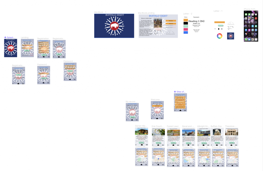
My app, Buffalo Eight is developed to teach users about the city of Buffalo, NY. The app will highlight historical and tourist sites, creating an interactive and informative experience.
2. 500 Startups
We assist people who are interested in visiting historical and tourist sites in Buffalo, NY. We make money by charging for advertising and a percentage of ticket revenue.
3. — Describe ideas by answering these questions (c) MITx15390x:
* What is the problem you want to solve
* Who experiences that problem
* How you want to solve that problem
* Why this is a better solution
I want to showcase some of the hidden historic areas of the city. This problem is experienced by people who visit who limit their trips to Niagara Falls and the Anchor Bar. I want to solve that problem by giving options of areas to visit that are nearby. (The Colored Musicians club, for example, is five minutes from the Anchor Bar.) This would be a better solution because there are several interesting places in the city that deserve to be highlighted.
4. Geof Moore’s Value proposition Statement
For (target customer)
who (statement of the need or opportunity)
our (product/service name) is (product category)
that (statement of benefit)
For new visitors to the city who struggle to unique places to visit. Our product is a web-based travel software that assists the user in making travel plans.
5. Steve Blanks’ XYZ
We help X do Y doing Z
We help tourists and history buffs discover return on new areas in the city to visit in social media by giving them options.
6. Petrick Vlaskovit & Branet Cooper’s CPS
Customer (who your customer is)
Problem (what problem you’re solving for the customer)
Solution (what is your solution for the problem)
For example: Customer — History buffs and tourists to the Queen City.
Problem — Unaware of hidden sites in the city, lack of time or transportation.
Solution — Easy to navigate system designed for non technical users who need assistance.
I researched a CRM named ZenPlanner. I signed up for a trial membership and viewed some demo videos. They actually gave me a call, thinking I was a potential client. Once I told them I was a penniless college student doing class research, they stopped sending me emails.
From my experience, ZenPlanner is very user friendly, but it seems to be a one-size fits all model. If you want specific modifications or designs, it will cost you. Some of the entry level demo models looked very basic, almost like an enhanced MS Access spreadsheet. It reminded me of the companies that businesses hire to create websites, and they use predesigned templates, if you want modifications or have specifications, it will cost you. That being said, the demo models I experimented with were easy to navigate. It took me about 4-5 swipes to complete the task on my desktop, about 5-6 on my Ipad.
One issue I found was ZenPlanner uses two way authorization. You enter your username and password, get a code to your phone, then enter the code. (We use it at work, but I don’t like it, personally.) I understand that this is a necessity, as you are potentially viewing confidential company data, but from what I can tell, this is a non-customizable feature. (I was curious to see if it could be removed, or if one paid enough, it would be removed. The company did not respond to my query)
Overall, I think ZenPlanner is a good asset for a small business owner who wants to keep accurate records and access demographic information for their customer base. There are options for ticket forms, controling supply and inventory, sending messages, create chat links, create mailing lists, and analytic information. They have an feature called “Omnichannel” which includes 24 hour chat support and instructional videos, which I liked. I find if I read an article or watch a video on how to solve an issue, I am more confident with problem solving, then by talking to someone and following their instructions.
My CRM vision was to create an app that has a list of tourist sites in Buffalo NY, giving users the option to buy tickets online, and connecting them to the websites (if available) of the tourist locations. This is not a traditional CRM, but I wanted to get some experience with the ideas for my CEEP project. Target demographic is 25-65 year olds. I used to travel on a shoestring budget, I would get the Lonely Planet guidebooks from the public library, research the sites I wanted to visit, and get an idea of what I wanted to see before visiting. (Find a good walking tour, download a podcast for a museum tour, get ideas of what areas must be seen and what areas can be avoided.)
One of the biggest technical issues for travel apps is assuming always-on data connection. Because it’s mobile, users lose coverage: tube stations, inside buildings, cathedrals, rural areas. Since this is a ticket service, I would build an app with good caching. Another issue is finger/button size. Every action button should be large enough that it can be hit successfully, but also spaced away from other active items to avoid tapping the wrong one. Selecting items can be difficult if the results are too small and squeezed one next to the other. (The virtual keyboard will also fill up half of the screen. I am not sure how to effectively test this, except I have exceptionally large fingers, which I hope will be an asset for testing.)
As mentioned, I would like to have the tickets cached after purchase, that way it can be used regardless of Internet service. Hypothetically links to suggestions for nearby sites of interest. (You are planning to visit the Buffalo Zoo? The North Park theatre is walking distance/Here is a location for chicken wings), and a chat message option to speak to people who have visited some of their sites and offer personal suggestions.
Welcome to DMA Blogs. This is your first post. Edit or delete it, then start writing!
Lab One, Two, Three