Project 4

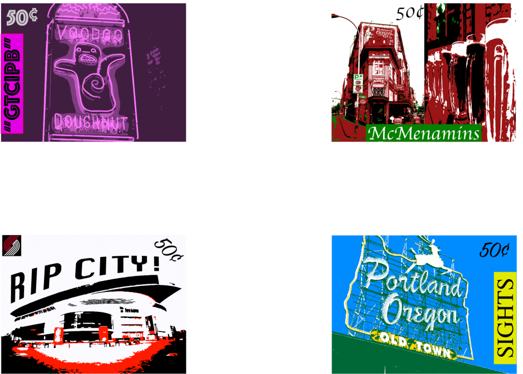
I think the largest takeaway I have from this project is how to shape text. In terms of design, I knew how to rotate and change the size of text. However, envelope distorting objects is something I’d never done before. It was interesting to use a new feature. Although, the downside I found is that it seemed hard to edit the object after you’ve used the envelope distort feature. This could also be because this is one of the first times I’m using the feature. I think my biggest concern with this project was coming up with a design. I knew generally what photos I wanted to use and the topics I wanted to highlight. However, I couldn’t really settle on how to arrange everything. Originally I wanted to incorporated all 5 Portland Professional teams on one stamp, but it was going to be too much so I stuck with one of the most iconic sports teams; the Trail Blazers. Outside of that stamp, I struggled to pick a color scheme that would work. The only color design I was certain I wanted to use was on the Sights stamp with the White Stag. The colors used for that stamp are the same colors used on Portland’s city flag. There’s not much I’d really change about this project. I think of all the projects, this one was my favorite. You have a lot of freedom with the design of the stamps. One thing I think I would change is have students use a photo with words already on it. One other difficulty I found was that a lot of the buildings I wanted to use already have writing on them, so I felt obligated to stick to a font that was similar to the font on the building or at least kept with the theme of the stamp. There’s not an easy work around for this since buildings often have easily recognizable logos and fonts to go with. Too many letters doesn’t make for an appealing stamp design. I think it would be interesting to see how every student deals with this problem. Lastly, I think the number one thing I’ll take away from this class is to trust my eyes. If something looks like it might be slightly off in terms of design, I’ve learned that it probably is.

Project 3

One thing I learned from this project is how to make patterns. I had no idea that you could make patterns in Adobe Illustrator. I actually like this project because it teaches how to use specific tools in both Illustrator and Photoshop. I’ve been meaning to learn more in depth technical edits with these two programs, so I’m glad I learned how to make patters. I think the most challenging part of this assignment was settling on a design that would work. There are so many metaphors to chose from. Even once you choose one, there’s multiple ways you can go about representing the phrase. On top of that, some designs are more difficult than others. I think the biggest takeaway I have from this project is that you have to be careful with time management. Even simple designs can take a lot of time to create.

Project 2

What I learned from this assignment was how important color schemes are in design. I knew about complementary colors before the assignment, but I didn’t know about the other color different color schemes. Colors really help indicate a change in the picture. Even with gradients, I was worried about how to draw a sunken ship under water when I first came up with the idea. I didn’t realize how adding a gradient would help me illustrate it perfectly. I think the biggest struggle for me, would be figuring out how to add to my pictures. It took some time for me to figure out how to draw the sunken ship. Even once it was done, I felt like it needed more detail.

If I could change something about this project, I would give a another option or two for the landscapes. That way it allows people to be a little more creative with the assignments. For example, adding a possible jungle option could be interesting.

Project 1

One thing I learned from this project is how easy it is to represent something using simple shapes. I was worried when I first heard about the project about how I would be able to represent the characters in the story. Once I got working though, I just kind of rolled with what came to my head. I think the most challenging part for me was the use of the rule of margins. I’ve always looked at the paper as the end of the frame, so if something comes to close to the edge, I never really thought about how to space it properly. Also I’ve never used any of the printing and mounting equipment before, so that was a struggle. What I learned from this assignment that I’ll carry to future assignments is that the answer isn’t always straight forward. I spent a decent amount of time thinking of how to draw the word “hush” before finally finding the answer. One interesting way to improve the assignment I think would be to allow students the use of one color other than black and white. That way if it’s difficult to represent something with shapes, they have a color you can use to identity it.