Project 4: Map Infographic(Updated with final)

To start, the project you will be viewing here is still very much a work in progress. I am still working at the placement and prioritization of the many roads present on my map, and still have some areas to fill out and touch up. With that said, I will explain how I have gotten as far as I have.

Hong Kong

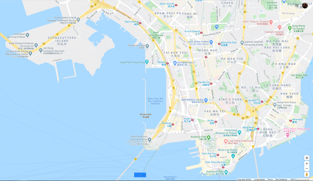
In deciding on my city, I picked Hong kong, this being because I wanted to fina a way to link this project creatively to a cinematic tradition that I am particularly fond of. I thought of Hollywood, South Korea, and even New York City, but ultimately I decided on Hong Kong because of a specific director: Wong Kar-Wai. Known for his masterful use of color, I felt Hong Kong would be the perfect subject because I pull a color scheme write from one of my favorite films: “Chungking Express.” And that’s exactly what I did.

Chungking Express (1996) dir. Wong Kar-Wai

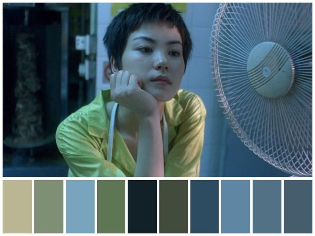
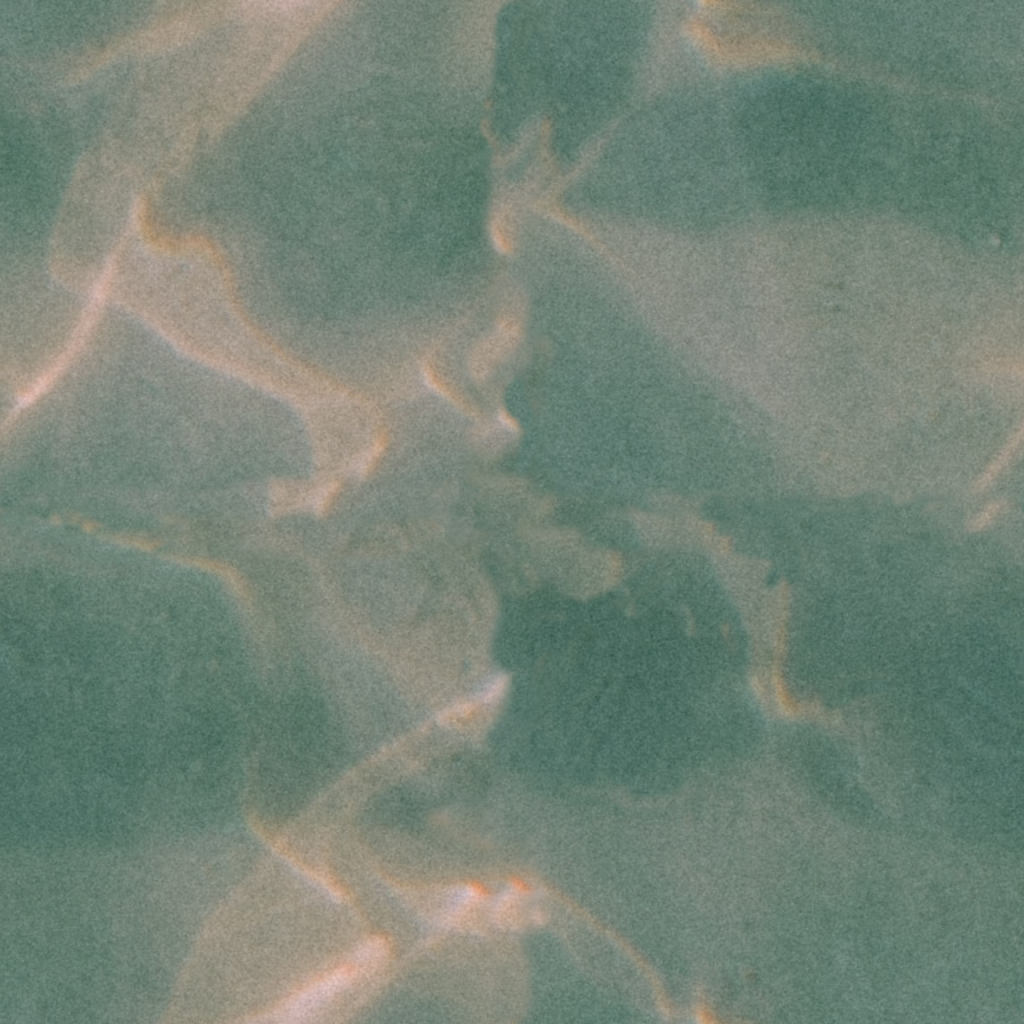
This above shot served as the inspiration for my color palette, now I didn’t pull every single color frrom the above palette, it was the general spectrum from which I created my palette.

My Map Thus Far

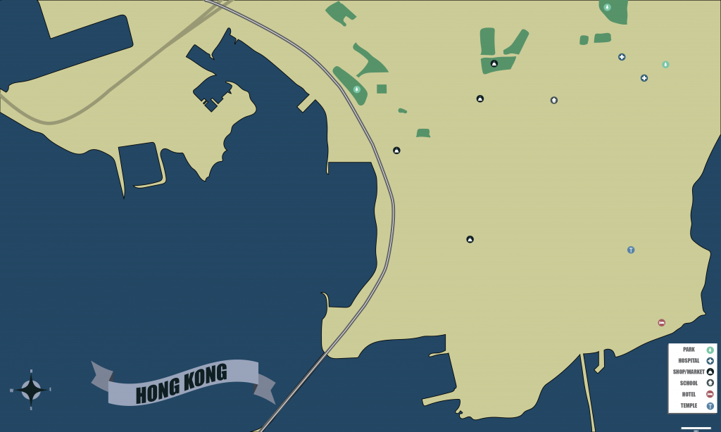
Now as I said, this is far from complete, I still have areas to outline, and decisions to make regarding the complex system of roads, and the labeling is unfinished, but I am saving that to go along with the way I set the roadways. At present moment this is the biggest challenge I’m facing, I already know that I will be singling out the highways, but there are many ways that I can go with the roads.

Further I also acknowledge the map may be slightly too far to discern the text and symbols, so I aim to complete the map, as I have committed too much to this specific perspective, and then enlarge after the fact in order to make it more clear. For the purpose of this post I have enlarged the symbols so they can be more easily discerned.

All in all I think this still needs a lot of work, and the roads and areas should help fill out the land that’s as yet empty.

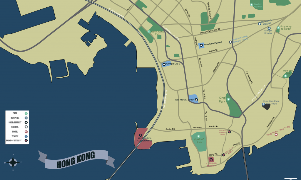
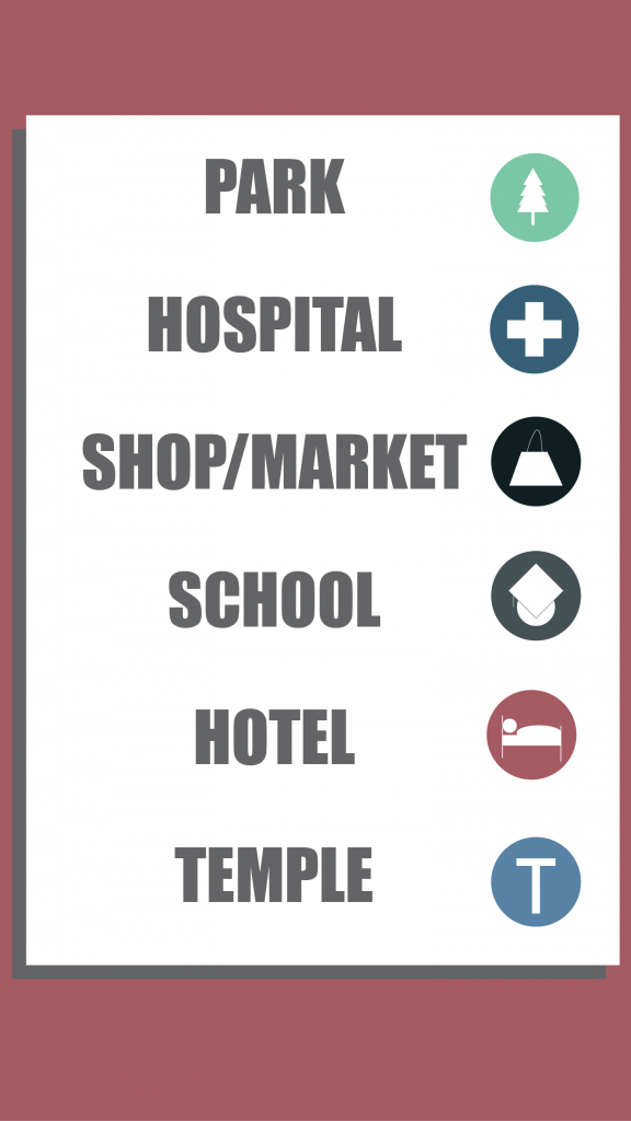
Above is the final rendition of my map of Hong Kong, following some of the advice I received, I focused less on the complex system of roads, and tried to seek out certain cultural locations, or locations that might have some significance in reference to the film from which I took my color palette. Notably I located the Chungking Mansions, which were the inspiration for the film that inspired my map. Furthermore I created an additional symbol for general points of interest throughout the city.

In retrospect, the one thing I might change would be the scale of the map itself, I think it would’ve served my goals better to hone in on the southern peninsula specifically, where much of the cultural aspects of Hong Kong are located, which would’ve given me a better opportunity to focus on those cultural aspects.

Project 2: Image Compositing

For my image composite, the most difficulty I faced was in forming a concept that would best represent the nature of my project one. It went through several iterations before arriving at a place where I thought the concept worked well. Ultimately, I made the decision that the gear aspect of the first project was not extremely imperative to the collection as a whole, so for my composite, I decided to make it about the photo element of my project one. Instead of a single composite, I decided to create four individual composites out of the film photos from my project one. Using a gallery as an inspiration, I thought using the pictures to speak for themselves is what would best represent the collection as a whole.

Furthermore, to tie everything together conceptually, each composite borrows one element from the composite before it. Whether or not that element is visible in both photos is not necessarily the case, but in every new composite from left to right, one element is borrowed from the previous composite to make something new. Conceptually, I felt this represented how a collection builds of itself, each image new by their company, just like a composite.

The backdrop of the white brick wall was chosen based off feedback from the class, and I think it works well to add some flavor without distracting from the focus of the project. Overall I thought this was tough but fun project that really made me think about the images in the first one. While at first I felt limited by them, by the end I felt my limitation to those photos was something that helped me be more creative in assembling my composite.

Lab 4 : Textures

Texture

Above is the texture I attempted to create for the second part of the lab. This was definitely the harder part of the lab, and I think were I too do it over, I would look for a better source image, as this texture still bears the marks of its initial offset.

Furthermore, when I used the pattern again, these issues were amplified, where I thought I had made the hard edges difficult to discern in the above file, the fill bellow looks very much like an artificially developed texture.

Project 1: Portfolio

The first 8 images, displayed above, are all shot on film. I chose to follow this as the focus of my project as it is a medium that I feel is very important to me. In the above photos I tried to get a variety of the different looks one can achieve using the medium, using a multitude of different subjects and settings for each photo. This is one part of my hobby: the creation of art.

Given the medium, the largest challenge in creating this collection was the cleaning up of the image. I often in my own work leave the dust and scratches as an aesthetic choice, but as the project dictated that we had to clean the photos up, I had to sit down and teach myself a new process to get the photos coming out as clean as possible.

The second half of the images as displayed above are all taken digitally, to display the second part of my hobby in film: collecting the gear. The items displayed above are the tools by which I made the art in the first 8 pictures, and I think that is a story in and of itself. A major part of learning film is learning the process, and understanding one’s equipment and appreciating the process at every level is critical to the medium. While the first half of the collection is concerned with what is created, the second half is focused on how. As the tools and the art cannot really be separated from one another. The medium is in and of itself a critical part of the creative process and the story and feelings evoked therein.

Lab 1: Acquiring Images

When looking at the differences in shooting the Tim’s cup on my phone versus on my camera, the first thing that stands out to me is the depth of field. The second image, a downsized copy of the one I shot on my camera, has a clear separation of focus between the subject and the background. Conversely the first image, taken on my phone, has a much broader focus and was a generally wider image when compared to the dslr, which was taken on an 85mm lens. The color is also more vibrant in image taken on the dslr. The images taken from the magazine in gallery below:

Above are the objects I scanned. The effect of a scan’s resolution on image size is the higher a resolution of a scan, the larger the image will be.

This was a quick image of a sun I developed in photoshop from scratch. I decided on the dimension 4 inches by 4 inches, my decision to keep it small was dictated y wordpress’ limitations in terms of file size, and I also thought a square aspect ratio would suit the design.