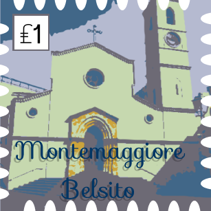
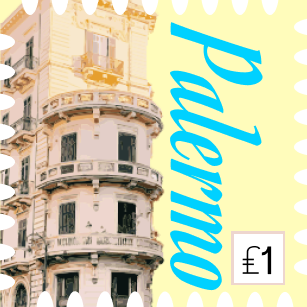

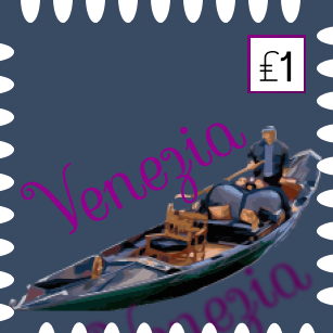
In this project I learned a degree of minimalism, and how to do more with less. It wasn’t terribly difficult, but I did what I could to make the images coherent and visually appealing. The challenging part was the image tracing, especially with all the inevitable fine tuning and glitches that come with it. If I could make my project any better I would like to go back and maybe improve upon the image tracing quite a bit. I can’t really think of a way to improve this assignment for the future, for a project due for the final week of school its very lax, which is nice when other teachers are bombarding us with major projects, but it still teaches design concepts concerning more simple design traits. I was personally inspired to do this work by images of Palermo that lined the hallway to Tim Hortons on campus last year, I have family lineage tracing back to there and it’s always seemed like a beautiful, colorful place, perfect for a post card or postage stamp.