Desert Landscapae
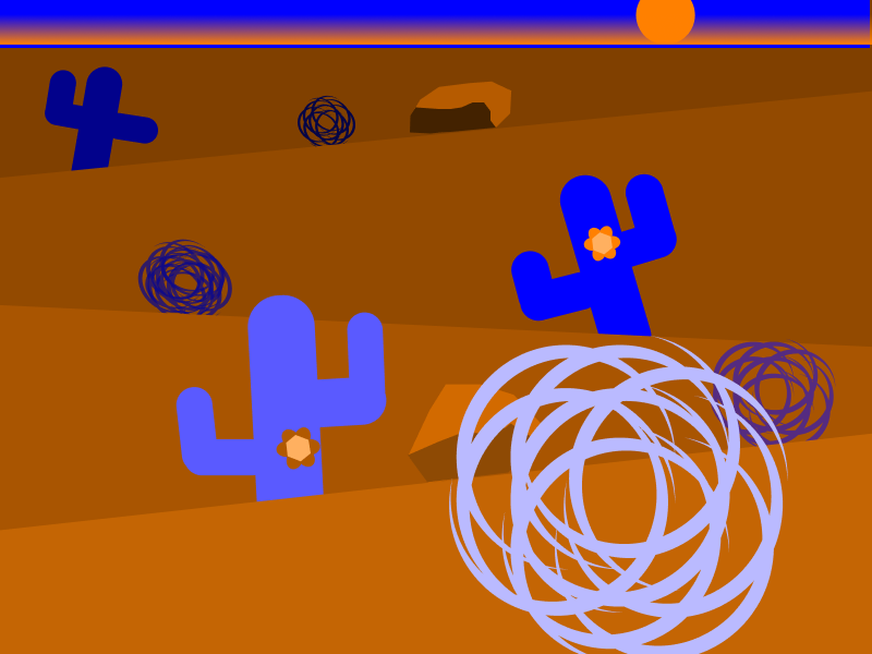
The contrast in position with the cacti, tumbleweeds, and the rocks.
The contrast in scale with the different sizes of the cacti and tumbleweeds to demonstrate depth.
The contrast in color with the tumbleweeds, cacti, sand dunes/hills, and the rocks.
City Landscape
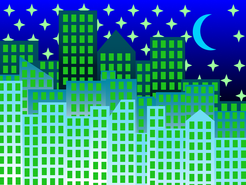
Repetition with not only the stars but the windows on the buildings.
The contrast in scale with the different heights and widths of the buildings
The contrast in color with the gradients of the buildings
Seascape Landscape
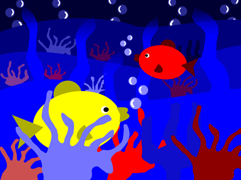
The contrast in color with the different color of the fishes, coral, and the waves in the background
The contrast in scale with the two fishes being two different sizes and the same with the background coral
The contrast in positions with where the fish are placed and the way they are facing
Outer Space Landscape
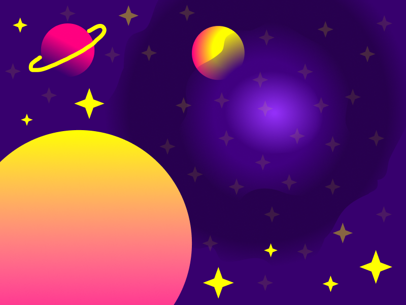
Similarity with the stars and their various groupings with one another
The contrast in scale with the different planets and stars
The contrast in position with how I placed the stars in random places, the same with the two pink and yellow planets.
Reflection:
For our second project, we had to use four different color schemes using the color wheel to create four landscapes, which were the desert, city, seascape, and outer space. We had to incorporate background and foreground and used gradients and color with a change in tone or tint to create depth. While doing all of this, we had to incorporate gestalt principles that we learned about from the first project into this project. I learned what color schemes were and what they were called. I wasn’t aware of their names and only knew about the complementary scheme before this class. It was easy deciding what I wanted to do for each landscape. Especially when it came to the elements like having tumbleweeds in the desert, coral in the seascape, a moon and stars in the city, and a nebula in outer space. Whenever I think of these different settings, what I designed and made is what pops into my head. Also, it was easy choosing the colors I did since they all complement those landscapes well. It was challenging scaling the elements properly to make sense, with the depth. It took me a while for the desert and seascape frames since they both had the most elements for me to rearrange and fix. My submission could be improved if I thought of the gestalt principles before I started working and mapped out which ones could work with each landscape. I instantly got to working instead of taking a minute to remember that I had to use the gestalt principles. I remembered halfway through and had to go back to fix what was wrong. I don’t think anything needs improvement for the next class. This was a self-explanatory and fun assignment to do. With future assignments and work scenarios, I’ll keep in mind the different types of color schemes so the pieces will be more pleasing or will make more sense rather than throwing in random colors that might clash or look bad. The reading we had about colors and how they are used in different scenarios across cultures was really interesting for me to learn because I never realized how diverse colors can be. It also helped me see these colors are used in real-life examples and the effect it has on a finished product.