Links to Project and App Testing Results
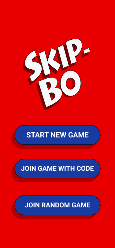
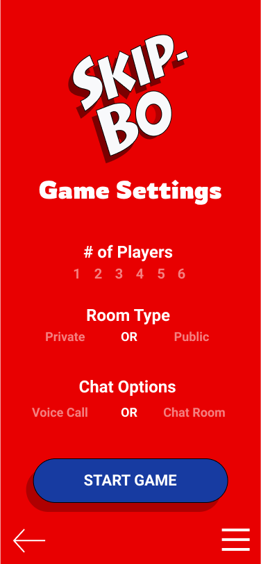
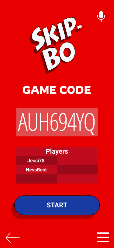
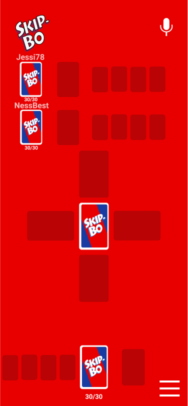
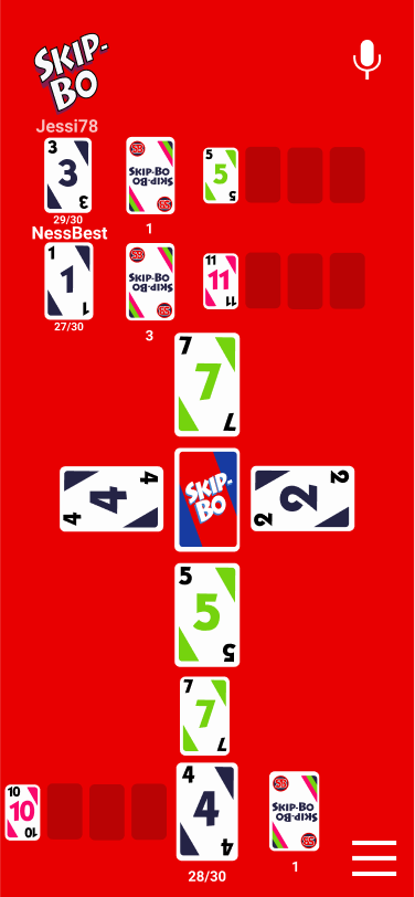
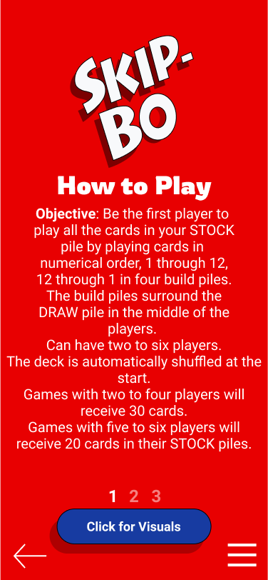
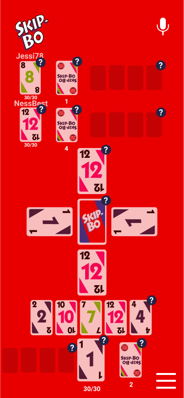
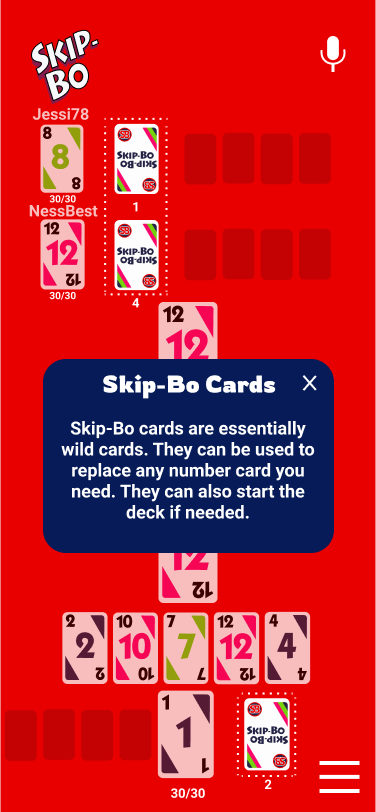
My Figma file link click here to see my prototype
The results I received from having my friends and family that tested out my app with maze.design:
https://app.maze.design/report/1krl26ki595bju#intro
Sketches:
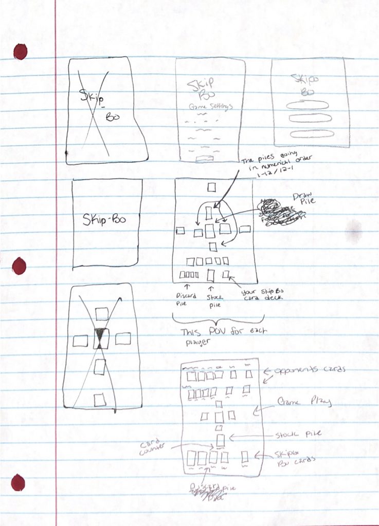
Reflection:
- What did you learn?
I learned how to do animations in Figma and how to smoothly design an app with the amount of prototype work we are allowed to do on Figma. The animation that I did was the menu pop up it, which was very helpful and a good thing to learn because instead of making individual screens to show the menu, the animation made it available on all the screens that I wanted it on without the extra steps. On top of that, I learned when working with multiples of one element and doing smart animations in Figma you need to keep track of the names on your because it can mess up and won’t do what you intended on doing.
- What was easy?
It was easy coming up with the app concept I wanted. I already had the app envisioned in my mind before I even started. I premade sketches of what I wanted the gameplay to look like and how the menu would be set up.
- What was challenging
It was challenging to keep track of the duplicate elements since there were multiple players. I had to slightly change the names so that each player had their own elements dedicated just to them, and they wouldn’t be switching with one another throughout the animations. It was also challenging figuring out the layout to make it not only look good but to make sense to players.
- How could your submission be improved?
I think my submission could be improved if I could transfer everything I did but onto the size of an iPad, maybe, so I had more room to do the first layout that I had in my sketches, but I liked how the layout turned out in the end. Overall I had to make sure that the layout could workout with every screen size anyway, so it worked out.
- How could I improve the assignment for the next class?
I don’t think there needs to be any improvements.
- How might you apply your knowledge in future assignments or work scenarios?
If I ever work with Figma again in the future or if a program I use is similar to Figma, I’ll label my elements right when I start my first frame so that I don’t have to go back and make adjustments later on.
- How did a specific reading or video inspire or help you?
When we were doing Lab 9, and we visited the animate.css website seeing all the different types of animations that can be done and how they’re programmed helped me have a better understanding of where these elements could work within my app. Like when we programmed the error message to pop up if there was nothing typed in the username or password forms. Although I couldn’t use them in my app because they didn’t fit with the theme, they helped me have a better understanding of the coding process. Also, with our lab ten that I mentioned before, I added in the menu animation, which helped me out a lot. I took a look at the website Stephanie Walter and read “Enhancing User Experience With CSS Animation” (https://stephaniewalter.design/blog/enhancing-user-experience-with-css-animations/) to have an idea of animations that would help the users experience be better nor worse.
