In this Project I learned how to artistically tweak letters while maintaining legibility.
The easiest part for me was choosing a film character to work with, I had an idea for this character very quickly.
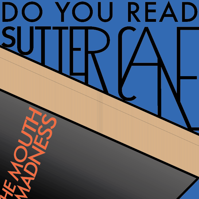
The hardest part was taking the black and white design for the distorted words and making it into a full color movie poster.
My submission could be improved if the “book” looked more like a book, the idea was that the name was connected with the book, but it looks kinda like random shapes instead, so bad illustration on my part.
I think this assignment could be better if you either made the deadline shorter, or added the requirement for multiple black and white designs, as it stood it felt like too much time with very little instruction.
This knowledge can help with all sorts of graphic design work, anywhere there is a title or a poster or some kind of bold heading, adding graphic design to the lettering can add a lot of life to it.
I drew inspiration from the film, At the Mouth of Madness, it’s my favorite horror film of all time, really good film. There were many references to the film in the original version that had to be trimmed down for the sake of visual design.