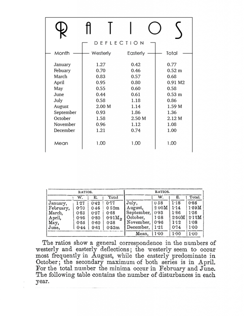
In this Project I learned about laying out charts to maximize both legibility and style. All of the graphs we started out with were legible to some degree, but there is much more to the layout of type than just making sure it can be read.
The easiest part of this project was re-entering all the data from the old chart into in-design, it takes time, but doesn’t really help us learn anything.
The hardest part by far was getting the data to look nice, it was always a balancing act between keeping everything easy to read and understand, and trying to make it something you actually wanted to look at. In the end I think it looks really nice though.
My submission could be improved by playing around with different fonts a bit more, the fonts I used were nice, but there are probably many better combinations I could have gone with.
I think this assignment could be better if you provided a specific work, or journal to find a good table that needed to be changed in it. Many of my fellow students put off working on this assignment because they didn’t know where to start. I feel that if they all had an initial book to look through for something, it would have gone smoother.
This knowledge can help in displaying information in a more readable way, in every chart, graph, and table there is a large amount of design that can go to make it look more unique and interesting.
I had some inspiration for this piece, once I got all the data down and began messing around with it’s style you recommended breaking a line with text. Once I began messing with that, I thought it looked kinda retro-futurist. So I imported one of my favorite fonts to use in that kind of setting, Andes!