Project Four

In this Project I learned about laying out charts to maximize both legibility and style. All of the graphs we started out with were legible to some degree, but there is much more to the layout of type than just making sure it can be read.

The easiest part of this project was re-entering all the data from the old chart into in-design, it takes time, but doesn’t really help us learn anything.

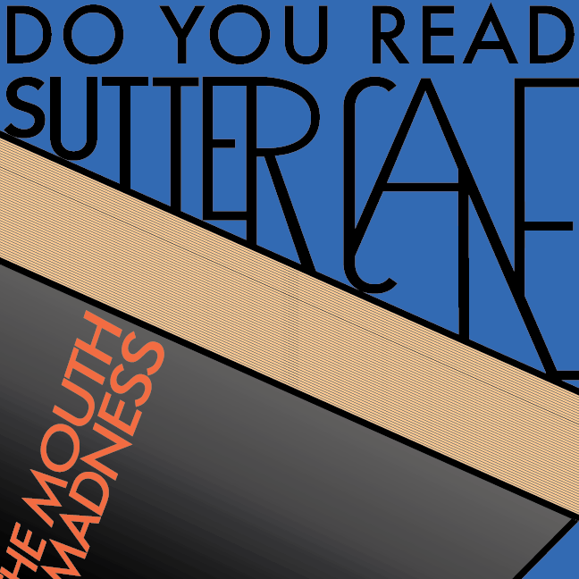
The hardest part by far was getting the data to look nice, it was always a balancing act between keeping everything easy to read and understand, and trying to make it something you actually wanted to look at. In the end I think it looks really nice though.

My submission could be improved by playing around with different fonts a bit more, the fonts I used were nice, but there are probably many better combinations I could have gone with.

I think this assignment could be better if you provided a specific work, or journal to find a good table that needed to be changed in it. Many of my fellow students put off working on this assignment because they didn’t know where to start. I feel that if they all had an initial book to look through for something, it would have gone smoother.

This knowledge can help in displaying information in a more readable way, in every chart, graph, and table there is a large amount of design that can go to make it look more unique and interesting.

I had some inspiration for this piece, once I got all the data down and began messing around with it’s style you recommended breaking a line with text. Once I began messing with that, I thought it looked kinda retro-futurist. So I imported one of my favorite fonts to use in that kind of setting, Andes!

Project 2, Character Poster

In this Project I learned how to artistically tweak letters while maintaining legibility.

The easiest part for me was choosing a film character to work with, I had an idea for this character very quickly.

The hardest part was taking the black and white design for the distorted words and making it into a full color movie poster. 

My submission could be improved if the “book” looked more like a book, the idea was that the name was connected with the book, but it looks kinda like random shapes instead, so bad illustration on my part. 

I think this assignment could be better if you either made the deadline shorter, or added the requirement for multiple black and white designs, as it stood it felt like too much time with very little instruction. 

This knowledge can help with all sorts of graphic design work, anywhere there is a title or a poster or some kind of bold heading, adding graphic design to the lettering can add a lot of life to it. 

I drew inspiration from the film, At the Mouth of Madness, it’s my favorite horror film of all time, really good film. There were many references to the film in the original version that had to be trimmed down for the sake of visual design.

Project 1, MintyThin

In this Project I learned about the many different classifications of fonts, I knew about serif vs sans-serif before but I learned more about the categories like geometric, blackletter, humanist and Egyptian.

The easiest part of this project was laying out the letters in photoshop, not much challenge in it, but it looks visually appealing when all put together.

The hardest part by far was working within the self imposed limitation that I gave myself. All capital letters (that didn’t have overhang) were only in a 7×3 grid, the small width limitation of three pixels made certain letters tricky to figure out.

My submission could be improved by having the top text line up better to showcase that it has true monospacing.

I think this assignment could be better if you gave all the students a sizing guideline from the start. For example if you did the lesson on bounding boxes and x-height first, then gave all the students a specific box to work within.

This knowledge can help in identifying existing font types in works that I might edit.

I drew some inspiration from fronts from the early days of computing, when they had less fonts to work with. My initial concept was to make a font where every letter was very thin and top heavy, but the small pixel limitation I placed on myself ended up dominating its design more than my initial idea.

Typehunting in a Graveyard

These are all font samples I found in the graveyard, they all have very different font styles.
As serif fonts are often considered more fancy, most of the stones out there had seriffed fonts, the only sans-serif samples I have are the letters C,N,R,T and Y.
I found two examples of blackletter fonts, the P and the S.
Another interesting font is that used on the N, as it looks very modern, as opposed to many of the older styles on the graves.