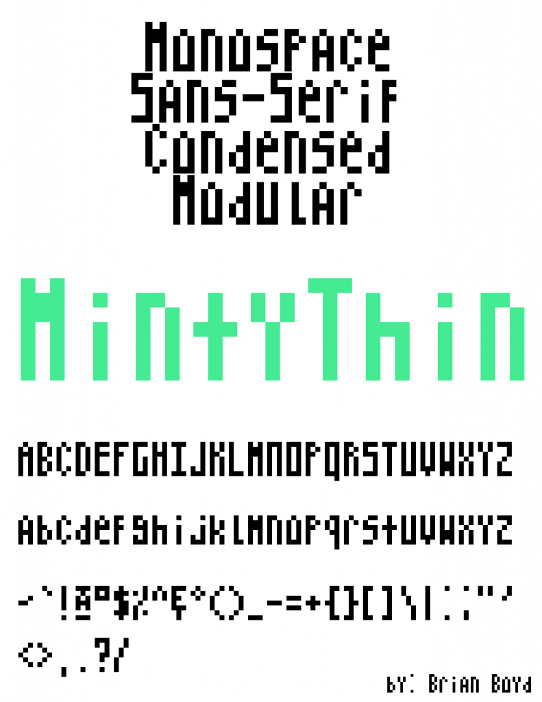
In this Project I learned about the many different classifications of fonts, I knew about serif vs sans-serif before but I learned more about the categories like geometric, blackletter, humanist and Egyptian. The easiest part of this project was laying out the letters in photoshop, not much challenge in it, but it looks visually appealing when all put together. The hardest part by far was working within the self imposed limitation that I gave myself. All capital letters (that didn’t have overhang) were only in a 7×3 grid, the small width limitation of three pixels made certain letters tricky to figure out. My submission could be improved by having the top text line up better to showcase that it has true monospacing. I think this assignment could be better if you gave all the students a sizing guideline from the start. For example if you did the lesson on bounding boxes and x-height first, then gave all the students a specific box to work within. This knowledge can help in identifying existing font types in works that I might edit. I drew some inspiration from fronts from the early days of computing, when they had less fonts to work with. My initial concept was to make a font where every letter was very thin and top heavy, but the small pixel limitation I placed on myself ended up dominating its design more than my initial idea.