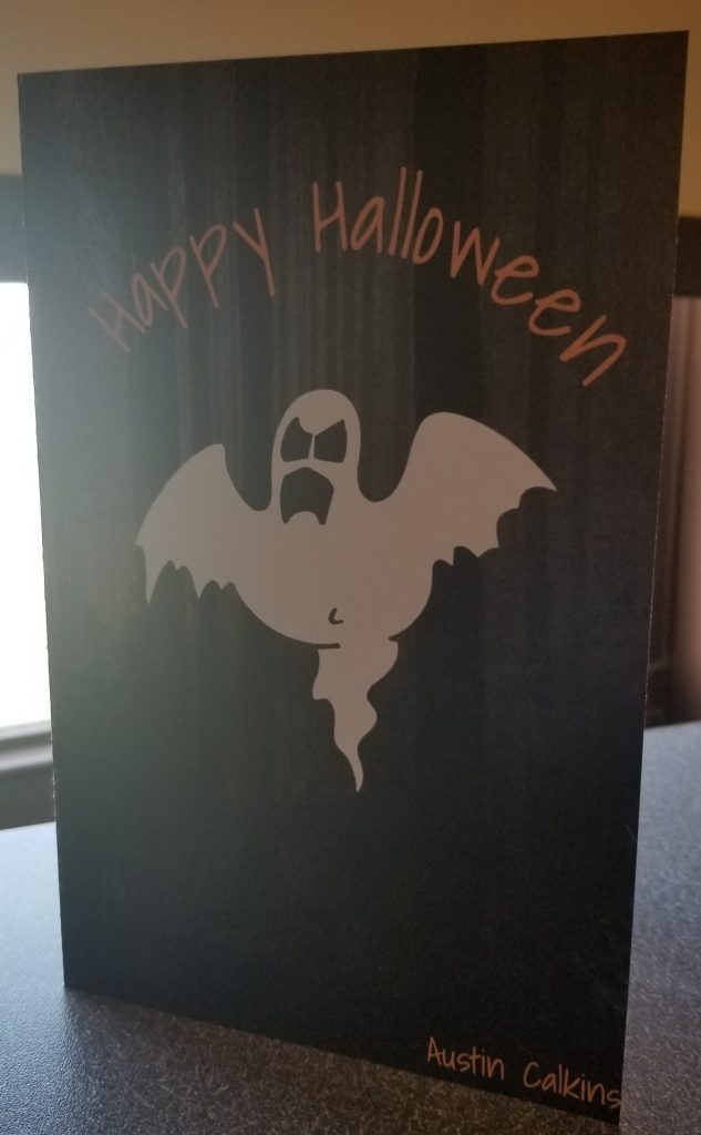
I learned the basics of Photoshop and how to apply those skills to make a card. Specifically, I learned about layer masks and using fonts from other places like Adobe Font and Google Font.
I found the majority of the project easy. However, for myself anyways, I struggled to find photos that were good quality or didn’t have watermarks on them. This was solved by using some of the websites for stock images that my professor provided.
I could have improved the cut and fold of the card. While it wasn’t too bad, there is some slight white paper left over on the top of the back side. This was caused by a fold that was slightly off. It isn’t too noticeable, but it still could be better.
I don’t think the project could be improved since we were allowed to do a different kind of card if we wanted to.
I could use Photoshop in the future as a computer science major when dealing with making a website. I could make my own graphics in Photoshop if I was helping in creating a website for someone.
I was inspired by a number of websites and articles. One of these was Jerry Uelsmann. I was inspired by the spookier images that were on the front page of his website. I decided to use this for the front and back of the card with darker images. I then contrasted this with a fun interior for the card.
