This is my product package. When I think of milk, creamer and dairy products, I usually think of more pastel colors. For the background pattern, I made a combination of more pastel colors that reminded me of these product colors. The cream color, the blue colors and the orange color were appropriate for this. I also added a green to the background pattern as this product is an apple pie spice creamer. I chose a simple coffee cup to the front and make it the same color as the logo, a light blue. I chose light blue as I usually think of the light blue that some milk containers are to signify that they are skim milk.
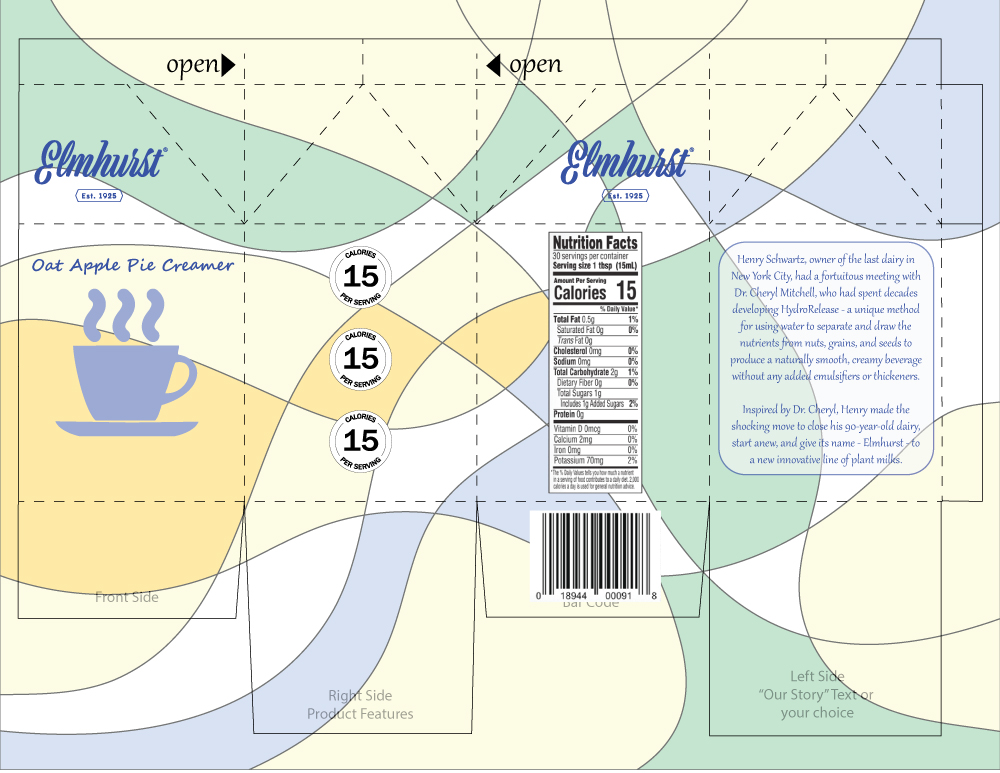
After the critique period, the first thing I did was reduce the opacity of the background. This made the colors a little less vibrant and achieved the pastel look I wanted to achieve. I made the calorie circles have a white background to contrast them from the pattern in the background. Finally, I updated the “Our Story” section with a short story from the Elmhurst website about how they started. I made all the font to be a similar script font to match the logo of the company. I added a lower opacity white box behind the Our Story to make it easier to read.