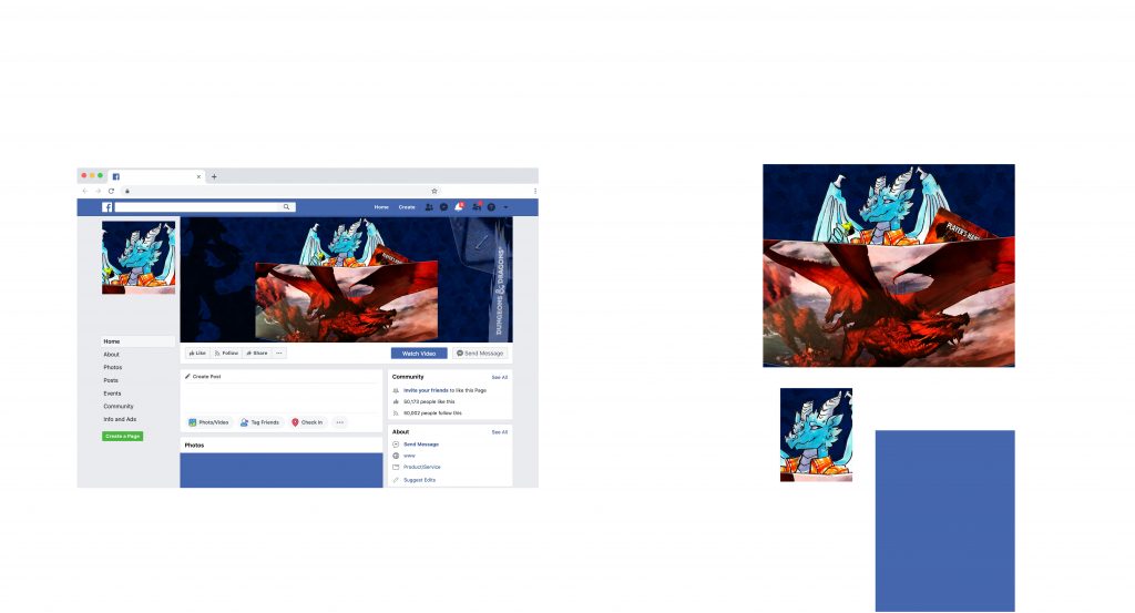
For Project 2, I decided to take the photos that I made and edited in Project 1 to create a Facebook page for if my character, Fulgur, decided to become a DM like myself. This could also be a suitable composite image for my own profile as a DM of D&D since he is my favorite character that I have made. I learned how to use various tools in Photoshop to make a composite image including masking, layers and layer options and effects. I used these tools to create an engaging and layered image.
Honestly, I didn’t find this project too hard or too easy. Discovering all the different options for masks and layer properties was fun to experiment with. I even learned how to change the pattern I used in the background. Masking the various pieces of the composite image was a bit tedious, especially with the number of details there are on Fulgur (the dragon). Overall, this was a fun project to work on and experiment with and explore Photoshop in.
I believe I did a fantastic job with this project. If I were to improve anything, I could have tried to do something with the small empty space to the left of Fulgur. However, I thought with the silhouette of the dragon statue on the left that adding else would make the left side too crowded. I believe the image is well balanced enough that the small empty space is fine to be there.
I believe the assignment is good as is. It allows a lot of creativity and experimentation, which I enjoyed. I believe one of the best ways to learn the workings of the program is to just let students find out themselves and explore what they can truly do once presented with the basic tools.