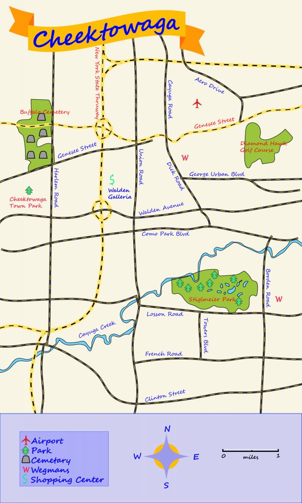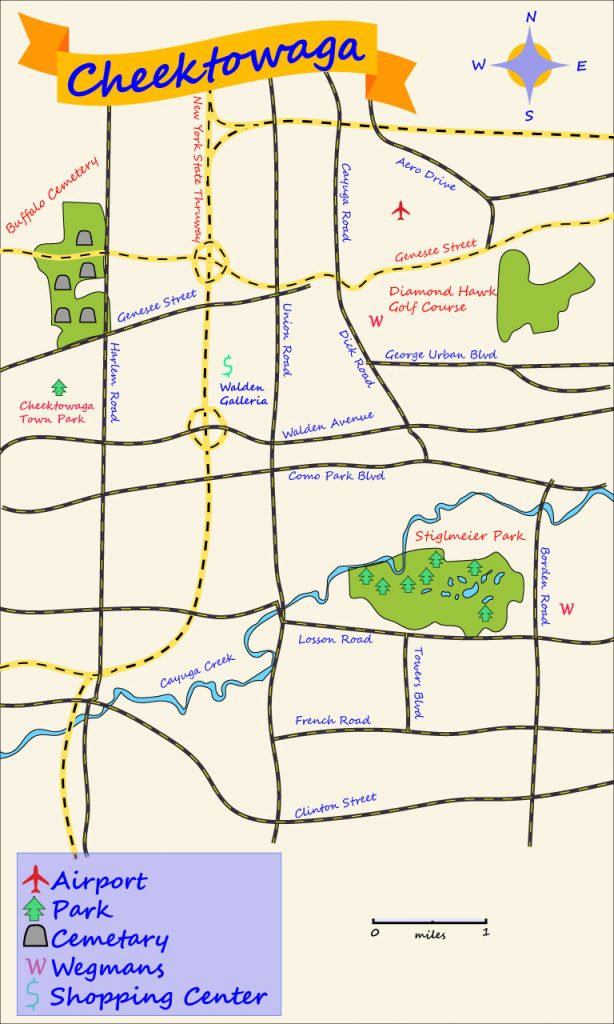
For this project, I decided to just create the map of my hometown, Cheektowaga. I went for a blue and orange/red color scheme for the map, as they are complementary and some of my favorite colors. Even though Cheektowaga does not have too many exciting places, I made sure to mark the highlights of the town, including the Walden Galleria mall, the Buffalo Airport, Cheektowaga Town Park and one of my favorite places to go for a walk when the weather is nice, Stiglmeier Park.

After receiving critique, I have not changed much. I moved the labels for some of the areas off the colored areas and onto the background so they are easier to see. I also slightly increased the font size for easier reading. I removed the bottom rectangle and moved the legend, compass rose and scale. This was done to make the map seem more together and that these three parts almost exist on the actual map. I did enjoy the rectangle before, but I do see the appeal of it not being there as well. Overall, I think this was a very fun project. It was a lot more open ended and taught me a lot about how layers interact with each other. I think my favorite part was the town banner. There was a lot of cool options for it and the making of the ends of the banner was creative. It is very neat how changing the colors of pieces of the banner can make it look like it is 3D.