DMA 212 – Project 4

1. What did you learn?

I learned how to shape banners and to make them. I also learned how to smart fill objects. These are skills I have never used before. I also learned that being a senior makes it very difficult to find motivation in the last few weeks of class. 

2. What was easy?

I found that it is easier to use Illustrator. I came into this class having very little experience with it, since most of my background knowledge is with figma, but I feel more confident with this program. It is definitely more useful that figma but not as straightforward. I also found the smart fill to be an easy task to grasp. 

3. What was challenging?

Finding a place that I wanted to create the map for was fairly difficult. I needed many different significant points but the process to find it was fun. I also struggled with how to make the map look aesthetically pleasing with the few colors I used. I have never been amazing at that and this project really tested that. 

4. How could your submission be improved?

If I had more motivation to do this project and less burn out it definitely would be improved. I know that more time could improve it more but that is always the case with any project.

5. How could the professor improve the assignment for the next class?

Making one more part of the project a separate lab would help pace things. For example, drawing all the lines and filling them could be a separate lab but it would also help students pace themselves better. 

6. How might you apply your knowledge in future assignments or work scenarios?

In general this project gave me more practice with Illustrator. I am a firm believer that the more practice you have the better you can become at a program. Being able to have a fundamental understanding of most of the tools in Illustrator is always useful when looking for a job in the digital world. 

7. How did a specific reading or video inspire or help you?

This YouTube video gives really good examples of more dynamic icons. Having fun icons can really make or break this project. 
DMA 212 – Project 3

1. What did you learn?

I finally understand how to use the pen tool properly! I know the key shortcuts to help make lines smoother. It took awhile for me to understand this tool but finally having a good grasp of it made this project much more enjoyable.

2. What was easy?

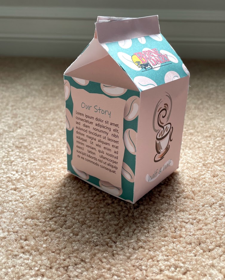
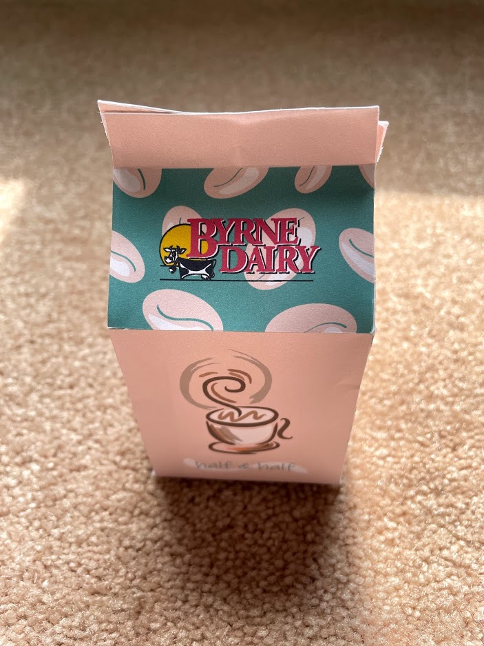
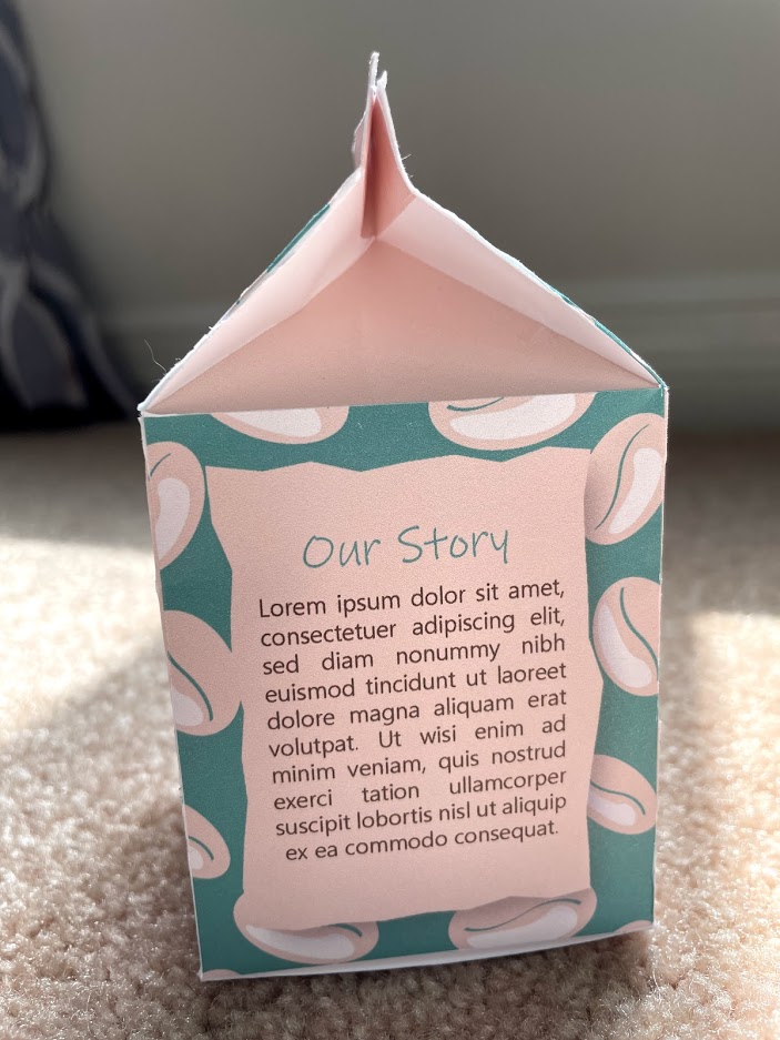
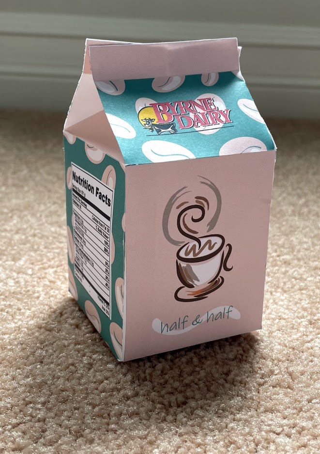
Making a pattern was interesting and uncomplicated. It was a creative way to add color and details. I was able to look at smaller detail and overall design since creating a pattern is much easier than making many unique coffee beans. 

3. What was challenging?

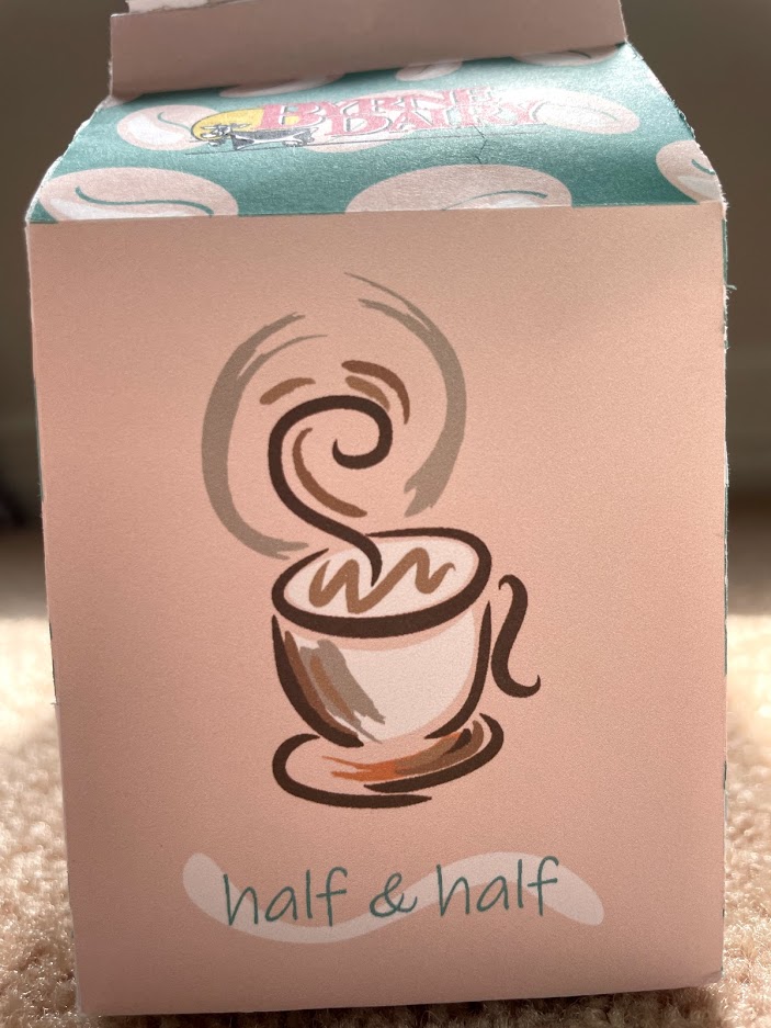
Creating the cup was difficult. I do not often draw using vectors so trying to make something look hand drawn but also professional was difficult since I do not have a lot of experience with it. I drew many different shapes and circles, I looked at hundreds of drawings to finally create the coffee cup that I was proud of. 

4. How could your submission be improved?

I wish I had more inspiration to look at. I often need to look at many examples before I can feel confident in my work. Often looking at how other students performed this project can help form different ideas in my head. After sometime I compost my own idea using the amalgamation of other students’ works. 

5. How could the professor improve the assignment for the next class?

I found the most difficult part was how quickly Professor Dunkel went through the last lab since that is where we had to remake the label. When teaching us how to retrace labels, take a little more time at each step. I felt like I was behind because of some minor mistake I made which made it difficult to follow. 

6. How might you apply your knowledge in future assignments or work scenarios?

Being able to successfully use the pen tool is already one of the best things I can do for any future project. It helps with image tracing and more importantly, I can finally recreate all my ideas in my head into illustrator. I have found that I really enjoy making logos and the pen tool makes the process much easier and the final product much more clean. 

7. How did a specific reading or video inspire or help you?

https://helpx.adobe.com/illustrator/how-to/use-pen-tool.html

This tutorial by adobe really helped understand the pen tool on a more fundamental level. 

DMA 212 – Project 2

1. What did you learn?

I learned that creating a collage is a form of design that is difficult for my brain to grasp. It is a unique and formless process that I never have had to do in my life. I also learned more about how powerful of a photo editing software Photoshop is and how diverse it can be. 

2. What was easy?

I found the basic editing concepts shown in class fairly easy. Creating shapes, masking objects and creating gradients all came natural to me.

3. What was challenging?

Creating the idea of how to mash up all my pictures was very complicated for my brain. This type of creativity is very novel to me. I used this as an opportunity to fully expand my skills by choosing an unfamiliar theme of the 80’s. This project definity helped me grow as an artist. 

4. How could your submission be improved?

If I had more time to bounce ideas off Ben Dunkle and even my classmates my project could be better. Having more people’s opinions can help me form a better concept art and inturn help me make a more put together project. 

5. How could the professor improve the assignment for the next class?

It could be useful for a class or group discussion about each person’s individual project where we look at all their pictures and throw some ideas for what they could potentially make. 

6. How might you apply your knowledge in future assignments or work scenarios?

Having a better understanding of how to make different photos look connected is a priceless skill. In future projects, I will be able to have a better understanding of how to make unique art from already existing concepts. 

7. How did a specific reading or video inspire or help you?

What really inspired me was just googling images in the theme that I wanted. I became very interested in making an 80’s themed project so I used google to help inspire my ideas. 

DMA 212 – Project 1

1. What did you learn?

Thanks to this project I learned the importance of photo editing and the value of proper lighting. When photos had better lighting it was much easier to edit. Proper lighting not only improves the quality of the image but also creates an opportunity for a greater variety of editing choices.

2. What was easy?

I found that manipulating the image using levels, curves, saturation, etc. was particularly easy. It was a simple yet powerful way to improve the quality of the images

3. What was challenging?

I found that using the stamp tool and the healing tool to fix this photo of Saint Basil in Russia was challenging. I wanted to remove all the construction materials from the photo. It took a very long time because it was very easy to make a mistake and redo the same portion-time and time again. 

4. How could your submission be improved?

Taking the time to learn about other tools in Photoshop would definitely improve my submission. I also believe learning to properly take pictures and frame objects would have helped my submission look more professional.

5. How could the professor improve the assignment for the next class?

The assignment was fairly straightforward and fun. However, more time to work on it would have been much better especially since school computers can be hard to come by.

6. How might you apply your knowledge in future assignments or work scenarios?

Every time I submit photo assignments I will make sure to make them look better every time even if that is not the primary goal. The small improvements can really make a piece look complete.

7. How did a specific reading or video inspire or help you?

I did not really read or watch a video that inspired or helped me.

DMA 212 – Lab 1

Compare your photo with the one from Unsplash. What are the differences? Why is one “better quality” than the other?

The Unsplash photo seems to have a higher resolution and less “cloudy” look. The nice picture has much brighter pixels that are very defined. It’s a dynamic photo with some blurriness to make your eye look towards the cat’s head. Each photo I took seemed to be nice but there could have been better lighting. I also feel that the Unsplash picture has been modified to look nicer. The creator may have used Photoshop and Lightroom to tweak different aspects of the photo like color and highlights. Since I had not added any elements of photoshop to my pictures they almost feel incomplete. The photo shows a lot of scuff marks because of its age which the Unsplash photo did not have. The coin itself is missing a lot of details the “better quality” photo did not have. My photo of my cat has less depth and details which the Unsplash cat did have.

Compare your photos with the scans. What are the differences? Why is one “better quality” than the other?

I was not able to scan an object. Ben’s scanner seems to make the image clearer. The photo had a more granular look to it. Scanning also made the pictures look brighter. The scan shows more details and gives it a better representation of the flower. The scan is a much better representation of coins. The scanner has more details. Generally, if you need to have a picture of some object like a photo or a small 3D object, the scan is definitely the way to go. It is a really good way to show details. However, if a 3D object like an animal or nature picture form is way more useful.

What could you do to improve the quality of the images acquired by each method?

I feel that for all the pictures I took I needed better lighting and just a general aesthetic. Using photoshop and lightroom would also be useful to make those photos more defined. Trying to frame the pictures and use natural lighting is the easier way to make them look better. Generally speaking, a nicer camera than my phone camera would make the resolution and the quality of the picture better. Ultimately, all pictures, even the scanned pictures can be made more defined with better details and colors by using photo editing software.

DMA 217 – Project 2

What did you learn?

I learned more about Figma. Variants made the design much easier. Also, overflow made the app move a lot smoother. I used stack overflow to get the scrolling effect which is very important for a few sections of the app. I also learned more about the usefulness of animations within an app. It helps with smooth transitions and it is useful in giving the app more life. 

What was easy?

I found the login section to be one of the easiest. It was similar to the last app so it felt very straightforward. I knew exactly what I needed to make a component of and I had a pretty good understanding of how it should look. 

What was challenging?

I found the animation prototyping a bit more difficult. It was a bit confusing to know how the actions would look like in the prototype. I did not always know which option would look best and help with usability. 

How could your submission be improved?

I could always improve the design. However, since the idea is pretty simple, I would start making a coded prototype. If I started to code the app so that it randomly generated a task from a list of different tasks, that would really help improve my submission. 

How could I improve the assignment for the next class?

I would add more sections to the menu section. There are only the notifications and “how it works” section. I would add frames for all the rest of the tabs that come off of the menu. 

How might you apply your knowledge in future assignments or work scenarios?

I would utilize auto-layout in my future assignments. After learning about it in class, I realized how much easier it would be when prototyping an app. It would also help with consistency through the app which can give it a more professional look. 

How did a specific reading or video inspire or help you?

When trying to think of an app concept I kept in mind that I wanted to make something I could use for myself. I was most motivated by my own experiences during the past spring quarantine. I felt so unmotivated. I tried many different apps but most of them asked for a list that I type in and that always led me to not even try the app in the first place.

DMA 217 – Lab 10

Great Uses of Animation

Coolors.com has a few “buttons” which when hovered over change color and extra information about where that button will take you animates in. It makes the web page more interesting and helps your eyes focus on that part of the webpage.

Check it out!

One small but well-placed animation in on Twitch. When hovering over a video it moves a little and has a purple border to the left. It highlights the video you want to watch.

Twitch

To make their website feel alive, Lavva utilized different animations. For instance, to connect with them, the support button on the bottom slides up. Not only that, they animated the back of their website so that the leaves move around the areas that they wanted the user to look at. Animation is littered throughout the website. From the change of color of a button while hovering or when there is an appearance of a product. The website is really well put together and the animations help it look more professional.

Lavva

DMA 217 – Lab 6 – Project 2 Start

Title:

It’s Just One

Description:

An app that gives you one daily goal to do. Quarantine can leave people unmotivated. This app gives the user a random goal to do a day. This app also listens to what the user likes. The user can rate that daily they did. If the user enjoys it, the app has the ability to make new daily goals similar to the ones they enjoy, to make it more likely for the user to accomplish the daily goal. 

6 User stories:

  1. As a young adult, I want to have one daily goal,  so that I can have motivation during quarantine.
  2. As a lover of learning new things, I want to have a system that gives me random goals, so that I can consistently strive to learn new things. 
  3. As a daily phone user, I want an app that will give me productive goals, so that I do not procrastinate on my phone as much.
  4. As a college student, I want to keep myself busy during a global pandemic, so that I do not feel as lonely. 
  5. As a young adult, I want to instill better habits, so that I do have a routine that makes me better for me. 
  6. As an older adult, I want to learn new things daily, so that I can keep sharp and continue being the person I want to be.

DMA 217 – Project 1 – Far Far Away

Initial Data Analysis:

  1. Identify a popular CRM and conduct a QA analysis. 
    1. Is it easy to complete basic tasks? How many steps/swipes/clicks does it take to complete the task on a desktop computer? What about on a phone?
      1. I used Hub Spot as the CRM that I conducted a QA analysis on. It took me a few steps to find the reset password. Generally, with most apps I have found it difficult to navigate to find the place to reset the password. 
    2. Are there any issues that make the app difficult to use? Can you imagine a person who might find aspects of the app inaccessible?
      1. I feel that the main group of people who would find it difficult to navigate would be the older generations, but that seems to be a side effect of not growing up with this kind of technology. It can be difficult to understand the icons. 
  2. Identify a target demographic and list requirements. This can be a club, your family, friends, classmates, any group that can be described with specific characteristics, such as age, interests, location, ailments, social/economic challenges, etc.
    1. The target demographic for my app would be people who are in long-distance relationships. This can include anyone but I would expect an age range from 18-25 years old. 
  3. Identify at least one useability, accessibility, and/or a technical issue you will address in your design. This should come from your QA analysis.
    1. My main usability issue as to how to find the place to reset the password. During my QA analysis of the Hub Spot, I felt frustrated because I could not find it for a long time. It was under security and then I even needed to scroll down. Since portions of the webpage stayed in place during the scrolling process, it did not click with me that I even needed to scroll. 
  4. Identify at least one new feature you will integrate in your design.
    1. My new feature includes the location of your contacts, the forums, and pinned messages. Pinned messages include specific forum messages or personal messages that the user would want to highlight. I also believe my concept for a CRM is also fairly unique.

Post Project Questions:

  1. What did you learn? I learned a lot from this project. I learned how difficult it is to make something, especially when uninspired. I learned to allow myself to take time and think about possible solutions. Most of my ideas came to me while I was walking. I also learned how to utilize different effects and shadows to polish the final look of my app. Before I added a shadow it looked tacky but afterward, I felt more confident in how it looked.
  2. What was easy? The easiest section to design was messaging. I have seen a plethora of different messaging apps and many of them are already well designed. I implemented many ideas that felt natural for me, making it the easiest.
  3. What was challenging? The sorting system was one of the more challenging concepts for me. My CRM is in its nature different since it is all about long-distance relationships. Because of this, it uses different groups as the main way of sorting individuals. I found it difficult to conceptualize the most straightforward sorting system for the groups I felt were most important for my CRM.
  4. How could your submission be improved? I really liked using components but I do not think I used them to the best of my ability. As I was working on the final touches I needed to move something that was on each frame but I did not make a component and I needed to change each frame. I also feel that with more time I would add more features to the app, especially in the menu section of it. Right now there is only a reset password feature, but with more time I would add more to the different sections of security.
  5. How could I improve the assignment for the next class? Like the previous question, I would add more features. I would also probably use Maze again to do some more testing to see what else I could change. 
  6. How might you apply your knowledge in future assignments or work scenarios? One idea that I will definitely apply is to start early. I slowly worked through ideas over the course of three weeks. Some nights were definitely longer than others but I did not feel overwhelmed closer to the deadline. I would also definitely use the component aspect of Figma. It was so nice to only need to fix one thing, and then everything else would change as well. It saved so much time and a lot of hair-pulling. 
  7. How did a specific reading or video inspire or help you? The video that most inspired me was the Netflix movie The Social Dilemma. I wanted my CRM to be more specific for the user, with no companies for which the information is being used for. It is for the users and only the users.  
  8. Comments:
    1. I have a few personal comments on my work. First of all, I would utilize version saving. I did not do it because I just counted on the autosave. The problem that occurred for me is that I changed the messaging logo but I can not show how I changed it because I did not save the earlier versions of it. 
    2. Also, I did use AB testing at the beginning of the project. However, this was before I knew of Maze. So I just asked my friends in person. I do not have a report on it. For the most part, I used it for the color scheme. The original colors were purple and pink or green and pink. All but one of my friends chose pink and green so I continued with that.

Maze Report

Project 1 Figma