Project 4: Russia

Sight
Food
Industry
History

What did you learn?

As in theme with this class, I learned how important typography is. It can be so complex or simple but it is a very powerful tool. It can really make or break a project. I really noticed how some type just simply looked bad with the different themes but some really highlighted exactly what I wanted it to. 

What was easy?

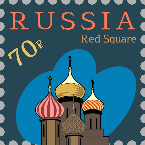
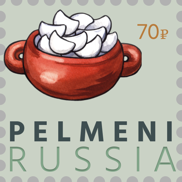
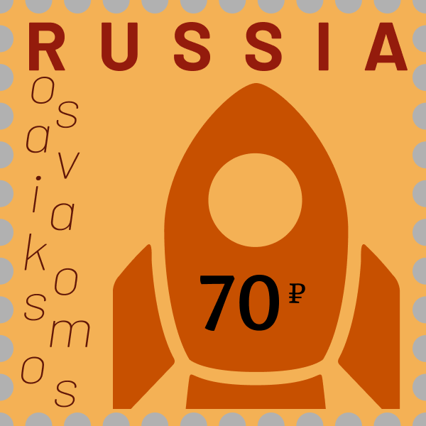
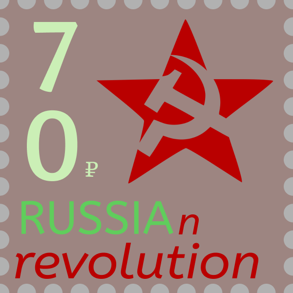
Figuring out what I wanted on each postcard was pretty easy. I am Russian so I decided to do this project on Russia, was a no-brainer! I know all about the culture and history. Also, choosing the color scheme was pretty easy. I have started to get the hang of using color, so it was pretty easy to find colors I wanted to use. 

What was challenging?

It was hard to choose which type would look best. Firstly, Figma does not give an example of what type I could use. Also, some of the type could not be modified, so was not capable of adding any contrast to that type. It was also a bit tricky planning exactly how I wanted each postcard to look since I wanted each postcard to be unique. 

How could your submission be improved?

Like my past projects, if I had more access to Illustrator I believe I would have been able to do many more interesting things to the fonts. I am personally pretty proud of these postcards but everything can always have more work done on it. For example, the post card on industry could have had more work done to it to make a more interesting type. 

How can the professor improve the assignment in the future?

I really liked how creative I needed to be for this project. Maybe having specific requirements for different types of font that should be used in the project. Having some form of check list of different types I should work would have been helpful so that it is less likely to get into a habit of using the same theme for each postcard. 

How might you apply your knowledge in future assignments or work scenarios?

I will keep in mind how a different font can greatly affect my game title, since I believe this can be the reason a person would be interested in playing my game. It is very important to catch the eye of possible consumers, and the font is very important for doing this. 

How did a specific reading, video or example inspire or help you?

Coolors.co was incredibly helpful in finding a color scheme. If I used a specific color on the postcard I could just plug in that color and an amazing color scheme was generated. This really helped bring my project together. 

Project 3: Light of my Life

What did you learn?

I learned how important metaphors are in our everyday lives. I had never really considered how different icons are actually metaphors. Growing up with the internet and phones, these metaphors just seem like second nature; however, there is so much more to these metaphors than just some random picture. I also never really thought about some of the metaphors that I use in my everyday, such as heartbreak or wasting time. I can see how someone who is not a native English speaker can easily get confused since how in the world can one waste time? But it makes perfect sense to me.

What was easy?

Once I thought of the metaphor and the images that coincide with the metaphor, it was pretty easy to put the images together in figma. I actually had to use two images of the light bulb since there was a wire running through it and in figma I can’t just erase it. However, it was pretty easy to just crop out part of the light bulb and place on the other one, so it was as if I erased it. I have had some experience with image manipulation so it is starting to feel like second nature.

What was challenging?

Nothing was incredibly challenging. I just needed to be patient with my creative process. I need to find a few metaphors and had to brainstorm different pictures that would easily express what I wanted it too. This was challenging since it took time for me to think of the best options.

How could your submission be improved?

It could be improved by the usage of Photoshop. If I had the opportunity to use Photoshop I think my project would have looked a lot more professional. Using Photoshop I would able to manipulate the images better than in figma and the project would look much better.

How can the professor improve the assignment in the future?

On the presentation on figma, it would have been nice to learn more about patterns. I personally do not like how my pattern looks, but I am uncertain on strategies to improve it.

How might you apply your knowledge in future assignments or work scenarios?

Being more conscious of how to apply metaphors to different games or projects will make anything I’m working on even more professional. It’s a creative way to help viewers have more insight to each project without simply telling them, and it should not be too complicated to apply.

How did a specific reading, video or example inspire or help you?

The article “Metaphor Definition And Example” by Richard Nordquist really clarified the idea of how metaphors are used in our day to day, especially in social media and phones. It helped put into perspective how often we really use metaphors, from the setting symbol to the camera on an app. You can show just the app and you instantly know what it is without having the name. That shocked me and helped me see everyday metaphors in a new light.

Project 2: Color

Desert
Color Scheme: Complementary
City
Color Scheme: Analogous
Ocean
Color Scheme: Triadic
Outer Space
Color Scheme: Split-complementary

What did you learn?

I learned to really notice color. I learned so much more about color. Interestingly, I notice color a lot more in life too. Recently I was looking at the night sky and I noticed different gradients and the contrasting colors of the world around us. I used to think I had some form of understanding when it came to colors: what looked nice and how to make things interesting. I realized that I had no clue. It feels really good to have a fundamental understanding on color since color is all around us. It makes me appreciate colors and the theory underneath it all.

What was easy?

Choosing which colors for the specific color scheme was pretty easy because there was already a specific method on choosing what color to choose. Since we had a color wheel, I was already able to choose the colors needed. Analogous was just three colors right next to each other,  complementary had to be opposite each other, and triadic and split complementary had specific locations on the color wheel. Understanding the color wheel was one of the easier parts of the project.

What was challenging?

Designing a landscape was pretty tough. The only other thing I have ever graphically designed was the heading for my website. So actually making a landscape was pretty interesting but also challenging. I never really thought of myself as artistic or creative, however this projected tested my idea of myself, really showing me was I am capable of creating.

How could your submission be improved?

More time just to learn more about figma and about different landscapes would help improve my submission. Also, I feel like my submission could have more depth. Lots of things are only one tone or they have a gradient. However, I think it would have been more interesting if I used more shades to give more depth perceptions into the different structures and geological landmarks but I do not have enough skills and information on how to do it properly.

How can the professor improve the assignment in the future?

Hoently, this project was really good for teaching us about basic color theory and more complex figma usages. We used a specific color schemes for each and by physically working in each scheme, it allowed for a much better understanding of the color theories than just a presentation.

How might you apply your knowledge in future assignments or work scenarios?

I will use this as often as using color will be needed! When designing a game I will keep a specific color scheme in mind to only enhance the experience of the game. If I want to have a specific point I would want to be highlighted I can use contrast so that the viewers eyes go straight to that point. If I was to make an interesting background that’s not too noisy I could use an analogous color scheme.

How did a specific reading, video or example inspire or help you?

Cameron Chapman’s article “Color Theory for Designers: How to Create Your Own Color Schemes” really help me to better understand how to choose the different colors that would look nice for each landscape. It gave me more context which ultimately helped me understand the color wheel and the schemes better since she explains the different schemes and gives many examples.

Project 1: Itsy Bitsy Spider

Sketch ideas

What did you learn?

This project really helped my understanding of the gestalt principles. It’s one thing to hear a lecture on it or read an article, but it is entirely different to put these concepts into use. I never knew there was a rule of thirds but following this rule really makes a huge difference when making the frames look aesthetically pleasing.

What was easy?

Using figma was pretty easy compared to my previous exposure to Adobe Illustrator. It was very user friendly to use and gave this project an interesting spin. Since I concentrated less on how to use the software, I could focus more on the frames and the ideas conveyed by the frames themselves.

What was challenging?

I have never in my life done anything like this project before. Thinking about things abstractly and making this abstract drawing be visually appealing and still have the viewer understand where I was coming from was a challenge. This project challenged me to think about graphic design in a way I never thought before, from similarity, proximity and continuity. Taking in all ideas I learned from lecture and from the multitudes of articles I read and then bringing the Itsy Bitsy Spider story to life in a creative and interesting manner has been a very fun challenge.

How could your submission be improved?

I feel like my submission has a lot to improve. I feel like still do not have enough understanding on some of gestalts principles, like closer. I tried to use all of the gestalts principles in this project but I do not think I am at a understanding where I can successfully implement all the different rules make my story even more compelling and aesthetically pleasing. So having more time and more experience with these principles when it comes to graphic design would really help my submission.

How can the professor improve the assignment in the future?

It would be interesting if each frame had to represent a gestalt principle as well as a frame from the story. It would really help with each principle since the best way to learn something is to actually physically work with the idea.

How might you apply your knowledge in future assignments or work scenarios?

I am interested in game design and using any ideas from gestalts principles and the thirds rule will always be useful when making different game covers or any design needed. I really enjoy these kinds of design projects, so this knowledge will always be useful for any other design project.

How did a specific reading, video or example inspire or help you?

I really enjoyed Sam Hampton-Smiths article on “The Designer’s guide to Gestalt Theory”. Sam explained each principle in the contact of graphic design today. It was easy to understand and it helped me identify and use the different gestalt principles in my work.

Lab 0: An Introduction

What did you learn?

I did not learn anything new. Figma is new to me, however, I took a DMA 201 class and were I was introduced to Adobe Illustrator. Figma is a new site but the tools provided in Figma is not new.

What was easy?

Since Adobe Illustrator is a software I really enjoy using, Figma was easy to get acquainted to. I also really enjoyed just doodling. I already doodle in my science classes but I finally get to doddle for a class and get rewarded!

What was challenging?

Even though doodling is pretty “easy”, it’s challenging to be put on the spot and told to just do what I feel like. It kinda feels to good to be true in a way, which leads me to be lost for doodles.

How could your submission be improved?

Honestly, I feel like I could have worked with Figma a little more. I have some shapes but looking back at it I could have easily filled the artboard with more shapes. I did try to show as much of my skills as I could in the least amount of shapes, which I do think I was a successful in. However, the semi bare art board seems a little unimpressive.

How can the professor improve the assignment in the future?

Personally, I think this a really good lab for being an introduction. It gets the students aquated with Figma, if they have never used it, and it allows us to settle into the class and feel more comfortable since it is easy and fun.

How might you apply your knowledge in future assignments or work scenarios?

Well, using a sketchbook still feels relatively foreign to me. However, now that it was required for me to write down my thoughts and ideas, I feel like I will be using a sketch book for general brainstorming a lot more. This will be very useful for me in the jobs I am interested in, medical doctor or game design, and it will only better any project I work on since all my thoughts will be saved and not just lost in the labyrinth that is my brain.

How did a specific reading, video or example inspire or help you?

It did not per say inspire me but the website that was linked brought up many funny images. These images made me laugh, which undoubtedly helped me by putting me in a better mood, which often lead to me being more productive.