

What I learned
In Project 2, I learned that color, and the right combination of colors, plays a big role in the appearance and cohesiveness of a design. The color wheel serves as a guide for graphic designers so that their colors do not clash. Prior to this project, I wasn’t aware of the different names for the methods of pairing color, such as triadic, analogous, and split complimentary.
What was easy?
I loved this project, especially the creative freedom to include pretty much anything we wanted in our designs. Overall, I had a smooth time using Figma and creating the shapes and figures I had envisioned. It was easy to keep thinking of ideas and objects I could add to my scenes to make them look more complete. Once I had my color schemes established, it was easy to play around with them to find the right tones, tints, and shades for each color.
What was challenging?
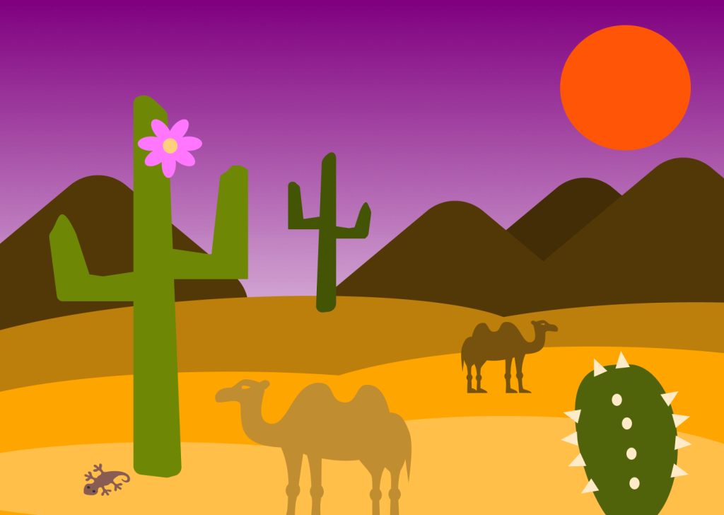
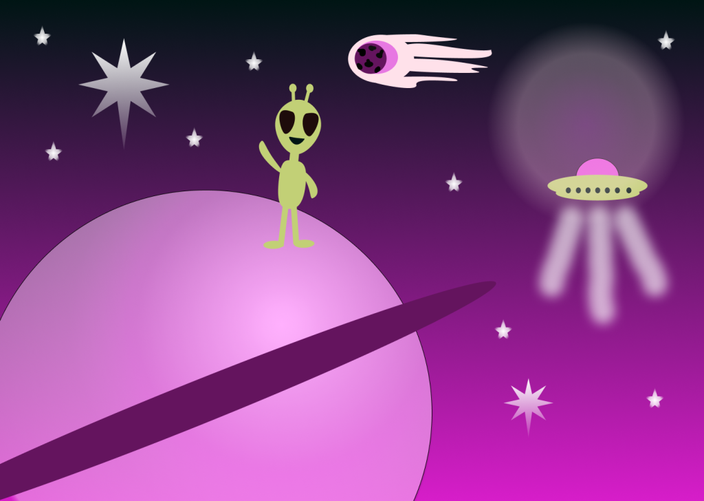
For me, I was indecisive of which color scheme theory to apply to which landscape because there was a lot of freedom (a great thing!). I picked what made sense logically (example: tropical= turquoise and orange, seascape= analogous cool colors). I found it difficult to pick which landscape would be “Coolors generated” because I saved 15 different combinations I loved! The only real challenge was making up my mind.
How could my submission be improved?
I am pleased with how my landscapes turned out, but there is always room for improvement. I could improve my submission by adding even more depth to my Seascape and Outer Space landscapes. All of them could probably benefit from even more detail. In the future, I might try to make all my shapes by hand and avoid any icons in order to strengthen my skills.
How could the professor improve the assignment for the next class?
Nothing I can think of, thank you!
How might I apply my knowledge in future assignments or work scenarios?
I will certainly apply my new knowledge of color schemes in future assignments and work scenarios. Color is everywhere, on everything. If something isn’t cohesive color-wise, people are going to notice. I will keep in mind the color wheel and what colors best pair with each other when creating flyers, graphic design, social media posts, PowerPoints, and more. If I ever need inspiration for what colors to use to get going on a project, I can turn to the color wheel and the different scheme theories to get me started.
How did a specific reading or video inspire or help me?
I referenced “Color Theory for Designers, Part 3: How To Create Your Own Color Schemes” the most for this project. This article served as my go-to “dictionary” for what the different color scheme types were and how to create them. I paid attention to the examples where it pointed out that adjusted chroma gives the scheme more variety, and I incorporated this into my landscapes. I also noted for future use that neutral colors are important when creating your own color scheme. Black, white, grays, browns, and off-whites can appear warm or cool depending on their surrounding colors.