What I learned
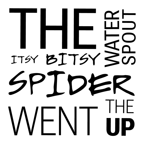
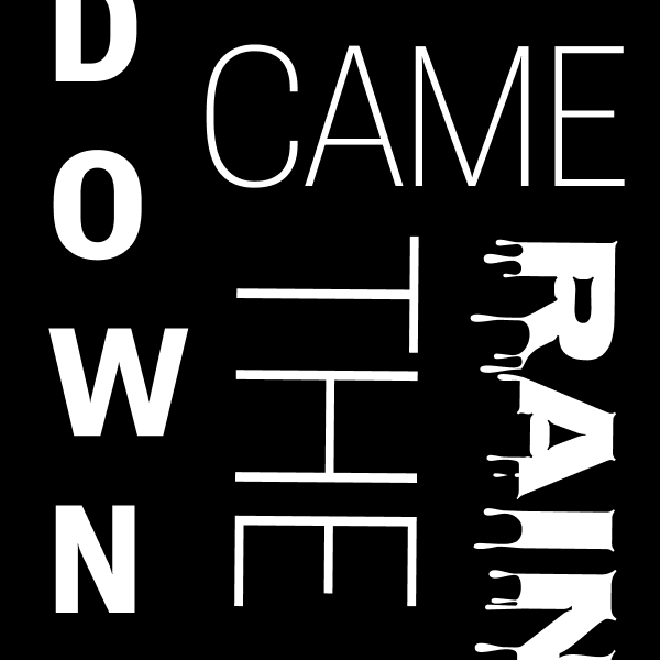
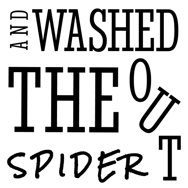
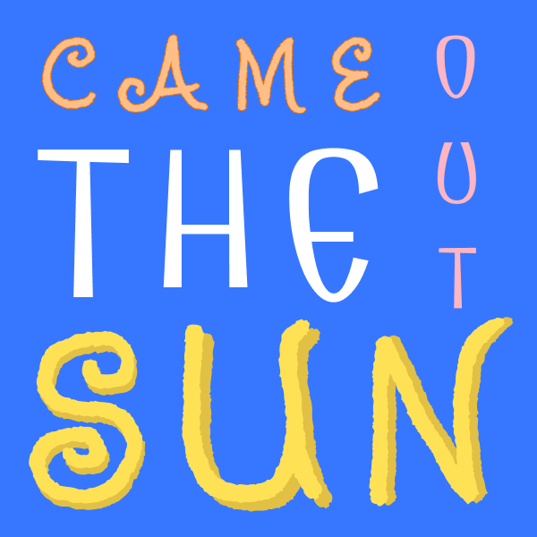
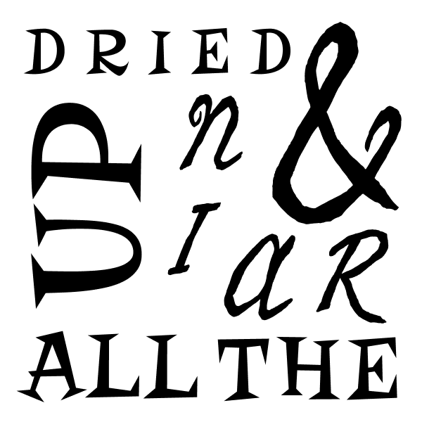
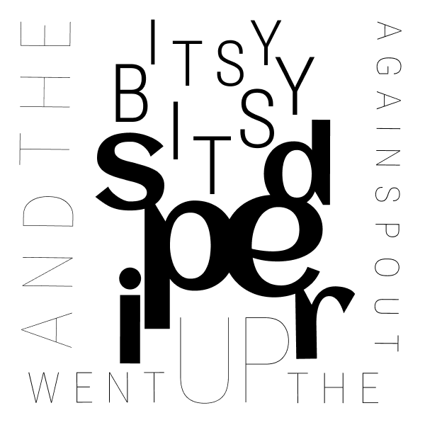
In Project 4, I learned the impact that font and its different characteristics have on a message. Different font affects how we interpret messages, and even how we read them in our head. I learned the many ways to manipulate text in Figma, as this project gave me the chance to experiment with font type, size, scaling, spacing, line height, grids, and margins.
What was easy?
I found it easy to pick out what fonts I wanted to use because there are so many to choose from and so many I liked. I enjoyed playing with different font pairings. I agree with the suggestion to use Roboto Flex because there are so many different variations.
What was challenging?
I had a bit of trouble when it came to spacing and lining up my fonts perfectly. I used grids and margins, but some words were difficult to line up due to too few or too many letters.
How could my submission be improved?
My submission could be improved by continuing to work on my spacing and aligning using grids and margins.
How could the professor improve the assignment for the next class?
Nothing I can think of, thank you!
How might I apply my knowledge in future assignments or work scenarios?
I can apply my typography knowledge in a future assignment, internship, or job by paying attention to the mood and feel of my type and making sure it is both creative and legible. Also, it seems to me that poor spacing is just as bad as a typo, so I will be mindful of that when completing future projects.
How did a specific reading or video inspire or help me?
I referenced the article, “Crimes of Typography: The Worst Things You Can Do” from thefutur.com. This article reiterated pretty much everything we discussed in class on how to perfect your type. It discussed not to use too many font types, fonts to avoid altogether, how to work with negative space, and how to properly space and align.