DMA: 214
Emily Scherer

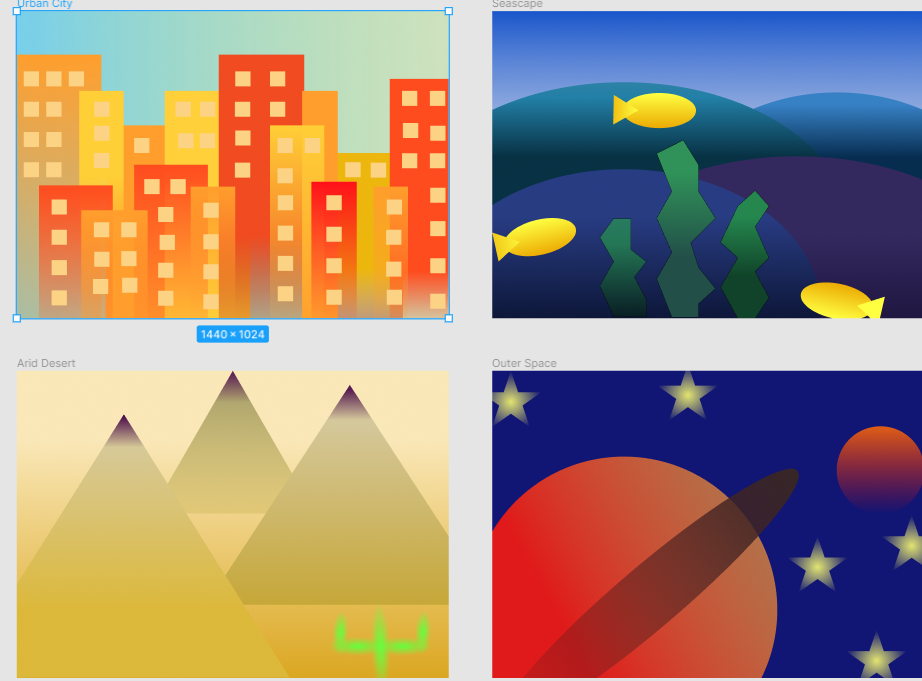
Urban city- Analogous
Seascape- Complementary
Arid desert- Triadic
Outer Space- Split complementary
- I learned how to create a color scheme like split complementary and match it with a landscape like desert.
- The easy thing was creating the shapes and design of the frames to match the landscapes like extraterrestrial I made planets and stars.
- What was challenging was to create a color scheme with one color and different hues because I felt like I kept wanting to choose different colors.
- My submission could be improved by fixing some of the rules that I may be breaking like don’t be a wimp and make things bigger and also not have things so symmetrical and diagonal symmetry.
- You could improve the project by adding two color schemes in one landscape to make it a little more challenging.
- I will apply this to my future job because I will know the color schemes and how to design a website with a working color scheme. This will be beneficial instead of choosing random colors I think look good together
- Design principles: Smashing magazine made me have a different perspective because I never thought too in depth about the use of color and similarity and contrast and how important it is.