Reflection:
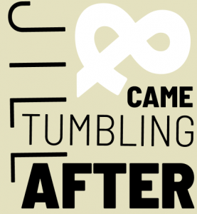
I enjoyed this project and how aesthetically pleasing the type looks when put together correctly. I learned how to use different variations of one font to fill up negative space, making a series of designs. It was easy to alternate between thin and bold type, as I could tell which kind fit the space and wording the best. However, it was challenging to fill up all the art board space. The type took a bit of finagling to make it take up as much space as possible without looking cluttered. My submission could be improved if I used Illustrator in my opinion, as it would have allowed me to move the words with greater ease. Figma prevented me from attempting more intricate designs. I think the assignment could be improved if it was laid out with directions on D2L. The knowledge that I gained in typography can be used in my future designs. I can now fill up spaces and use different fonts to create complementary type. I was inspired by looking at the past student work, as it gave me inspiration for laying out my words.