
In my first frame I show a triadic color scheme when creating a beach image. I use various shades of blue, yellow and red to create my portrait. I applied the rule of thirds to the layout of the water with the beach, where there is 2/3rds blue and 1/3rd yellow.
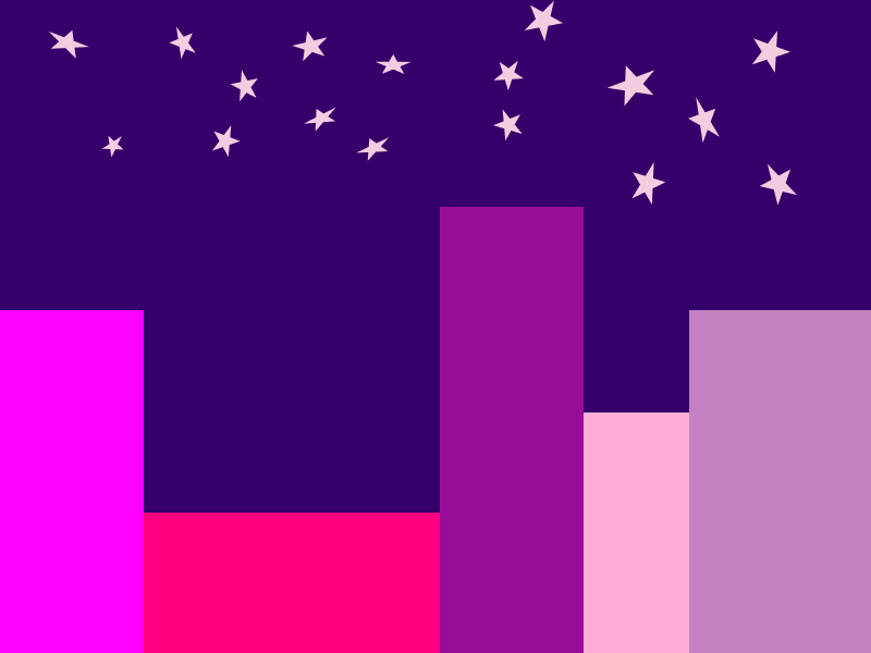
In the second frame I created a picture of a city in an analogous color scheme. I used blue, purple and a purplish red for my three color options, as they all aligned one after another on the color chart. I used a dark shade of blue for the background, to develop an image of nighttime in the city. The stars are all a very light tint of purplish red to fall in line with the analogous color scheme.

In my third frame I created a desert using complementary colors of orange and blue. I created three pyramids to resemble Egypt. The sun is a darker purple color, with the linear function on at 100% to add color effect.
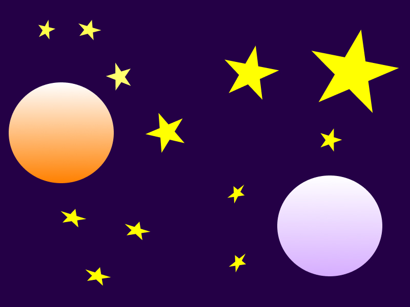
In my fourth frame I depicted outer space in a split-complementary color scheme. For the colors I used blue, reddish orange and yellow. I played around with the shades of each color to create contrast between the various objects in the picture. To add a little glamour to the planets I used the linear function, attempting to make them look as if they are glowing a bit.
What did you learn?
I learned new ways to manipulate color while remaining within the guidelines of specific color schemes. I also learned how to use the Linear function when editing color to add a reflective nature to whatever object I am coloring.
What was easy?
Certain color combinations were easier to work with than others. For instance, the complementary design was very easy because it only consisted of two colors in the combination. At the same time it presented a challenge because I was more limited in my design options, but it was less overwhelming knowing I only had to work with two different color groups.
What was challenging?
This project was not incredibly challenging to be honest, but it was sort of a challenge to take color combinations that would not traditionally be applied to certain settings and use them effectively. When I did the desert animation, I had to work around the challenge of a blue sun. To get around it I added the linear function to give the sun a glowing look.
How could your submission be improved?
If I was a little more technically proficient with the Figma program I am sure I could have added various color affects to improve my design aesthetic. I also think I could have messed with the angle of different shapes to create more depth and detail.
How could I improve the assignment for the next class?
A way to improve the assignment for the future in my opinion would be to make the settings in which students have to use as themes a little less traditional to see how students could get creative in the design process. Maybe instead of a desert have them do a concert, or a baseball field. Something along those lines that is kind of out of left field could help make the assignment interesting.
How might you apply your knowledge in future assignments or work scenarios?
Being colorblind, I most likely will never be responsible for any color schemes in any design process in the future. With that being said, I am sure I will work alongside designers that will ask for my input on colors and having the base knowledge that this assignment provided will definitely help with my conceptualization of real world designs.