Categories
Uncategorized

Project 4: Amsterdam

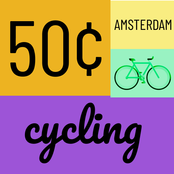
In my first frame, I went with a bicycle theme. When I was spending time in Amsterdam I was fascinated by the amount of bikes being ridden around the city at all hours of the day. It was such a unique aspect of Amsterdam’s culture that really stuck out to me. In this design, I used a split complementary color scheme combining shades of yellow with reddish purple and bluish purple. It looks like something that would be hung up in a bed and breakfast tourists would stay at while stopping through the city.

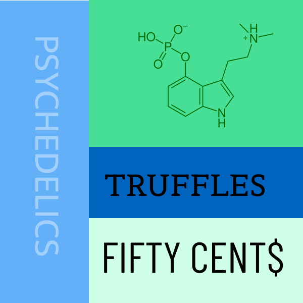
In this frame I wanted to depict the incredibly unique legal drug culture of Amsterdam. It is amazing to me that a country can legalize psychedelic substances like LSD (acid), MDMA (molly or ecstasy), and Psilocybin (mushrooms). The image in the top right is the chemical compound of Psilocybin. Even with these loose drug laws, abuse rates remain incredibly low. It is something to be analyzed for other countries. For this design I used an analogous color way of blue and green, which has always been a favorite color combination of mine.

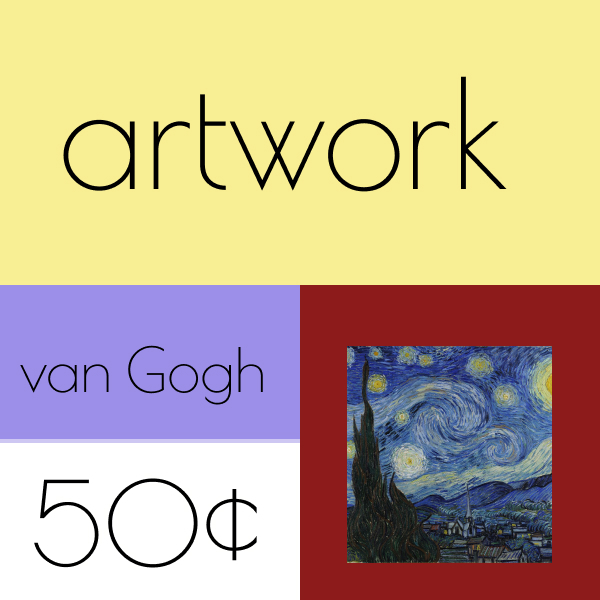
The artwork scene in Amsterdam is unbelievable. The city is home to the world famous Vincent van Gogh museum, containing an extensive collection of the late artist’s work. Seeing it was my favorite part of visiting the city, and potentially my favorite memory from my travels so far. I used the triadic color scheme consisting of blue, yellow, and red. The shades I used seemed to work together to create an appealing layout all together.

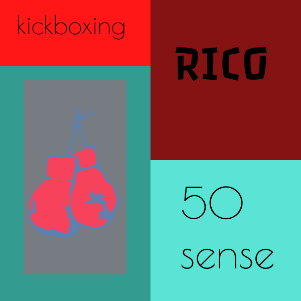
In this frame I tried to depict dutch kickboxing, which is a big part of the athletic culture in Amsterdam. I really enjoy the sport as a fan and unskilled practicing amateur. Many world champion kickboxers have come out of The Netherlands and the most notable is Rico Verhoeven, the current heavyweight world champ. The color scheme is complementary, utilizing various shades of red and green. The boxing gloves fit perfectly in a green background for this color way because they are traditionally depicted in the color red.

What did you learn?

I didn’t necessarily learn anything new with this project, but rather reinforced the techniques and theories that have been covered so far in the course. I got to get creative with color patterns and subtopics related to Amsterdam, and enjoyed the trip down Nostalgia lane that it gave me.

What was easy?

This project was not too challenging, but it took some creative thought process to figure out the ideas I used for my frames. I love Amsterdam and the topic came quite easily.

What was challenging?

Finding color schemes that worked well was challenging for me, being colorblind. I think that would be my biggest struggle in the design world. Other than that the project was straight forward and easy to complete once I got the color patterns sorted out.

How could your submission be improved?

I think I could have done more research into cool fonts to use in my designs. There are many to choose from and I’m sure if I spent a long enough time looking through them all I could find some that fit my ideas perfectly, but with that being said I like the way my project turned out overall.

How could I improve the assignment for the next class?

I think if the assignment allowed for more utilization of images and less written words, it would open up opportunity for more creative thinking. Less words and more representative imagery that can be up for interpretation.

How might you apply your knowledge in future assignments or work scenarios?

I am going into a career in marketing, and most likely will never be putting together designs on a grid. With that being said, it is good that I improved my knowledge on color coordination and layout spacing. If I ever have to approve designs in the future this knowledge will benefit me most definitely.

Categories
Uncategorized

Project 3: Louis Vuitton

What did you learn?

I learned how to manipulate Figma to alter pattern designs. There are many settings that can be applied to alter the overlaid images. I liked the idea of adding a subtle clock within the Louis Vuitton logo pattern to signify the metaphor that time is money. This allowed me to play around a lot with the shading of the pattern and create something unique.

What was easy?

This was a harder project because it required more individual creativity rather than following steps, but it was easy to think of color combos that could go well with each other. I love the look of light blue with complimentary colors so the red was a really cool pairing to me.

What was challenging?

I found it very challenging to figure out how to manipulate the layers to my design in order to convey what I was going for. I thought that I may have to go into every individual logo within the pattern and change the colors to fill in my clock outline. After playing around with the effects in Figma I was able to use saturation to darken the shade of LV logos within the clock and not affect the outside logos that were true red.

It was also challenging having such a great degree of freedom to think of a design and be creative using a metaphor as a concept. I had to follow a thought path and figure out an idea that would convey “time is money” and it led me to something that seems creatively exciting to me.

How could your submission be improved?

I think if I made the Louis Vuitton pattern smaller overall I could have had a more detailed clock design. More logos in the pattern would have allowed a greater resolution for the design. I also think I could have played around with the light effects on the logos, making some shiny or digitized/unfocused. Doing something like this would have made the design more intricate.

How could I improve the assignment for the next class?

I don’t really see any areas for improvement in terms of direction. I liked the creativity this assignment granted me, and it was fun to use my own unique concept and incorporate color into it. This assignment helped further my understanding of Figma and helped my creative confidence grow.

How might you apply your knowledge in future assignments or work scenarios?

I believe I will likely work in a creative field where I need to brainstorm design concepts and approve concepts from other people. This assignment helped me further my understanding of design and color coordination. I also am sure patterns will play a big role in many of our future assignments, and this assignment helped me learn how to manipulate patterns in Figma to a higher degree.

Categories
Uncategorized

Project 2: Colors

In my first frame I show a triadic color scheme when creating a beach image. I use various shades of blue, yellow and red to create my portrait. I applied the rule of thirds to the layout of the water with the beach, where there is 2/3rds blue and 1/3rd yellow.

In the second frame I created a picture of a city in an analogous color scheme. I used blue, purple and a purplish red for my three color options, as they all aligned one after another on the color chart. I used a dark shade of blue for the background, to develop an image of nighttime in the city. The stars are all a very light tint of purplish red to fall in line with the analogous color scheme.

In my third frame I created a desert using complementary colors of orange and blue. I created three pyramids to resemble Egypt. The sun is a darker purple color, with the linear function on at 100% to add color effect.

In my fourth frame I depicted outer space in a split-complementary color scheme. For the colors I used blue, reddish orange and yellow. I played around with the shades of each color to create contrast between the various objects in the picture. To add a little glamour to the planets I used the linear function, attempting to make them look as if they are glowing a bit.

What did you learn?

I learned new ways to manipulate color while remaining within the guidelines of specific color schemes. I also learned how to use the Linear function when editing color to add a reflective nature to whatever object I am coloring.

What was easy?

Certain color combinations were easier to work with than others. For instance, the complementary design was very easy because it only consisted of two colors in the combination. At the same time it presented a challenge because I was more limited in my design options, but it was less overwhelming knowing I only had to work with two different color groups.

What was challenging?

This project was not incredibly challenging to be honest, but it was sort of a challenge to take color combinations that would not traditionally be applied to certain settings and use them effectively. When I did the desert animation, I had to work around the challenge of a blue sun. To get around it I added the linear function to give the sun a glowing look.

How could your submission be improved?

If I was a little more technically proficient with the Figma program I am sure I could have added various color affects to improve my design aesthetic. I also think I could have messed with the angle of different shapes to create more depth and detail.

How could I improve the assignment for the next class?

A way to improve the assignment for the future in my opinion would be to make the settings in which students have to use as themes a little less traditional to see how students could get creative in the design process. Maybe instead of a desert have them do a concert, or a baseball field. Something along those lines that is kind of out of left field could help make the assignment interesting.

How might you apply your knowledge in future assignments or work scenarios?

Being colorblind, I most likely will never be responsible for any color schemes in any design process in the future. With that being said, I am sure I will work alongside designers that will ask for my input on colors and having the base knowledge that this assignment provided will definitely help with my conceptualization of real world designs.

Categories
Uncategorized

Project 1: Jack and Jill

In frame one I am introducing Jack as a circle figure and Jill as a triangle. This frame utilizes repetition and the rule of thirds. For every 3 Jacks there is 1 Jill. Jill is strategically placed a third of the way in from the left and a third of the way down, along the grid lines of the rule of thirds, reinforcing this concept.
In frame two I am utilizing the Gestalt principle of continuation. Jack and Jill are repetitively moving forward and upward towards the top of a hill. The viewer’s eye is being led to the top of the hill, which is the focal point. The triangle and circle in the top right are enlarged to add emphasis to the top of the hill being the focal point.
In frame three I am utilizing the principle of closure by taking a section of the pale and removing it, allowing the viewer’s eye to connect the sides of the pale to the handle even though there is a gap. In reality the handle would be connected, but in this animation the viewer makes the closure from the pale to the handle.
In frame four I am using proximity to show Jack falling down the hill. The circles are further away from Jill (the triangle) who is at the top of the hill with the pale of water. Jack is far from Jill location wise, drawing the viewer’s eye to Jack on the right side of the animation. 
In frame five, I am using the concept of similarity. Initially the triangles that act as Jack’s crown are the same. On each circle, a crown made up of five triangles is on top of each circle as Jack descends down the hill. When Jack reaches the bottom, the triangles of the crown are enlarged and rotated in various directions to emphasize that the crown has been broken.
In figure six I used figure ground to provide contrast between Jack and Jill. The point is that a figure ground dynamic is created where Jill, the triangle, overlaps the circle. At this point, there is a shift between what is and what isn’t, where the color white takes over as the primary color. 

What did you learn?

This project helped me to better understand the Gestalt principles and how they can be implemented into design. I gained a better understanding of how to use the Figma program, as well as how to approach designing more open-mindedly.

Was it easy?

I would say this project was not too difficult. The biggest challenge for me was using the actual program that I do not have much experience with. Creating the designs conceptually was not hard, but I am limited in my knowledge of Figma.

What was challenging?

What was challenging was finding animations that fit specific principles without looking too much like other Gestalt principles. My proximity animation and similarity animation were originally very close in design to one another, so I added the crowns in the similarity design to further differentiate it.

How could your submission be improved?

I could improve my submission with a greater level of detail in my animations. This was limited by my lack of experience with Figma and I was unable to fully perform the designs I imagined. Down the line as my skill improves with the program I believe I will be able to make much more detailed animations that are more captivating for viewers.

How could I improve the assignment for the next class?

I think the addition of color to the assignment would improve it for next class. It would allow for a greater level of creativity and make it more exciting as a designer. I kept noticing little places in my designs where adding some color would help to get the point across much more clearly.

How might you apply your knowledge in future assignments or work scenarios?

I will definitely refer to the Gestalt principles utilized in this project for the rest of my class projects and labs. I think these principles are very evident in everyday life, as well as in my eventual career in marketing. Even if I am not a designer, I will have to approve designs and ads that will utilize these principles.

Categories
Uncategorized

Lab 0

First blog post. Looking forward to the semester.

Categories
Uncategorized

Hello world!

Welcome to DMA Blogs. This is your first post. Edit or delete it, then start writing!