Categories
Uncategorized

Project 1: Jack and Jill

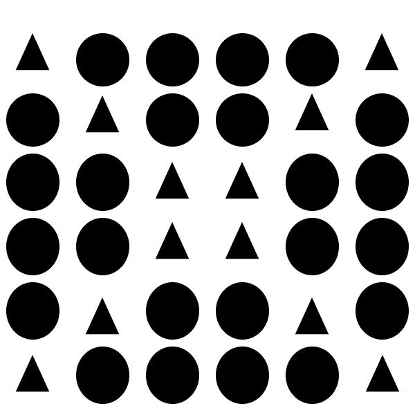
In frame one I am introducing Jack as a circle figure and Jill as a triangle. This frame utilizes repetition and the rule of thirds. For every 3 Jacks there is 1 Jill. Jill is strategically placed a third of the way in from the left and a third of the way down, along the grid lines of the rule of thirds, reinforcing this concept.
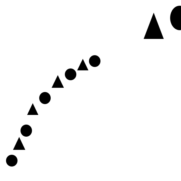
In frame two I am utilizing the Gestalt principle of continuation. Jack and Jill are repetitively moving forward and upward towards the top of a hill. The viewer’s eye is being led to the top of the hill, which is the focal point. The triangle and circle in the top right are enlarged to add emphasis to the top of the hill being the focal point.
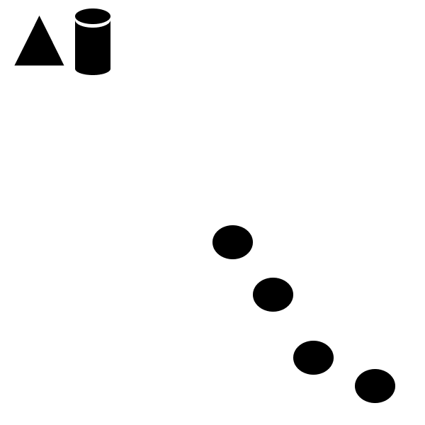
In frame three I am utilizing the principle of closure by taking a section of the pale and removing it, allowing the viewer’s eye to connect the sides of the pale to the handle even though there is a gap. In reality the handle would be connected, but in this animation the viewer makes the closure from the pale to the handle.
In frame four I am using proximity to show Jack falling down the hill. The circles are further away from Jill (the triangle) who is at the top of the hill with the pale of water. Jack is far from Jill location wise, drawing the viewer’s eye to Jack on the right side of the animation. 
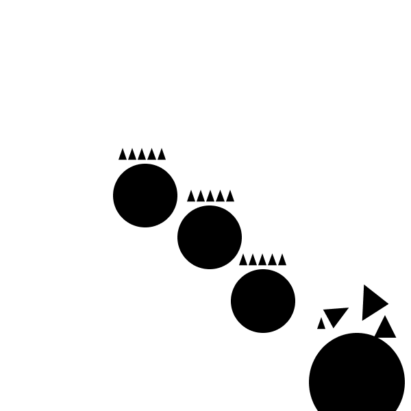
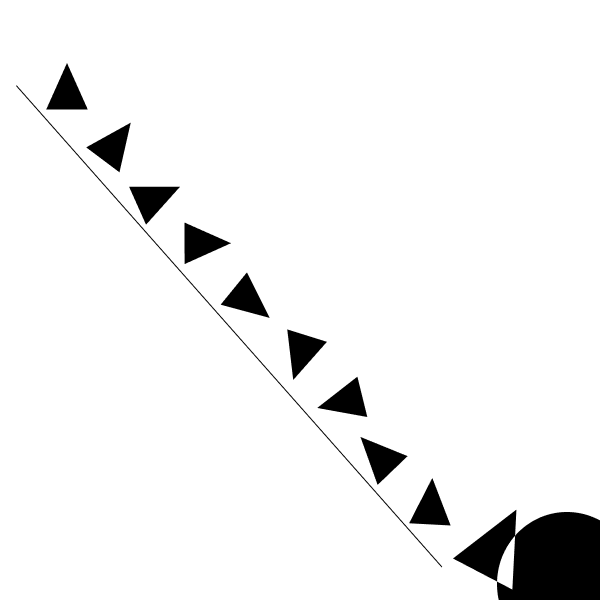
In frame five, I am using the concept of similarity. Initially the triangles that act as Jack’s crown are the same. On each circle, a crown made up of five triangles is on top of each circle as Jack descends down the hill. When Jack reaches the bottom, the triangles of the crown are enlarged and rotated in various directions to emphasize that the crown has been broken.
In figure six I used figure ground to provide contrast between Jack and Jill. The point is that a figure ground dynamic is created where Jill, the triangle, overlaps the circle. At this point, there is a shift between what is and what isn’t, where the color white takes over as the primary color. 

What did you learn?

This project helped me to better understand the Gestalt principles and how they can be implemented into design. I gained a better understanding of how to use the Figma program, as well as how to approach designing more open-mindedly.

Was it easy?

I would say this project was not too difficult. The biggest challenge for me was using the actual program that I do not have much experience with. Creating the designs conceptually was not hard, but I am limited in my knowledge of Figma.

What was challenging?

What was challenging was finding animations that fit specific principles without looking too much like other Gestalt principles. My proximity animation and similarity animation were originally very close in design to one another, so I added the crowns in the similarity design to further differentiate it.

How could your submission be improved?

I could improve my submission with a greater level of detail in my animations. This was limited by my lack of experience with Figma and I was unable to fully perform the designs I imagined. Down the line as my skill improves with the program I believe I will be able to make much more detailed animations that are more captivating for viewers.

How could I improve the assignment for the next class?

I think the addition of color to the assignment would improve it for next class. It would allow for a greater level of creativity and make it more exciting as a designer. I kept noticing little places in my designs where adding some color would help to get the point across much more clearly.

How might you apply your knowledge in future assignments or work scenarios?

I will definitely refer to the Gestalt principles utilized in this project for the rest of my class projects and labs. I think these principles are very evident in everyday life, as well as in my eventual career in marketing. Even if I am not a designer, I will have to approve designs and ads that will utilize these principles.