Project 3: Event Display and Drink Label

  • What did you learn?

For this project, I learned how use Photoshop and Figma in order to design a drink label and create an event display.

  • What was easy?

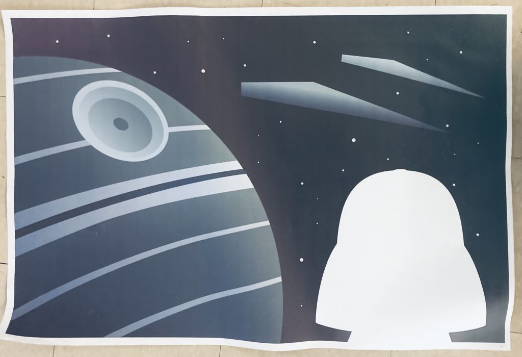
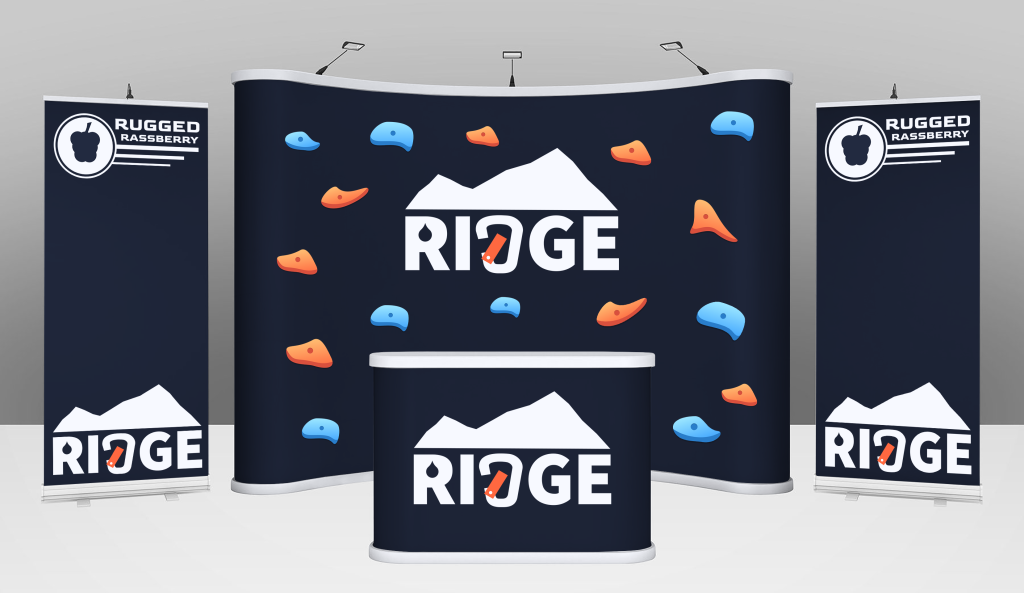
The easy part of the project was using Photoshop to create the event display.

  • What was challenging?

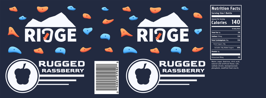
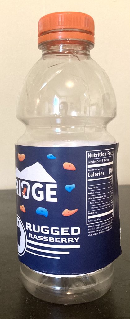
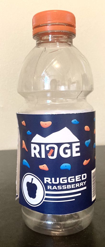
The most challenging part of the project was coming up with the drink brand and package design.

  • How could your submission be improved?

I think my submission could be improved if the logo and nutrition facts were larger on the label.

  • How can the professor improve the assignment in the future?

I think the project works well as it is.

  • How might you apply your knowledge in future assignments?

This project has taught me to use Photoshop’s transform tool to warp an image to fit with the perspective. This will be helpful for future projects that require me to put logos into a 3d space.

Project 2: Merch

  • What did you learn?

For this project, I learned how to design and print stickers and a poster in Figma.

  • What was easy?

The easy part of the project was using Figma to create the designs.

  • What was challenging?

The most challenging part of the project was printing and cutting out the stickers.

  • How could your submission be improved?

I think my submission could be improved if I incorporated typography into the poster and stickers.

  • How can the professor improve the assignment in the future?

I think the project works well as it is.

  • How might you apply your knowledge in future assignments?

This project has taught me a lot about using the pen tool in Figma. This knowledge will be useful for any vector based designs I do in the future.

Project 1: Menu and Table Tent

  • What did you learn?

In this project I learned how to create die strikes and image bleeds in order to optimize projects for print.

  • What was easy?

The easy part of this project was organizing the type for the menu and table tent in Adobe InDesign.

  • What was challenging?

The challenging aspect of this project was understanding how the digital design would translate when printed.

  • How could your submission be improved?

My submission could have been improved if there was less empty space on the inner right side of the menu. I also feel that some of the images could have been larger.

  • How can the professor improve the assignment in the future?

I think the assignment could be improved by making the table tent and menu two separate assignments.

  • How might you apply your knowledge in future assignments?

By doing this assignment, I have learned a lot about creating designs for the purpose of print. This knowledge will definitely be helpful for when I have to create future projects for print.

Project 4: Book Theme

  • What did you learn?

For this project, I learned how to create paragraphs styles and use them to format large amounts of text in Adobe InDesign.

  • What was easy?

The easiest part of this project was moving the text and images into InDesign.

  • What was challenging?

One of the most challenging parts of this project was keeping track of the paragraph styles and determining where to use each style.

  • How could your submission be improved?

My submission could be improved if the style was a bit less generic. However, I would still want to keep the design relatively simplistic so that it wouldn’t distract from the actual content of the book.

  • How can the professor improve the assignment in the future?

I feel that the project works well as it is.

  • How might you apply your knowledge in future assignments or work scenarios?

I will be able to apply what I have learned if I ever have future projects that require me to format large amounts of text over several pages.

  • How did a specific reading, video, or example inspire or help you?

A specific reading that helped me was TypeTalk: How to Attract Attention With Pull Quotes. This reading helped me to make the pull quote stand out from the rest of the text.

Project 3: Type History Poster

  • What did you learn?
    For this project, I learned how to use InDesign to format text.
  • What was easy?
    The easiest part of this assignment was researching the history of Garamond typefaces
  • What was challenging?
    The most difficult part of this assignment was figuring out how to format the information on the page.
  • How could your submission be improved?
    I feel that the italics toward the bottom of the poster are a bit too large and draw too much attention.
  • How could the professor improve the assignment for the next class?
    I feel that the assignment works well as it is.
  • How might you apply your knowledge in future assignments or work scenarios?
    This assignment has taught me various methods of organizing large amounts of text. This knowledge will be very helpful for future projects that involve text.

Project 2: Expressive Words

  • What did you learn?
    In this project, I learned how to use kerning and transformations in order to reinforce the meaning of the words.
  • What was easy?
    The easiest part of this assignment was coming up with the concept that I wanted to convey. I knew that I wanted to get across the ideas of “restoration” and “repetition” since these themes play a large role in the films.
  • What was challenging?
    The most difficult part of this assignment was figuring out how to format the type in a way that got the themes across.
  • How could your submission be improved?
    My submission could be improved if I found a way to make it clearer in the first image that the letters are reforming rather than fading away.
  • How could I improve the assignment for the next class?
    I feel that the assignment works well as it is.
  • How might you apply your knowledge in future assignments or work scenarios?
    This assignment has taught me that the placement and transformations of text are just as important as the words themselves. In future assignments, I will think more deeply about how I can make my type more expressive.

Project 1

  • What did you learn?

I learned how to create a useable font with Fontstruct.

  • What was easy?

Fontstruct itself was very intuitive and easy to use.

  • What was challenging?

It was challenging to create letters that had diagonal sections such as “N” and “K”.

  • How could your submission be improved?

My submission could be improved if I used more grid space for each letter.

  • How can the professor improve the assignment in the future?

I think the project is fine as it is.

  • How might you apply your knowledge in future assignments or work scenarios?

This project will be very useful if I ever have to create my own unique font again.

  • How did a specific reading, video, or example inspire or help you?

It was very helpful to keep in mind where the base line and x height were.

Lab 3: Forest Lawn

Serif: This font is serif because of the thin feet on the bottom of the letters.

Sans-serif: This font is sans-serif because it lacks the feet on the letters. One thing that stood out to me about this particular font was how the bottom of the “W” was rounded.

Blackletter: This font is blackletter because of its fancy design and sharp points.

Script: This font is script because it looks like cursive handwriting.

Slabserif: This font is slabserif because of the very blocky serifs it has.

Historical: This font is historical because each letter has small additions to it.

Lab 1 – Typography Basics

  • What did you learn? – I learned how to download fonts, create glyphs, and manipulate text in Illustrator, Indesign, Photoshop, and Figma.
  • What was easy? – Downloading the fonts
  • What was challenging? – Manipulating the anchor points on the text was especially difficult when there were many points next to each other.
  • How could the submission be improved? – I felt that this lab was effective at showing the differences between the four programs. However, I feel that this lab could have gone a bit more in depth with each program.
  • How might you apply your knowledge in future assignments? – This assignment has given me a basic understanding of how to use text in Illustrator, Indesign, Photoshop, and Figma. This knowledge will help me to create designs that require typography.

Typehunting Assignment:

One instance of typography that caught my attention was on this Oreo cookie packaging. This logo appeals to me because it is so distinct and easy to read. I also appreciate how the three-dimensional letters make the logo look like it’s coming out from the packaging.