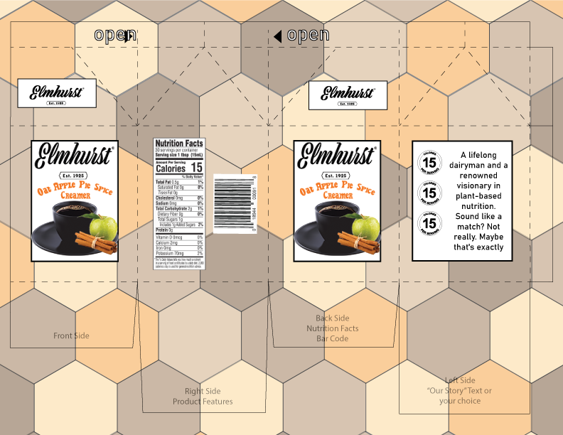
For this project I really wanted to focus on the background as that’s what most people first see. The hexagon pattern I feel helps it stand out as its bold and very direct. I chose the colors I did for one reason, and that is fall. When is one most likely to enjoy a product like this? In my mind no better time then a nice day in October. I took a couple pointers from the critique as well, them being to change the font on the story as it was too hard to read and also lower the opacity even more of the background to not make it too overpowering. Both suggestions I really think help this piece come together.