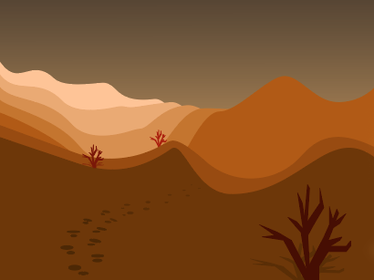


During this project, I learned the importance of having a color scheme in art projects. Implementing palettes that I thought looked aesthetically pleasing and choosing what the foreground and background would be colored was a learning process. After lots of trial and error, I believe I created pieces that reflect an emphasis on color schemes that work.
The most easy part of this project was definitely the ideas for me. I was able to picture the final product in my head with the colors I wanted for certain subjects. However, the execution was very challenging. Getting the shapes to fit within a perspective or simply adding small detail was the most tedious and difficult process for me during this project’s creation.
I could probably improve some small elements of each piece if I had more time to pay attention to every path I created in Illustrator. Additionally, I could possibly explore different triadic, complimentary, or analogous color schemes and create even more contrast between background and foreground objects.
I thought this project was a great learning process and think it should be assigned exactly as it was in the future.
For my future projects, I now have a well-rounded understanding of how color works in illustrator, especially the color guide and HSB. My inspiration for this project actually came from some psychedelic rock music I listened to before and during my work time, which is why a lot of the elements have a warped or unique perspective and angle to the respective landscape portrayed.