Project 4 Reflection

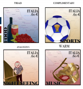
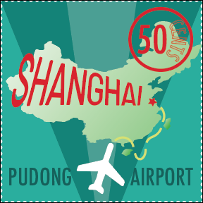
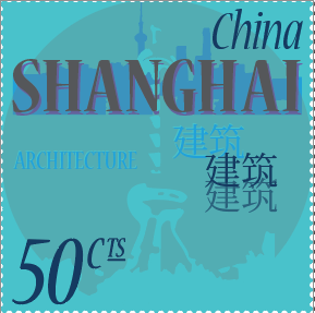
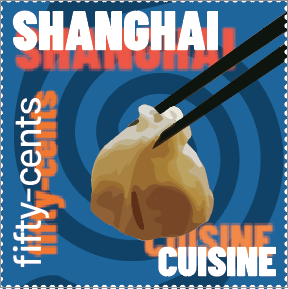
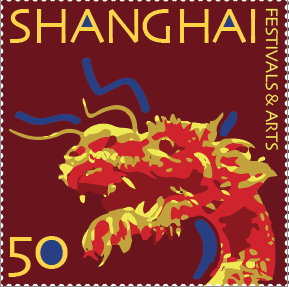
In this project, I learned how typography plays a vital role in communicating a message. My various typefaces included both serif and sans serif fonts that all represented four sectors of Shanghai, China : Festivals and the Arts, Architecture, Cuisine, and Airports (specifically the Pudong Airport). Each composition turned out completely different. I found the easiest thing for me was the spacing of the lettering; through kerning and rulers, I was able to get everything nearly perfect with spacing, which I think made each stamp look clean and neat. On the other hand, one challenge in this project was image tracing. Although it is an automated style, this tool was very difficult to use to come up with the image I was seeking, and I spent most of my time fixing the paths of my image-traced objects. I believe my submission could be improved if I went back and got extremely tedious with the task of perfectly spacing everything, but I think it came out pretty well, nonetheless. I think it would also be interesting to actually print and make stamps in the future. Going forward, I will look at typography differently and consider when to utilize typography in future graphics products. With the new techniques I learned (kerning, expanding text, custom fonts, envelope distort, etc), I will certainly be advantageous with the power of typography in future graphics projects.

One inspiring piece for me this project was this past project from a student who took the course:

Project 3 Reflection

During my third project, I learned the functionality of symbols and patterns in a graphical piece, and specifically how their incorporation can provide a background layer to a project that enhances its overall aesthetic appeal.

For me, the easiest part of this project was coming up with the idea for my metaphor or adage. I decided that the “art of war” would elicit an image of a gun that had a paint brush for a barrel. This idea was easy to brainstorm and conceptualize, and I knew it was within my realm of capabilities to create a photoshopped image that looked realistic while still being surreal in nature.

Additionally, I found the execution of the idea somewhat challenging, mainly because of the wide array of options I had to get the image to look how I wanted. For instance, I could have masked the brush to go inside the barrel rather than morph into the barrel, and these two options require different methods. Furthermore, for the shadows, I played around with a number of different methods and landed on what I thought would look best, which was to duplicate and transform each object, bring the light down to make it a solid black, lower the opacity, and finally add a gaussian blur to soften the shadow edges.

I think my submission could be improved with higher quality images as my main foreground objects, such as my paint palette, which ended up being lower in quality than the rest of my images retrieved from Google. It was somewhat difficult to find high resolution bitmaps, so I chose to compromise with what I could find and make the best of it.

The assignment could be improved possibly by making it a “surreal”-focused theme rather than just an adage or metaphor. This would allow a lot more ideas to flow through among the class and diversify the results, though it would make the brainstorming process painstakingly longer with such a broad focus.

In the future, I will definitely pay close attention to patterns in works and see where a pattern may be sufficient for one of my digital pieces. I think patterns are great for providing a creative, yet simple vector(s) to enhance a work and work cohesively with bitmaps in Photoshop.

I was specifically inspired by the adages I found online, looking at how some other people had visual plays on different phrases or ideas. Although, the “art of war” idea was my own original idea for this project.

Project 2 Reflection

Desert – Analogous
Urban – Complimentary
Aquatic – Split Complimentary
Extraterrestrial – Triadic

During this project, I learned the importance of having a color scheme in art projects. Implementing palettes that I thought looked aesthetically pleasing and choosing what the foreground and background would be colored was a learning process. After lots of trial and error, I believe I created pieces that reflect an emphasis on color schemes that work.

The most easy part of this project was definitely the ideas for me. I was able to picture the final product in my head with the colors I wanted for certain subjects. However, the execution was very challenging. Getting the shapes to fit within a perspective or simply adding small detail was the most tedious and difficult process for me during this project’s creation.

I could probably improve some small elements of each piece if I had more time to pay attention to every path I created in Illustrator. Additionally, I could possibly explore different triadic, complimentary, or analogous color schemes and create even more contrast between background and foreground objects.

I thought this project was a great learning process and think it should be assigned exactly as it was in the future.

For my future projects, I now have a well-rounded understanding of how color works in illustrator, especially the color guide and HSB. My inspiration for this project actually came from some psychedelic rock music I listened to before and during my work time, which is why a lot of the elements have a warped or unique perspective and angle to the respective landscape portrayed.

Project 1 Reflection

Throughout the process of creating six unique graphics for this first project, I learned the power that simple gestalt principles hold within artwork. For example, some principles I employed into my pieces were [in order of the story], contrast through proximity, continuation, grouping, repetition, and figure/ground compositions that tie two of the pieces together. I specifically learned to utilize these principles in a way that is confident, efficient, but not too overthought.

The easiest part of the project for me was including a myriad of gestalt principles, sometimes repeating a principle in different ways, in each respective panel. On the other hand, the direction I wanted to take in conveying my story was the challenging part, as I was constantly bouncing back and forth between ideas as the project evolved.

Furthermore, after self-analysis I do believe my submission could be improved with minor spatial adjustments. For instance, while I edited diligently to avoid any tangent lines, I feel it was hard to avoid certain edges being close together that almost touch, however I was mindful of my margins.

I personally believe this is a great first project and have nothing to give that would improve the nature of the assignment. Perhaps instead of nursery rhymes, students could take on the challenge of creating a unique story for the class to critique.

In the future, whether it be projects in this course or even internships after this course, I will be looking to create and be able to identify gestalt principles within my own work and consider being effective over being content-heavy.

The Smashing Magazine article was my main inspiration to begin this project with an adequate understanding of gestalt and its application to contemporary examples. I felt that this article summarized each principle concisely, yet comprehensively, and shortly after my first peruse, I began my initial sketches.