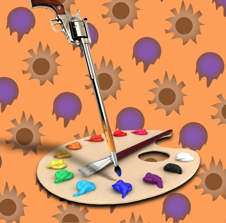
During my third project, I learned the functionality of symbols and patterns in a graphical piece, and specifically how their incorporation can provide a background layer to a project that enhances its overall aesthetic appeal.
For me, the easiest part of this project was coming up with the idea for my metaphor or adage. I decided that the “art of war” would elicit an image of a gun that had a paint brush for a barrel. This idea was easy to brainstorm and conceptualize, and I knew it was within my realm of capabilities to create a photoshopped image that looked realistic while still being surreal in nature.
Additionally, I found the execution of the idea somewhat challenging, mainly because of the wide array of options I had to get the image to look how I wanted. For instance, I could have masked the brush to go inside the barrel rather than morph into the barrel, and these two options require different methods. Furthermore, for the shadows, I played around with a number of different methods and landed on what I thought would look best, which was to duplicate and transform each object, bring the light down to make it a solid black, lower the opacity, and finally add a gaussian blur to soften the shadow edges.
I think my submission could be improved with higher quality images as my main foreground objects, such as my paint palette, which ended up being lower in quality than the rest of my images retrieved from Google. It was somewhat difficult to find high resolution bitmaps, so I chose to compromise with what I could find and make the best of it.
The assignment could be improved possibly by making it a “surreal”-focused theme rather than just an adage or metaphor. This would allow a lot more ideas to flow through among the class and diversify the results, though it would make the brainstorming process painstakingly longer with such a broad focus.
In the future, I will definitely pay close attention to patterns in works and see where a pattern may be sufficient for one of my digital pieces. I think patterns are great for providing a creative, yet simple vector(s) to enhance a work and work cohesively with bitmaps in Photoshop.
I was specifically inspired by the adages I found online, looking at how some other people had visual plays on different phrases or ideas. Although, the “art of war” idea was my own original idea for this project.