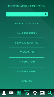
Question 1: What did you learn?
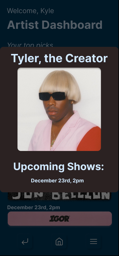
For this project, I really learned the importance of using components for things like overlays and animation. I thought that components were really rudimentary at the start of the class, and didn’t really understand their use that went beyond a button, for instance. But after experimenting a lot with the use of overlays, I came out with a finished product that has a really nice flow, and this was a cool thing to utilize. Below is an image for the “Artist” quick-look overlay I used for Post Malone, Tyler, the Creator, and Twenty One Pilots for all of their artist pages, respectively.
Question 2: What was easy?
I think the easiest thing for me was the concept for this application, because I am very passionate about music, and the idea made perfect sense to me because it’s an app I wish we had right now in quarantine times. It was also pretty straightforward to develop out the design of the app.
Question 3: What was challenging?
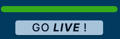
For me, the most challenging parts of the project were (1) learning how to properly animate the progress bar I used and (2) working consistently on a schedule in balance with all of my other finals. I think the animation for the progress bar is definitely not the result I had hoped for, but it works with a simple click, nonetheless. Below you can see the two states for the progress bar that changes when you click on it in the prototype.

Question 4: How could your submission be improved?
My submission could be improved by fixing the progress bar to actually animate and look more clean. I also think that my logo is a bit boring and could probably be improved, but I wanted to keep it simple so that I could put more attention and effort into the actual functionality of the app.
Question 5: How could Professor Dunkle improve the assignment for the next class?
I think this assignment was great because it was based around the relevance of the times we are living in. Developing a “quarantine app” was really fun and helped provide me with the perspective of how I can contribute to other people’s happiness or convenience during the pandemic, as it has definitely affected everyone in a negative way to some degree.
Question 6: How might you apply your knowledge in future assignments or work scenarios?
I honestly would like to come back to this project in the future and see if I can take the prototype further than the confides of Figma, possibly even collaborating with someone who has experience in coding to develop out the back end of the app and make it real for people to buy. Although, I understand that in order for it to become a real app, there would have to be some serious strings pulled in light of getting popular artists in the system, so it’s probably far-reaching as it is.
Question 7: How did a specific reading or video inspire or help you?
This video was initially what I referred to for making my progress bar, and I understood the use of the way he did it in the video, but it was lacking the crucial step of actually using multiple frames to animate the state of the loading bar, so that’s where I got stuck.
I also used the format of Spotify to go off of for my own app, but tried to differentiate my app in places that were vital to its unique appeal, that is, to actually provide live streaming as opposed to Spotify which is largely just audio streaming.
I also looked to Instagram for the Artist Home pages, seeing how they display “followers” and “following” statuses, and I think it’s important to look to apps that are ubiquitous in the market to get a good idea of what works well and what does not.