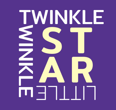
Twinkle Twinkle Little Star 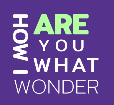
How I Wonder What You Are 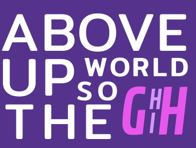
Up Above The World So High 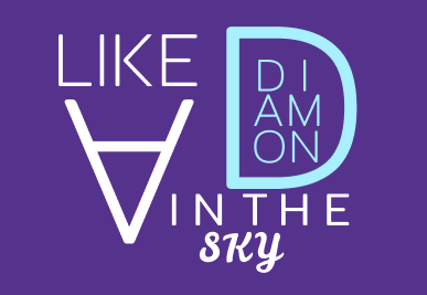
Like A Diamond In The Sky 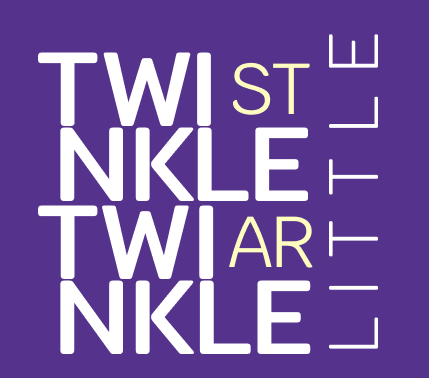
Twinkle Twinkle Little Star 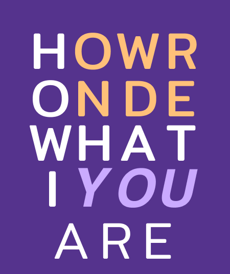
How I Wonder What You Are
QUESTIONS-
- What did you learn?
For this final project, I learned how to align text and make it seem uniform, which gives it an appealing and clean look to it. I also worked on spacing the words and setting them equidistant from one another.
2. What was easy?
From my experience, this was by far the hardest project for me this semester. Prior to this assignment, I never really tinkered with text or the typographical aspect that was needed to complete this task. This was definitely a fun yet difficult experience that I hope to improve at in the future. Nothing was necessarily “easy”.
3. What was challenging?
The biggest thing for me that consumed a lot of time and energy was trying to fill the gaps. While aligning the text was tricky, having to fulfill the space while keeping everything uniform was a hassle, but at the same time taught me a bit about how to make a clean “print” using only text, which forced me to be creative and traverse through serveral stages of trial-and-error.
4. How could your submission be improved?
Regarding the spacing and overall layout for the text, I think I did an okay job. However, some frames look better than others. If I had more time, I would redo a few of these frames or at least alter the layout so it “flows” better. Such can be seen with the second and fifth lines in this rhyme.
5. How could I improve the assignment for the next class?
Had I been given another chance to “rework” this assignment, I would definitely spend more time on those two frames I mentioned in the previous question and tweak the colors a bit. I feel like while colors don’t always matter, they do help to bring the rhyme to “life”.
6. How might you apply your knowledge in future assignments or work scenarios?
In the future, I would have experience of working with text alone from this project, but I would still need a lot more time with this topic as I think that I haven’t really gotten the hang of things yet.
7. How did a specific reading or video inspire or help you?
The only thing that inspired me for this project was the nursery rhyme “Twinkle Twinkle Little Star” that I used for the first project, “Principles of Gestalt”. Having some prior experience working and thinking about this rhyme really helped me when it came to choosing a nursery rhyme for this task. Other than that, all of the “layouts” and format that I used for each frame just came with time and experimentation, whether it was picking different fonts, emphasis on these fonts (italics or bold), or deciding how big or small I wanted the text to be. All of this combined to fill in missing pieces that was needed to complete or enhance that line. Such can be seen for my third and fourth frame “Up Above The World So High” and “Like A Diamond In The Sky”.