

Visit Aurain Here!
1. What did you learn?
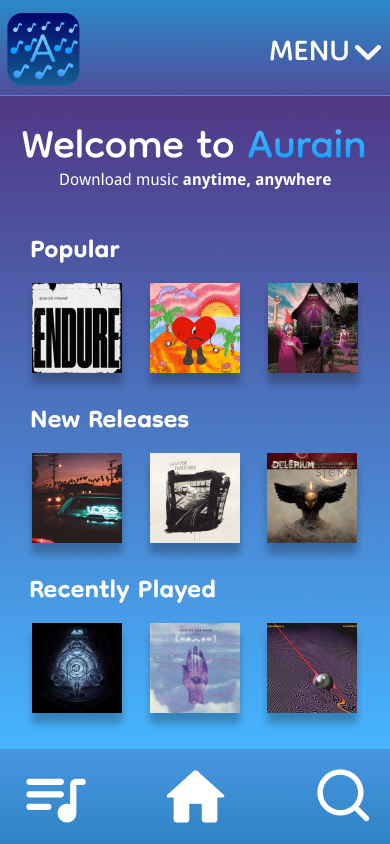
As I was progressing through this project, I learned how to use the Neumorphism Plugin as a design style approach. I gained more experience working with components and overlays, as well as adding different effects to my objects.
2. What was easy?
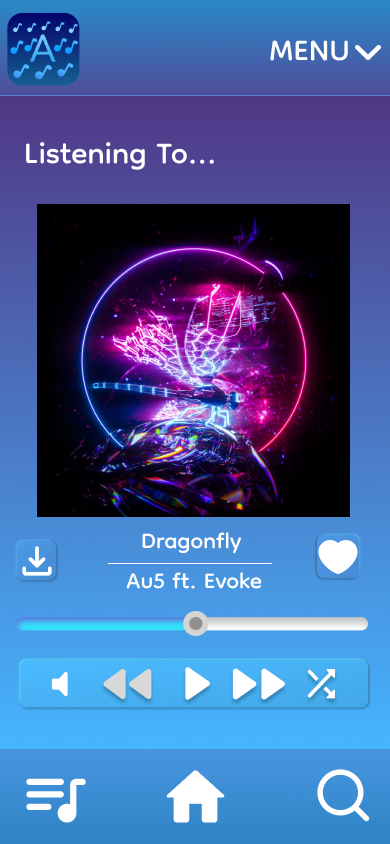
For this project, I found the process of creating a fitting color scheme and simple layout to be fairly easy. Creating components such as a playbar proved to be somewhat difficult at first, but became easier with time.
3. What was challenging?
The hardest part of this project was piecing everything together. For my sketches, I brainstormed a few ideas that could work in my app. While sketching made my formatting easier, I still struggled with understanding how elements could fit seamlessly on each frame. For example, the Now Playing frame was challenging because I had to fit several buttons, the playbar, song title, album, etc all on one page. I understand that I could’ve used overflow, but still don’t feel super comfortable using this technique in Figma.
4. How could your submission be improved
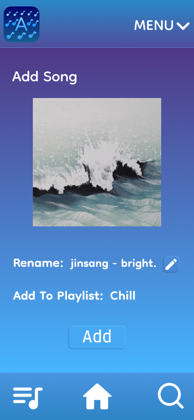
Next time, I would add some sort of overflow to my design and work on the Sort feature. I’d also add the ability for users to view each playlist. For practice, I might implement these changes to see how things turn out.
5. How could I improve the assignment next class?
I think that everything needed to complete this project was given in full detail. Aside from specific features that are tailored to different apps, the necessary criteria were easy to follow.
6. How might you apply your knowledge in future assignments or work scenarios?
From my experience with this project, I understand the general layout of a music player and can continue to look at popular apps such as Soundcloud and Spotify for more ideas. This assignment allowed me to sharpen my skills in Figma and understand different design trends or ISMs.
7. How did a specific reading or video inspire or help you?
Unlike past projects that involved stock photos and videos, I only used real albums and song covers to resemble music that can be listened to anywhere. For the download feature, I briefly looked at Apple Music to get an idea of creating a download queue with the song title and artist. As for the neuromorphic appeal, I found several websites that assisted me in seeing how this design approach is good and bad. I found that while this technique can be aesthetically pleasing, some people may have a difficult time noticing functional buttons or other elements that correlate to this trend.
https://www.justinmind.com/ui-design/neumorphism
https://hype4.academy/articles/design/neumorphism-in-user-interfaces
https://uxplanet.org/neumorphism-in-user-interface-tutorial-c353698ac5c0