- What did you learn?
I learned about the different types of typography that exist and how to properly use them in designs. I also learned how to incorporate appropriate kerning and tracking when needed between individual letters or characters or a range of letters or characters.
2. What was easy?
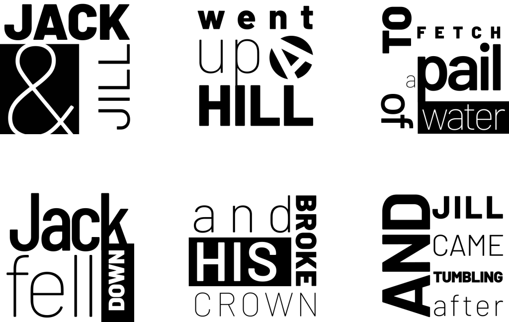
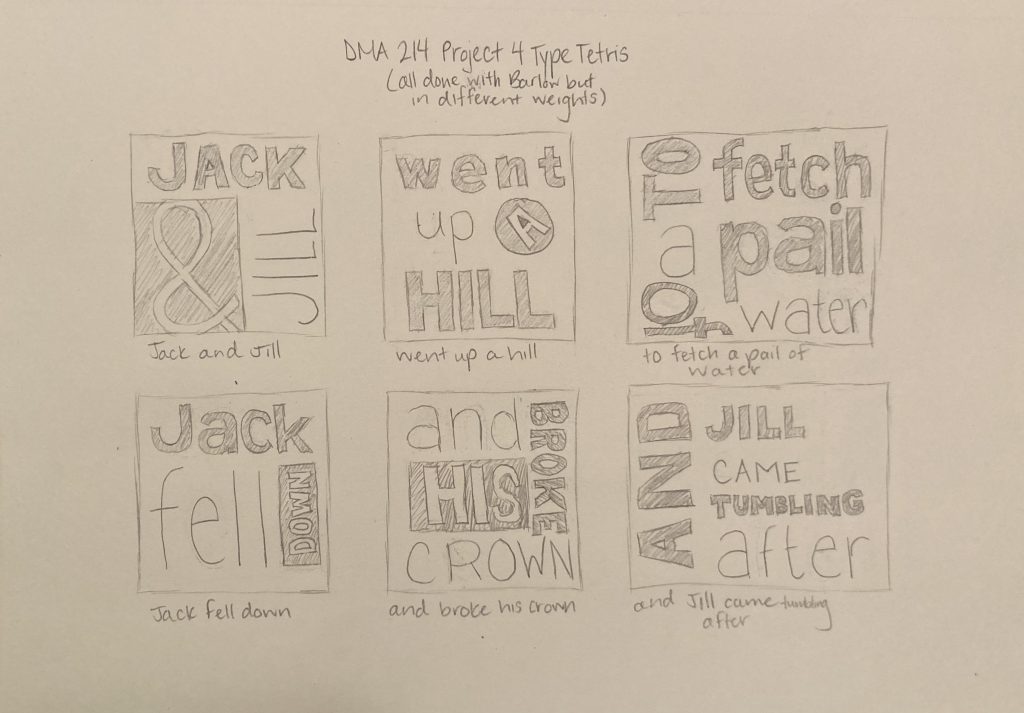
I found it fairly easy to increase and decrease the size of each word. This helped a lot when I was trying to completely fill each frame with the typography.
3. What was challenging?
I found it challenging to properly apply and vary the all uppercase and lowercase letters in each word of the nursery rhyme. I found that it made sense to use ExtraLight or ExtraBold on all uppercase or all lowercase words.
4. How could your submission be improved?
My submission could be improved by incorporating more black rectangles behind different words in white. I could also play with positive and negative space more in my designs.
5. How could I improve the assignment for next class?
I could improve the assignment for next class by using another font in addition to Barlow. I think that it would challenge each student’s creativity, but also provide enough structure to each design in order to maintain a certain consistency.
6. How might you apply your knowledge in future assignments or work scenarios?
I might apply my knowledge in future assignments by being aware of what type of fonts will dilute the efficacy of the communications in my designs. It will also help me to keep my visuals looking clean and professional. As for future work scenarios, I can apply my knowledge by avoiding fonts that will make my designs less appealing to the viewer.
7. How did a specific reading or video inspire you?
A specific reading inspired me by helping me to understand the basics of typography. It was entitled “Butterick’s Practical Typography 2nd Edition” by Matthew Butterick and it guided me along some of the do’s and don’t’s when it comes to typography. He even went as far as including some specific font types to avoid when choosing them for designs.