- What did you learn?
I learned that there is a lot that goes into creating an app prototype and that it takes a great deal of revision before coming to a final product the designer is satisfied with. I also learned that you can create components on a master frame in Figma so that you will not have to create the same element over and over again, but rather you can use the element you originally created as a component throughout your other frames in your app prototype.
2. What was easy?
I found it easy to come up with a design for the app icon and logo. I wanted something simple but modern that represented the essence of Balance.
3. What was challenging?
I found the interaction details to be challenging because the noodles overlapped and it was sometimes difficult to see which frames navigated to other frames.
4. How could your submission be improved?
My submission could be improved by making colors that fit the AA guidelines which past the test using the “Contrast” plugin. For the purposes of this project, however, I used a darker aqua blue to compensate for the lighter aqua blue I originally had in place.
5. How could I improve the assignment for the next class?
The professor could improve the assignment for next class by having the logo and icon being used to navigate to the main TODO list as optional.
6. How might you apply your knowledge in future assignments or work scenarios?
I might apply my knowledge in future assignments thinking about creating an app prototype from the perspective of a user instead of a designer. This will help me to improve the user experience overall. Furthermore, I might apply my knowledge in work scenarios by making accessible app designs for those with disabilities by using colors that fit within these guidelines.
7. How did a specific reading or video inspire or help you? Refer to a specific reading or link for this; do not reference a class video or lecture.
A specific reading that helped me was the article from Adobe entitled “Design Thinking Process and Its Phases.” It detailed the five stages of the design thinking process. The first stage of this process was the one which resonated with me the most. The word used was empathize, and this meant to understand the problem of the user for whom you are designing. Fully comprehending the needs of the user is essential to maximizing their app experience.
Final Project Frames


Revisions in Class (9/28/22)
After being given revisions in class, here are the changes I made to my designs. I included three more frames to incorporate animation, changed the black text color to a softer gray, added a “Back to Home” on the main personal tasks list and the main work tasks list frames, created new calendars, and made the clocks on the main personal tasks list and the main work tasks list frames interactive by leading them to the calendars.
App Logo Animation Frames
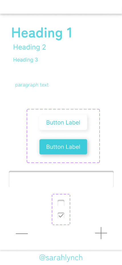
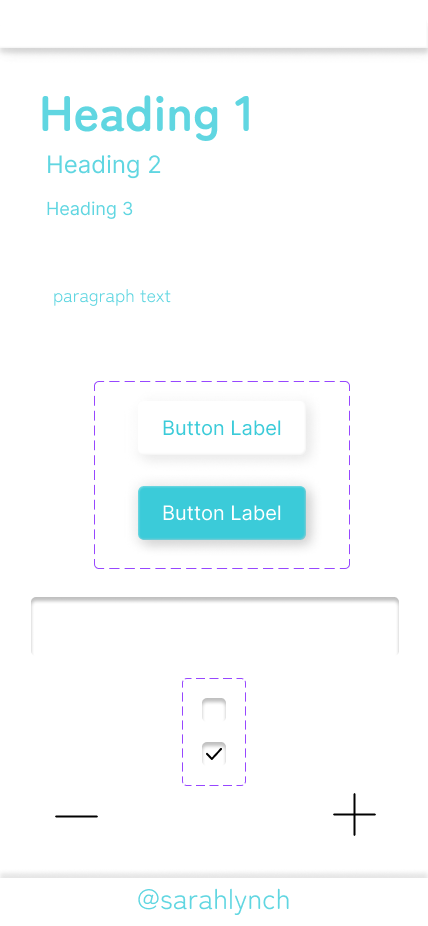
Master Frame, App Icon, and App Logo
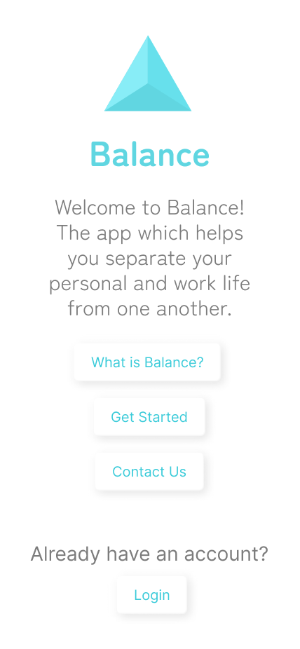
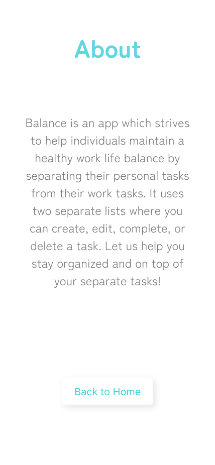
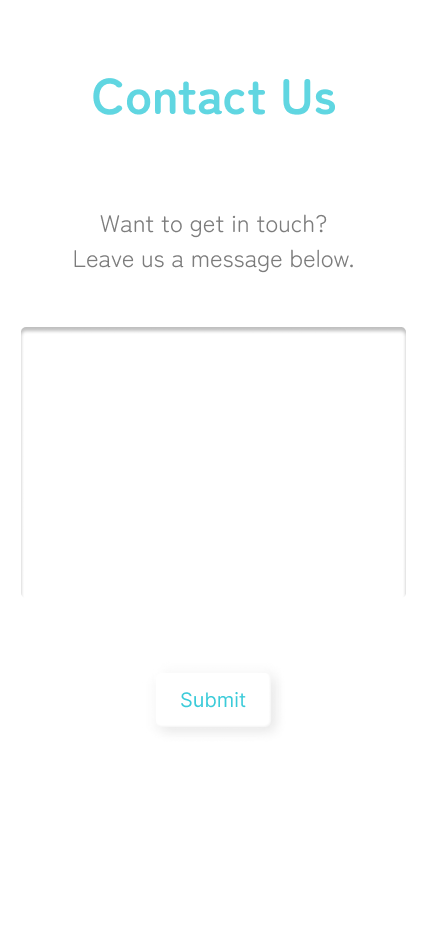
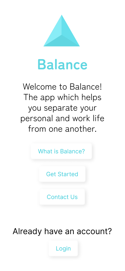
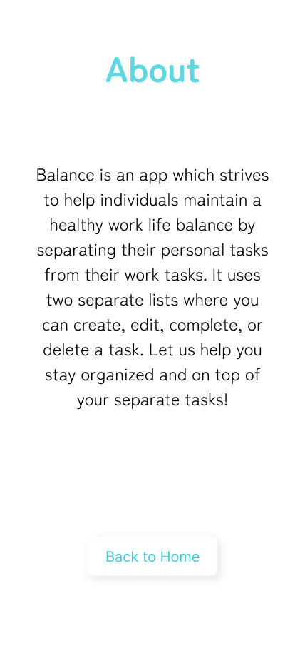
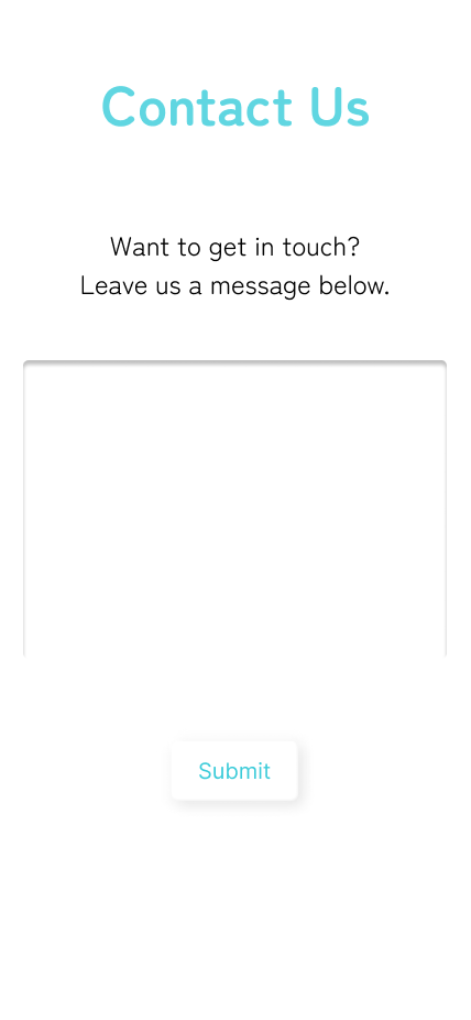
Home, About, and Contact Us

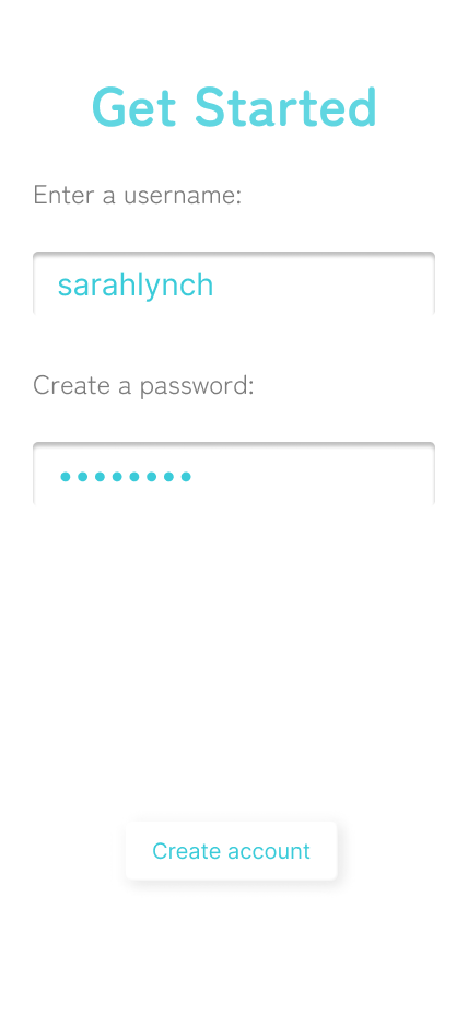
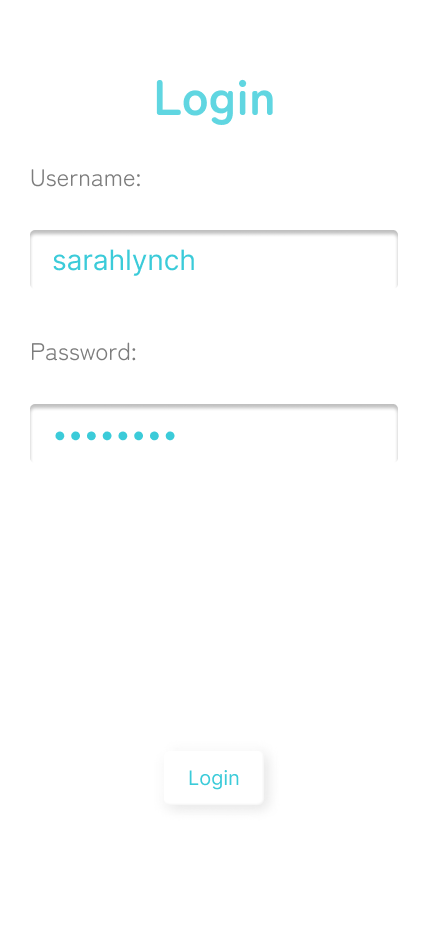
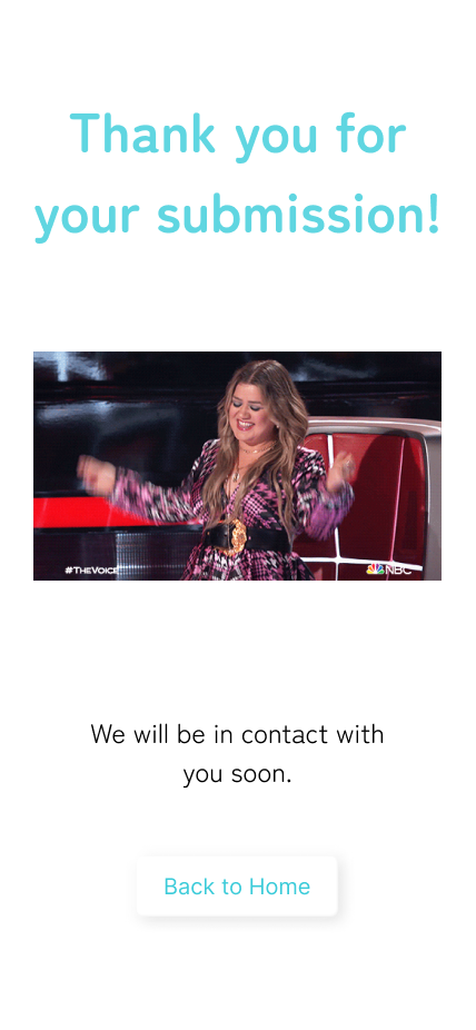
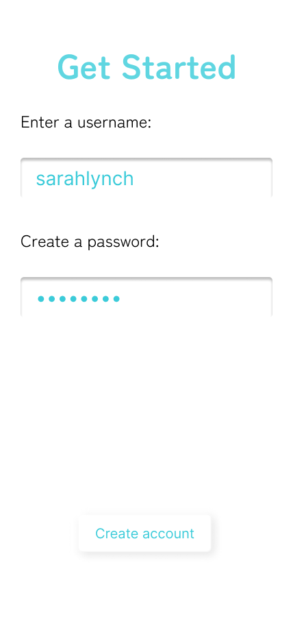
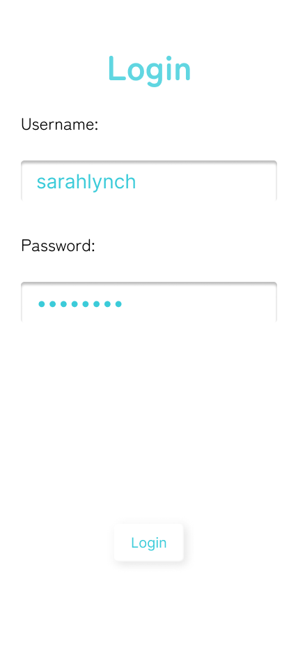
Contact Submission Success, Get Started, and Login
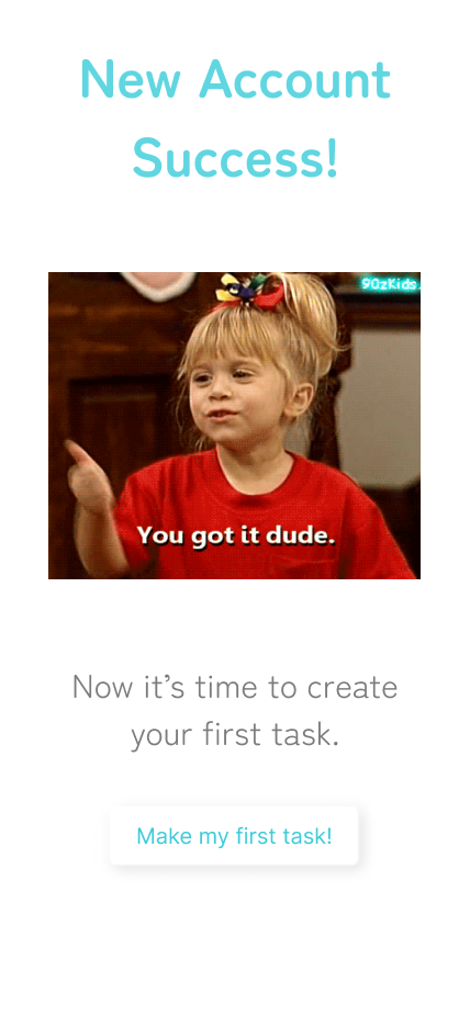
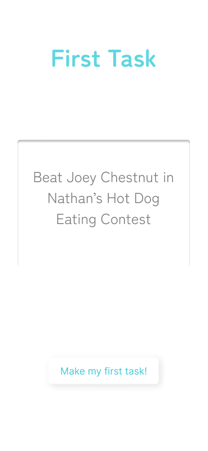

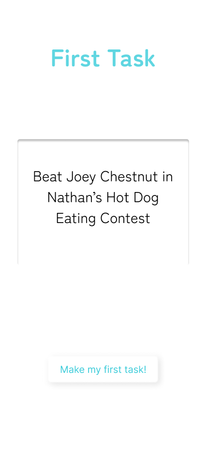
New Account Success, First Task, and First Task Entered
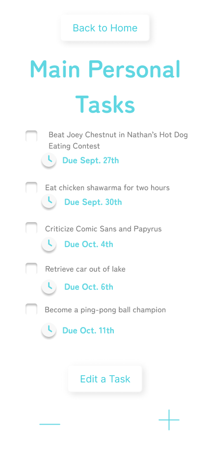
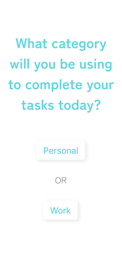
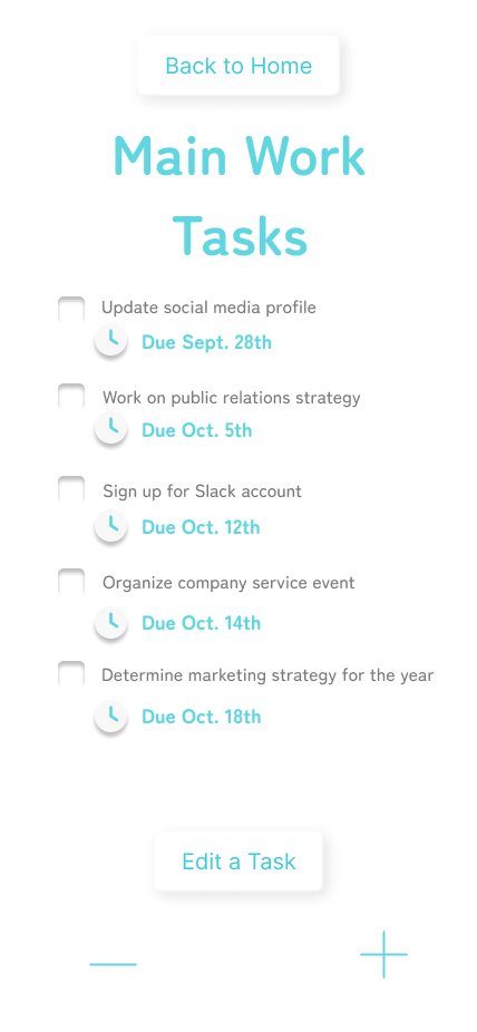
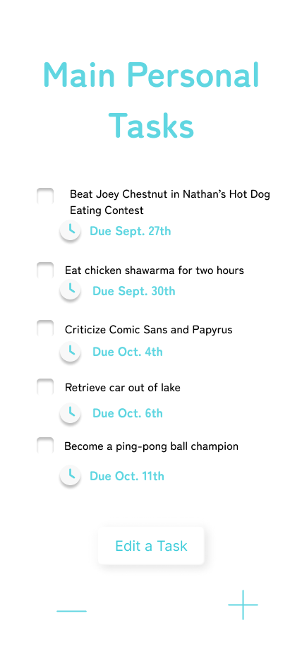
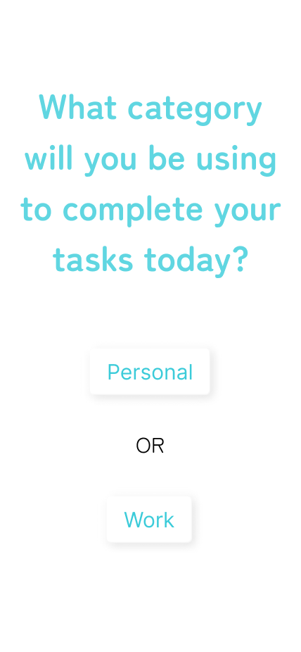
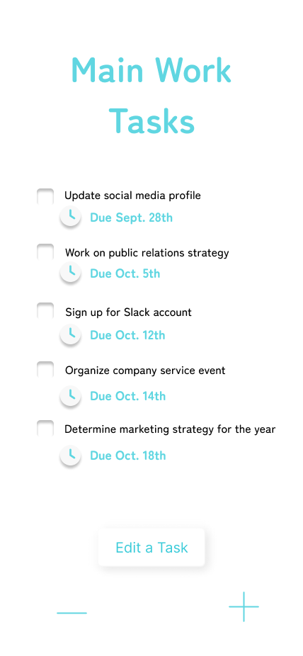
Categories, Main Personal Tasks List, and Main Work Tasks List
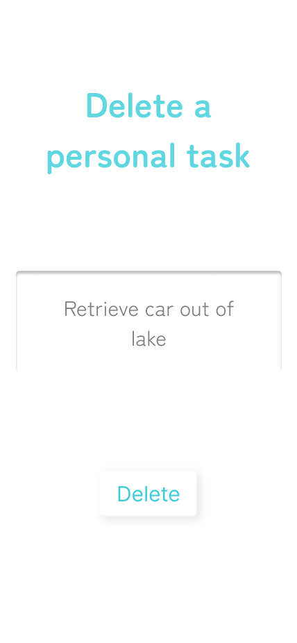

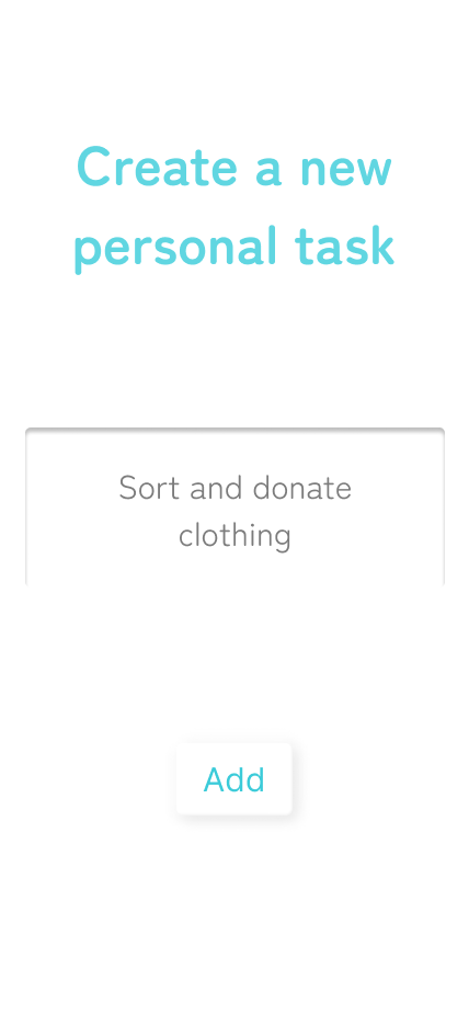
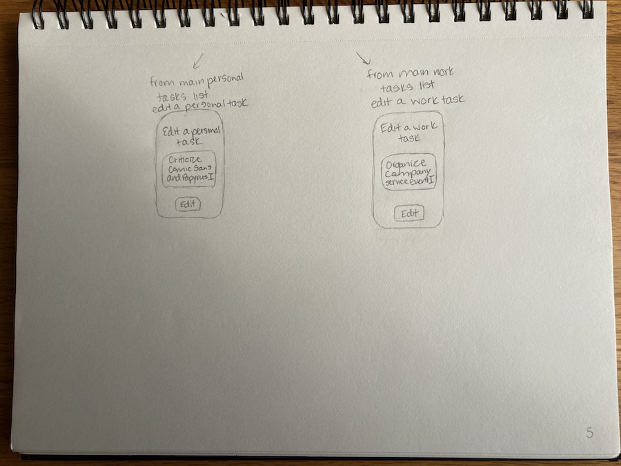
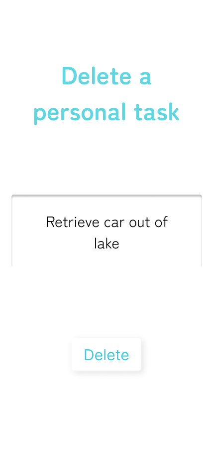
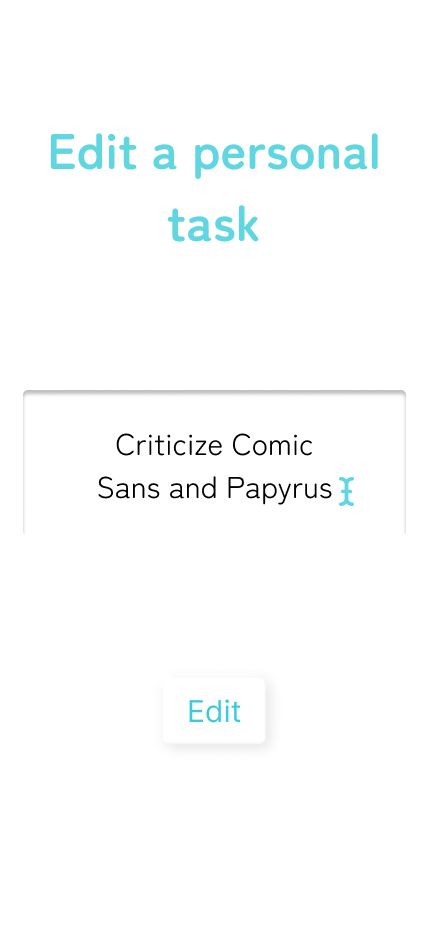
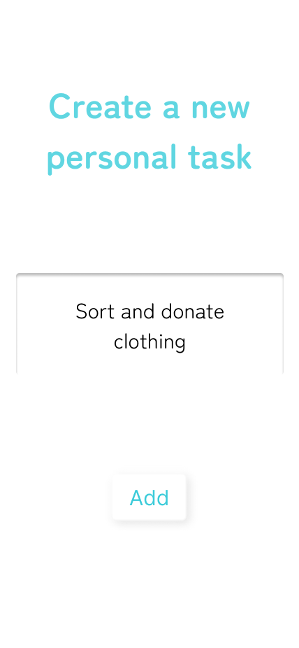
Delete a Personal Task, Edit a Personal Task, and Create a New Personal Task
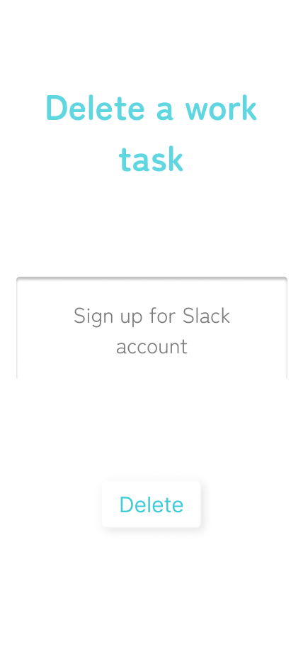
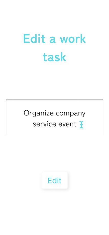
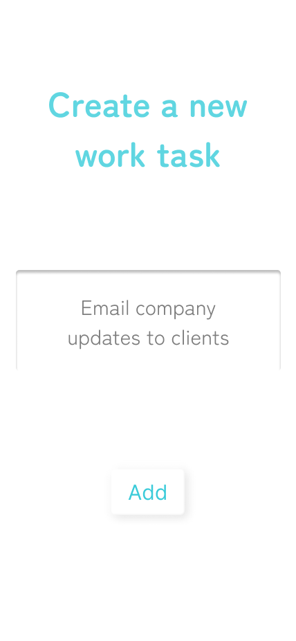
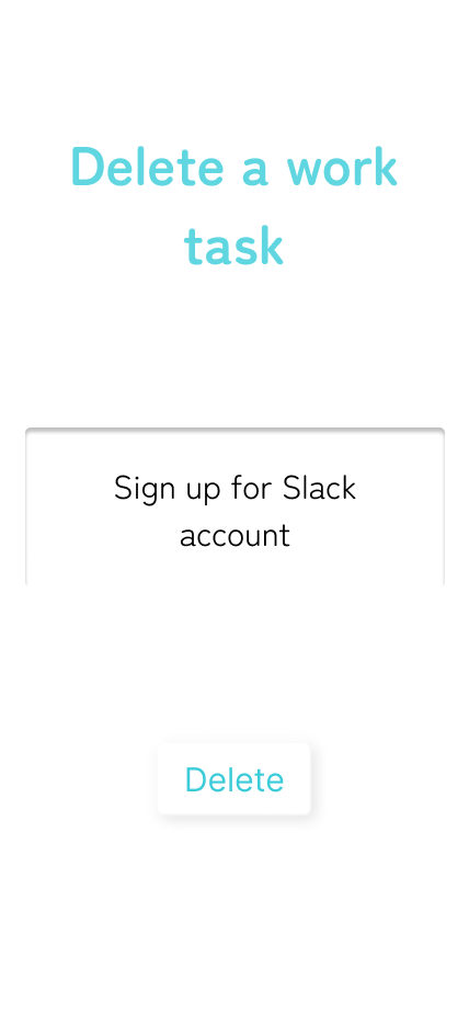
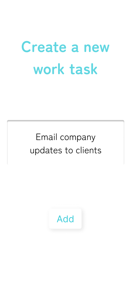
Delete a Work Task, Edit a Work Task, and Create a New Work Task
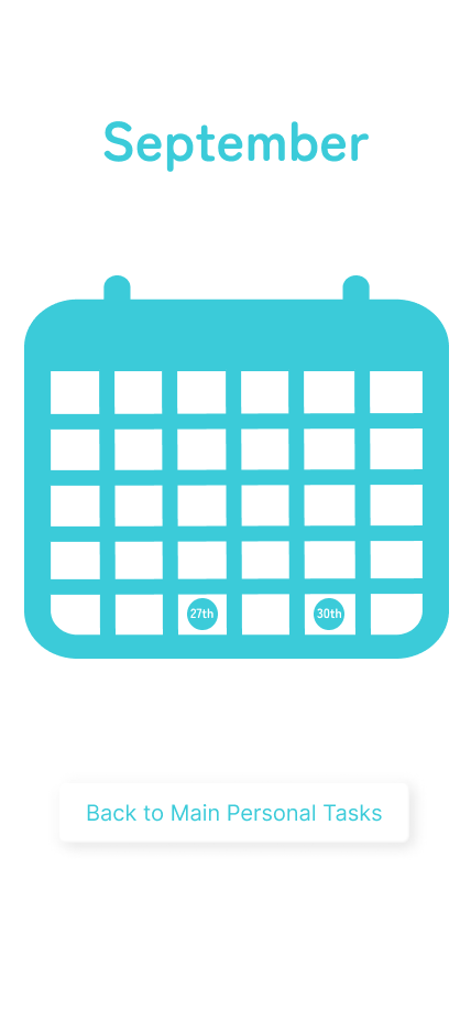
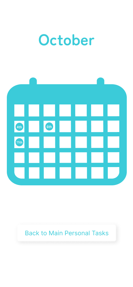
Personal Calendars for September and October
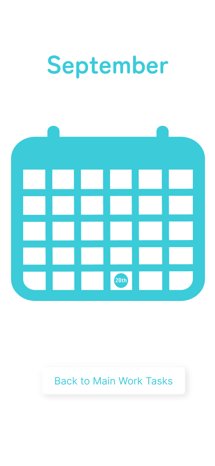
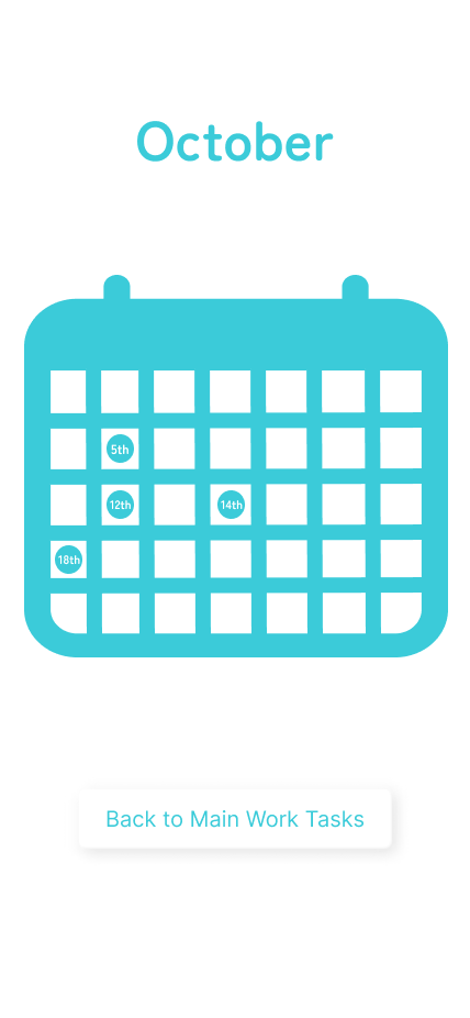
Work Calendars for September and October
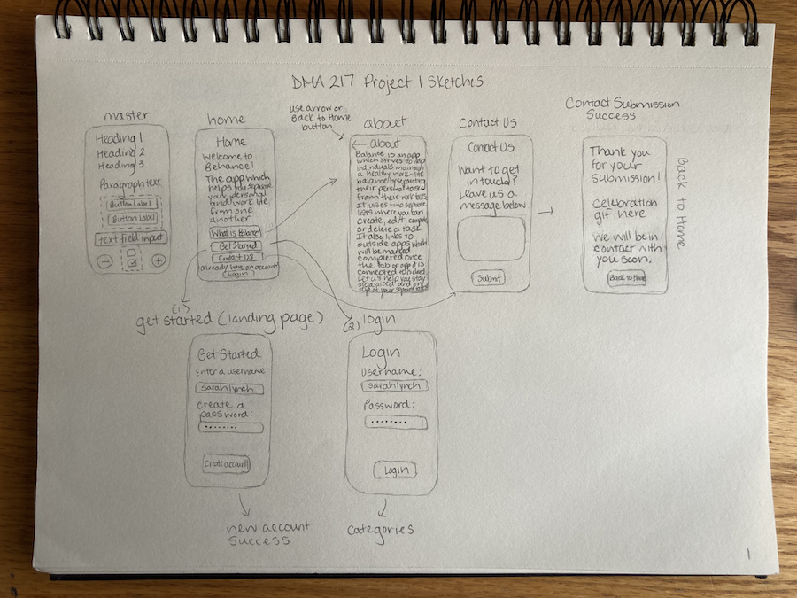
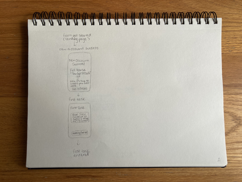
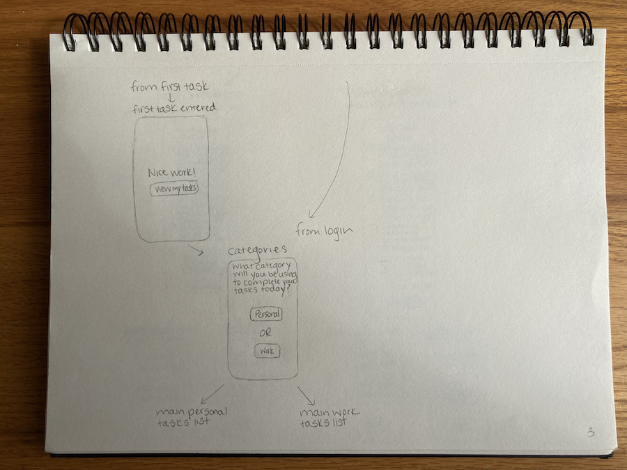
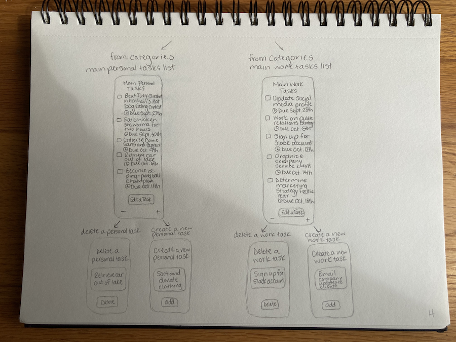
Below are the sketches I created for Project 1.