- What did you learn?
I learned that you can apply layout, color, image, and typography to one design in this project. It showed me that you can apply design concepts and principles from each into one single design.
2. What was easy?
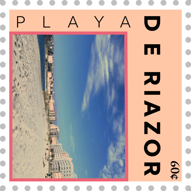
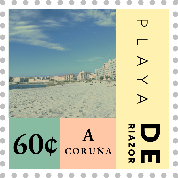
I found it fairly easy to choose the images I wanted to use for each stamp. Taking a lot of pictures on my recent trip to Spain definitely helped to give me a lot of options to choose from.
3. What was challenging?
I found it challenging to incorporate something into each box of each frame when thinking of each stamp with the rule of thirds. I also found it difficult to merge my images and designs while still maintaining a certain consistency within my design.
4. How could your submission be improved?
My submission could be improved by incorporating more changes to the photos themselves and contrast to the typography.
5. How could I improve the assignment for next class?
I could improve the assignment for next class by using more fonts in each frame. I think that it would challenge students to maintain a consistent design while expanding their creative ideas.
6. How might you apply your knowledge in future assignments or work scenarios?
I might apply my knowledge in future assignments by combining all four elements of layout, color, image, and typography in my designs, keeping in mind certain concepts and principles I have learned in the process. As for future work scenarios, I can apply my knowledge by making sure to use all four components instead of just one.
7. How did a specific reading or video inspire you?
A specific reading inspired me by helping me to understand the basics of typography. It was entitled “Butterick’s Practical Typography 2nd Edition” by Matthew Butterick and it guided me along some of the do’s and don’t’s when it comes to typography. He even went as far as including some specific font types to avoid when choosing them for designs.
My typefaces used in my initial designs are Kumbh Sans, Licorice, Whisper, Zen Old Mincho, and EB Garamond.
My typefaces used in my final designs are Kumbh Sans and EB Garamond. I used these two because EB Garamond worked well for the stamp price and Kumbh Sans was a paired nicely with it to give a clean, professional look.
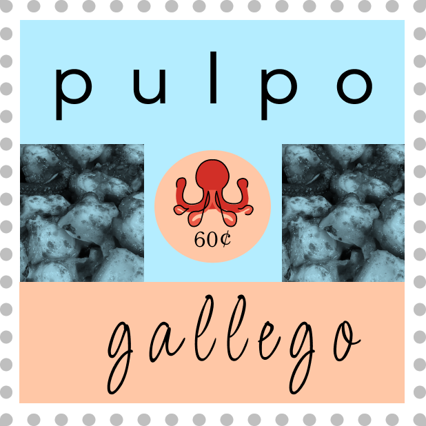
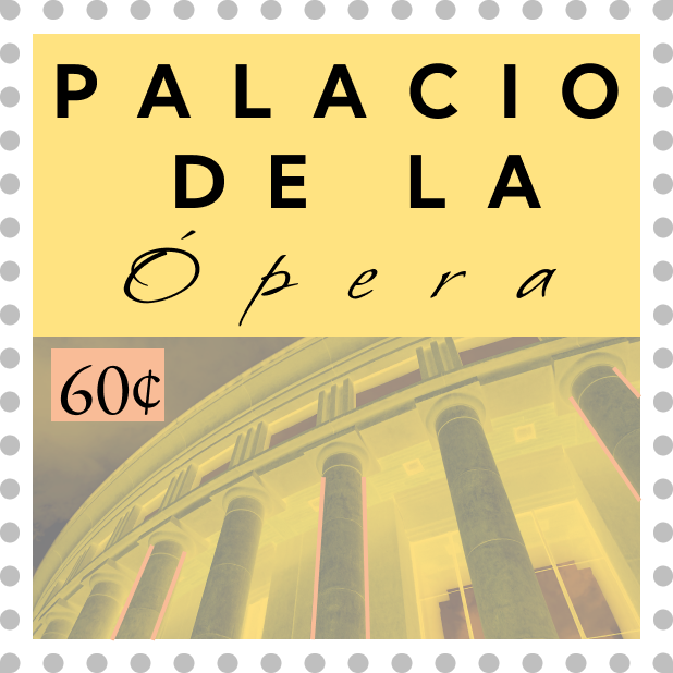
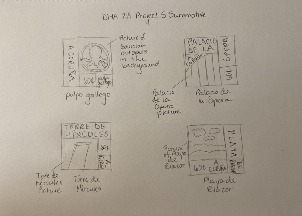
Initial Designs
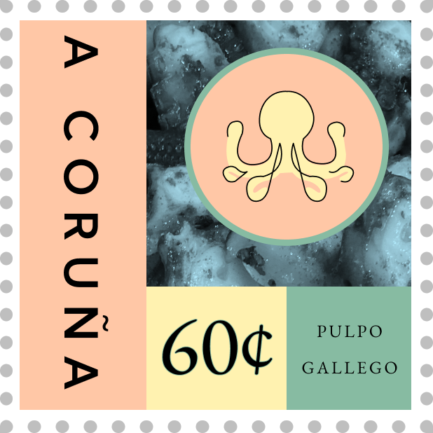
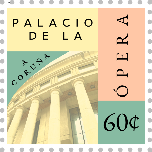
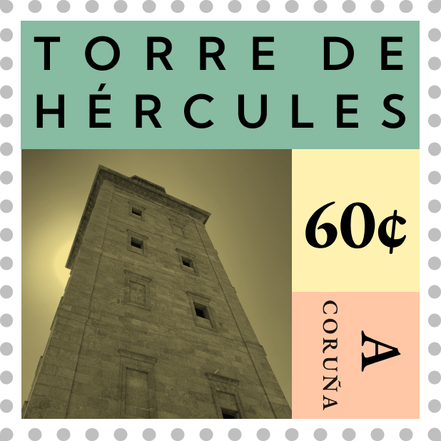
Final Designs