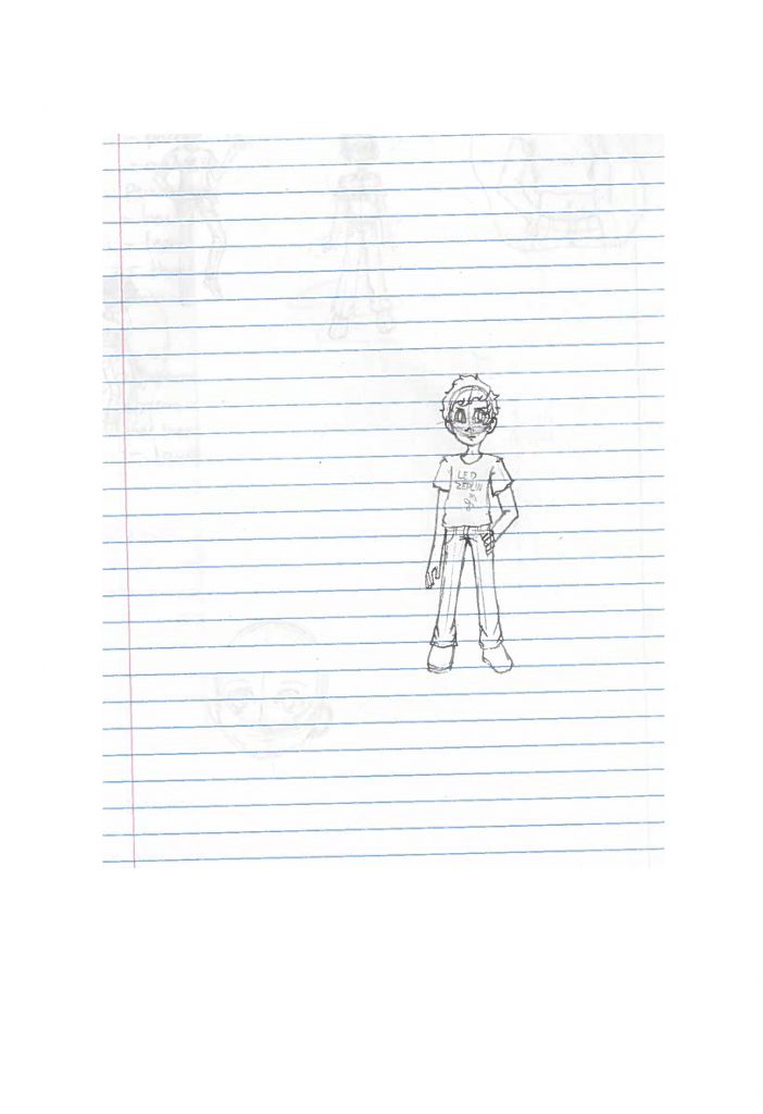
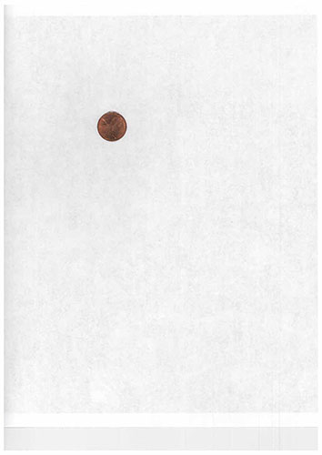
These were the photo that were scanned. The first is one of my own drawings, the second is a scanned penny, the third is a magazine cover, and the last is a public photo that was printed. All the images don’t have the best resolution. The penny in particular can barely been seen once zoomed in, it’s hard to register that it’s a penny. The magazine cover turned out ok compared to the other two, most likely to do with the size of what was scanned. Same for the city photo.


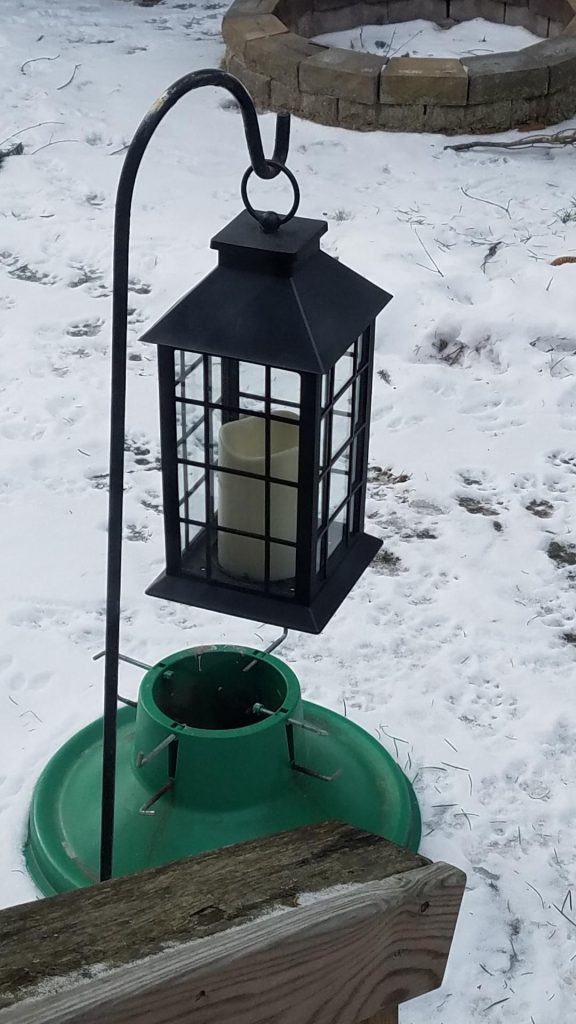
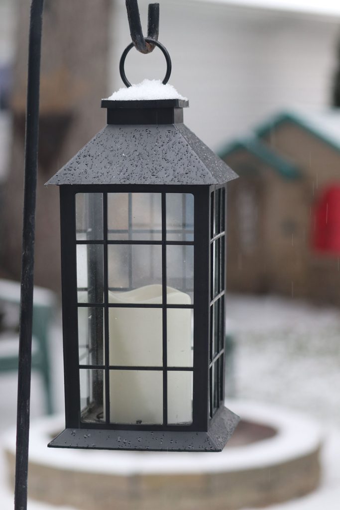
The first photo was taken on my iPhone while the second was taken with a real camera. The photo with the phone is basically all the same shade. There’s no contrast of colors. The other photo has color contrast with the lighting. The background is also blurred, showing depth while the first photo doesn’t. In the camera photo you can see the light off of the snow on top, while in the phone photo the snow looks all one color without much distinction.
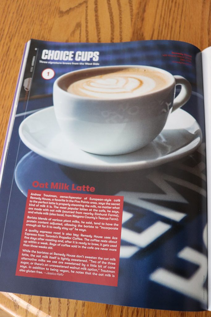
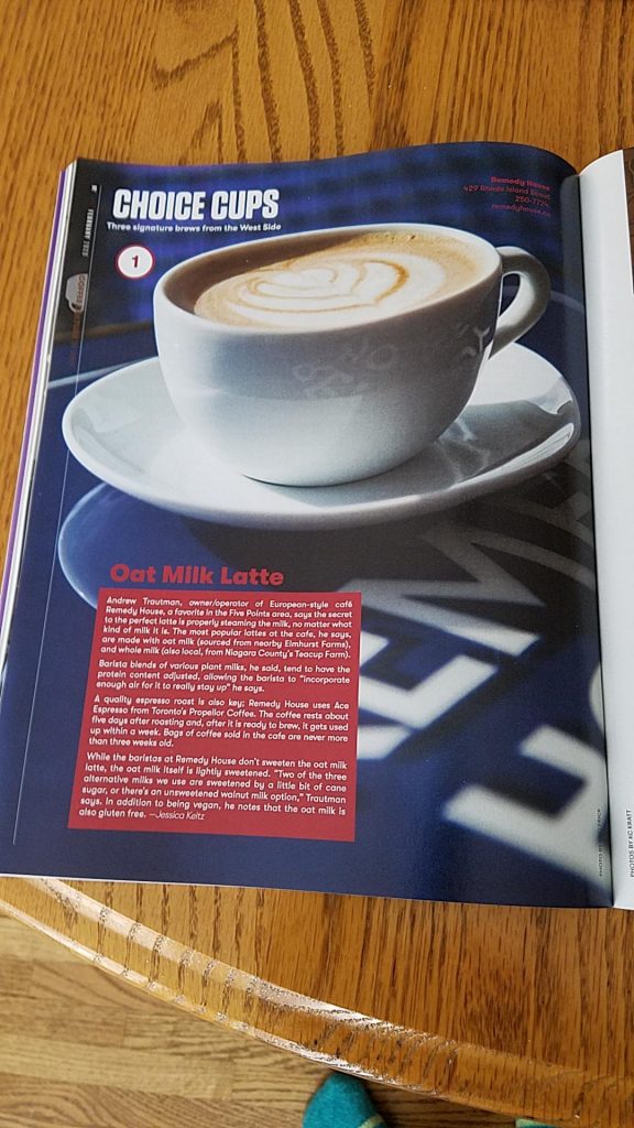
The first photo is with a phone while the second is with a camera. The first photo is significantly more blurry with less lighting contrast. The lighting in the second picture reflex off the magazine as well as the table. The second picture is also clearer.
The stock images are extremely clear. The also, most likely, have setting differences of lighting and color. My own drawing (can’t draw with right hand) is clear even with the lack of artistic quality.
