For this project we used text and color schemes to create stamps for a specific location.
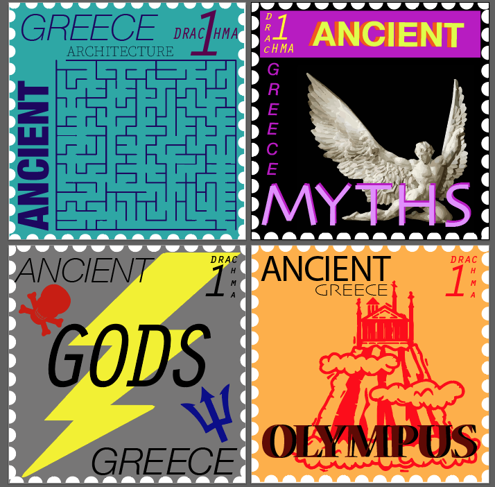
I did Ancient Greece because I thought I could have fun working with this myths and creating what maybe what we would have seen at the time if they had stamps. I was inspired to do this because of my obsession with classics and a recent podcast I’ve been listening to.
I learned typography tactics which were really fun to learn and how to fit the letters in a way that were aesthetically pleasing. Also, working with the previous color knowledge to make the stamp look good rather than an eye sour.
It was challenging sometimes to see spacing problems in the letters or try to find the best way to make it look even. However, I think it was do to my inexperience with changing type and it was easier to find problems the longer I worked on the project, though I’m sure I still missed some things.
Coming up with the original idea as easy as well as deciding what colors I want for each the different stamps.
The third stamp, the Gods, I feel could definite be improved. It loos overall more cartoony in a bad way, but I like the lightning bolt across the middle and like the overall design. I’m not sure how to fix it, but it could use work.
typography itself is really useful skill to have and I really enjoyed doing it. creating posters, working on art, or promotional material could use this kind of knowledge and I would love to do things like that.