- What did you learn?
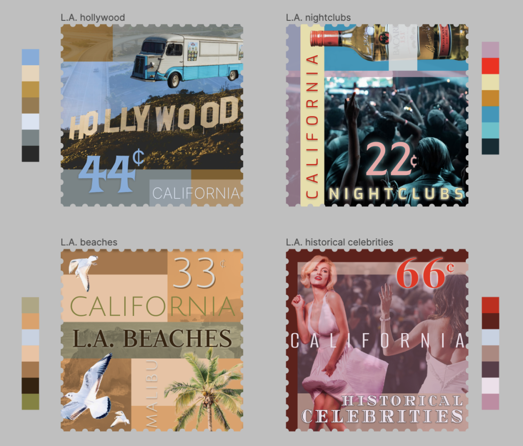
I learned more insightful ways to use imagery and text together as a unit, changing the image’s saturation, colour, contrast, etc. in order to match it with my chosen text font. I also learned that by using grids, you do not always need to flatten images in order to make them fit accordingly.
- What was easy?
It was easy enough to choose a location and choosing aspects that coincided with them as a whole. It was also easy to find appealing colour swatches matching aesthetically to the chosen place.
- What was challenging?
It was challenging to figure out the exact composition that fit well while also making the stamp aesthetically pleasing.
- How could your submission be improved?
I think if I went in and actually took time to center everything to an exact t using the grid tool. I did it sometimes, but not consistently.
- How could I improve the assignment for the next class?
I think giving more insight into aesthetics connects to places, things, and people. Like association of colour. I think we spoke about it at some points in class, but more insight on it never hurt anyone.
- How might you apply your knowledge in future assignments or work scenarios?
The idea of composition will probably follow me in the art world for the rest of my life, so I think overall this will be the most helpful tool for the future.
- How did a specific reading or video inspire or help you?
Class demos and discussion is what really assisted me in this project.
