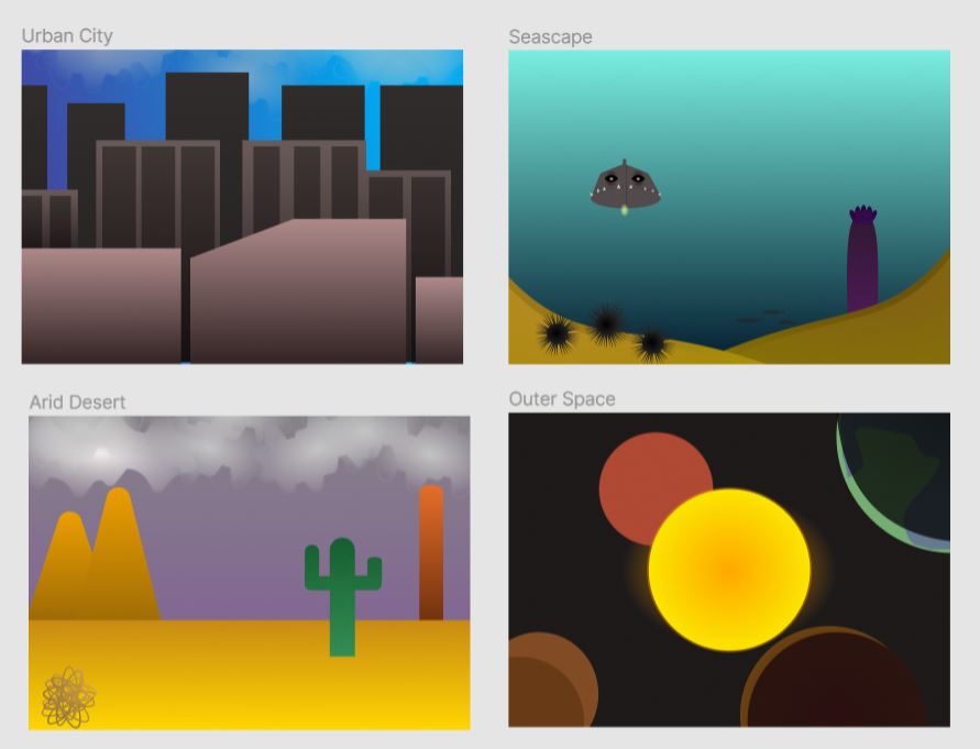
With this project, I learned how to effectively use colors to distinguish an objects’ position and bring a location to life. The easiest part of this project would have to have been creating the distinguish an objects’ position and bring a location to life. The easiest part of this project would have to have been creating the Outerspace location. The hardest part of this project would have to have been the city location because I was not too sure what colors would accurately show the distance between the buildings. My submission could be improved by adding more details such as stars in the space location or more windows in the city, or particles in the sky in the desert, and the water of the ocean to add more realism. This assignment was perfect how it was at least in my opinion. It felt like a satisfying sequel to project 1. In the future, this will help me to choose colors for whatever I’m making that will all blend satisfyingly. The complementary colors lesson helped me because I had forgotten all about how to use the color wheel so that worked as an excellent refresher.