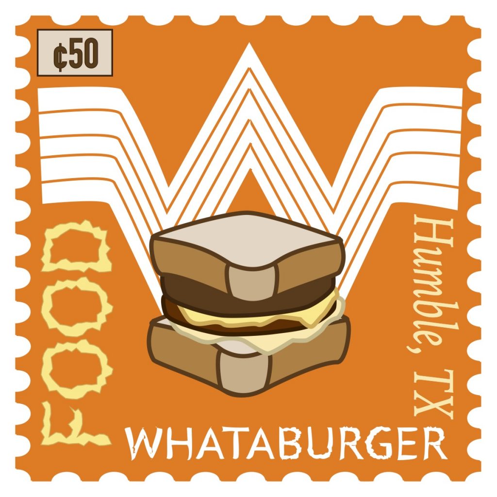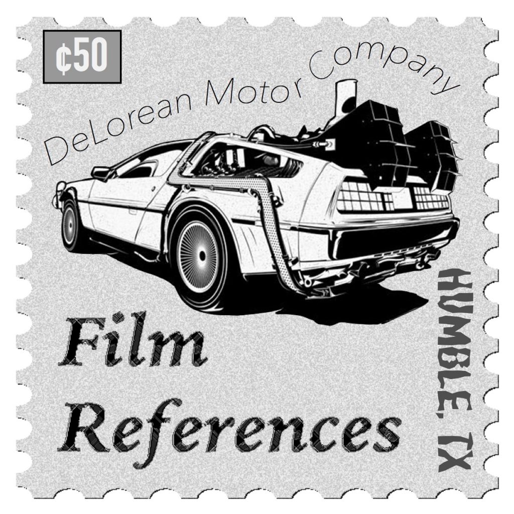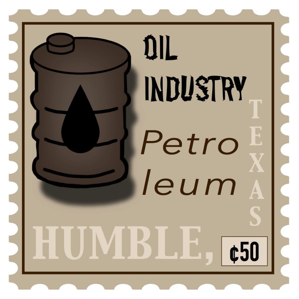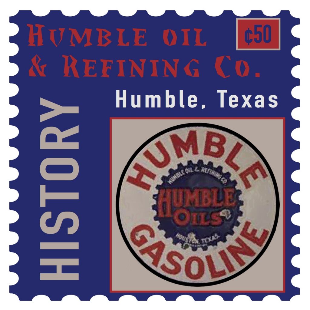


I learned how to differentiate between different fonts, as well as how to make my fonts type on a line, how to type them and roughen them (or even apply different effects to them like tweak or zig-zag), and I learned a bit more information about Humble, Texas. I also learned how to correctly make a vector image, which is a very nice skill to have!
The easiest parts of the project were deciding the place, finding the correct information, and then finding images that could go onto the stamps. I also managed to find a stamp template online that worked very well in Illustrator.
The most challenging part was deciding between Photoshop and Illustrator. I first started in Photoshop, not only with my images but also because I thought it was the easiest to do. Then, when that failed, I decided Illustrator was the best option.
How could your submission be improved? I think I could have done a bit more in terms of the background looking better, maybe should have added a few more details or images. I think it looks quite basic, but then again not many people will admire stamps.
I definitely suggest teaching about vector images! It’s a very helpful tool, as it’ll save people who draw their own art for the projects. Or even including a stamp template, or how to make it look like a stamp instead of it just being a square.
How might you apply your knowledge in future assignments or work scenarios? If I ever want to create my own stamps for mail, this seems like a wonderful thing to use in the future! I also plan to keep doing vector images and the typing style, as the typing style is super fun!
I honestly was inspired by my trip to Texas back in 2018. I originally was going to do Venice, Italy, but I was looking at some of the photos and videos I made with friends and I instantly decided on Humble, Texas. It’s right on the outside of Atascocita, Texas, and is quite close to Houston, Texas.
