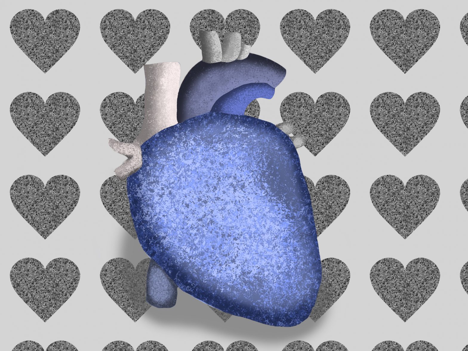
What I learned from this project is how to create patterns, and how to find some of the nature textures in Photoshop. I also learned how to correctly shade to try to make the heart look like a realistic heart of stone.
The easiest parts of this project were figuring out what colors to use, what tools to use to create the spotting for the stones, and using a reference image for the heart’s shape.
The challenging parts of this project were correctly shading the heart to make it look realistic, and finding a realistic texture in photoshop for the pattern used.
I could improve this a lot by making the background not so bright and irritating to the eyes compared to the colored foreground. I could also improve my shading and my pattern a bit more.
To improve the assignment for the next class, I suggest helping them find better realistic examples of these short metaphors, or even by allowing a bit of flexibility when a metaphor doesn’t always have a realistic looking image. (Mine was actually a bit hard to make look realistic, since the hearts aren’t really a human heart shape.)
I can apply the knowledge I gained from this project in future assignments or work scenarios by using the photoshop tools to correctly cut out an object (whether you use the magnetic lasso tool and then the select and mask tool, or if someone uses something different) and having it help with selections while filling in objects (like with drawings!)