I learned how to create thumbnails, how to optimize photos and how to make it so the photos are different for websites and for printing.
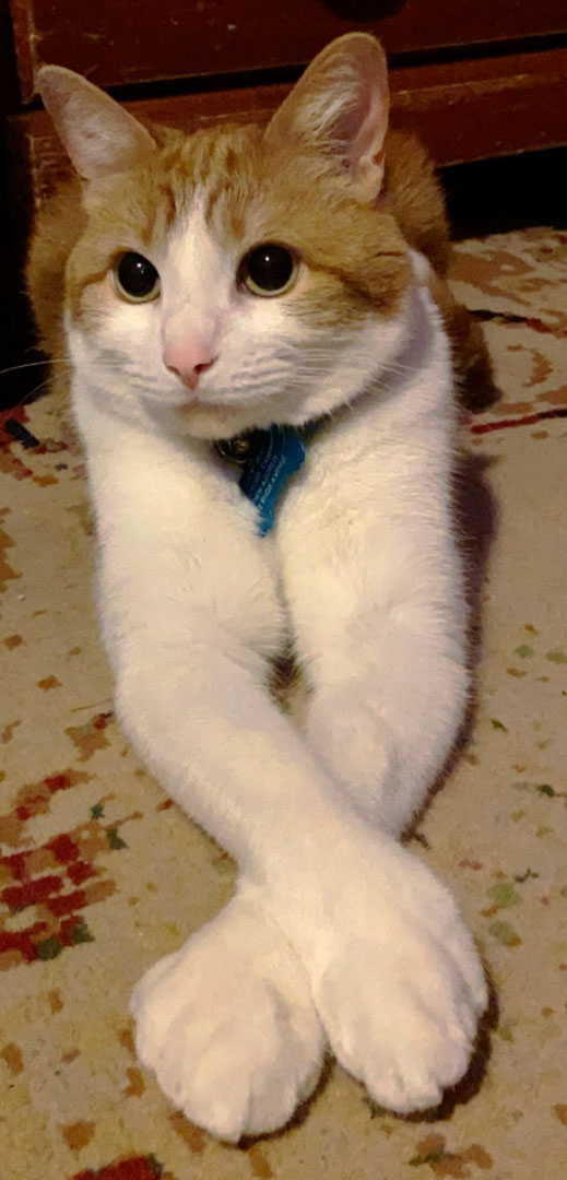
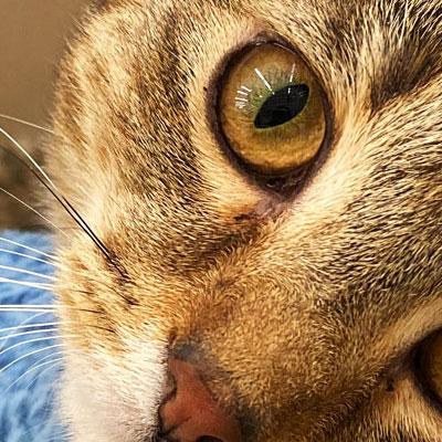
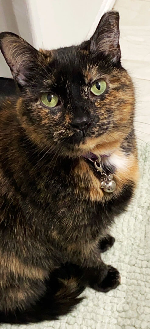
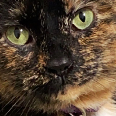
The easy part was finding photos to use, as these are all photos that relate to me. I like cats, nature, art, video games, and important people in my life. It was also easy doing the levels and curves for my photos.
The challenging part was trying to get some of the photos less than 200k because some of the photos were taken with my phone, which is an iPhone 11.
I’m actually not entirely sure how to improve what I have, maybe fix some of the levels or the curves? Add some unsharp masks? I fixed the one image I was originally going to put, and swapped it out for a better photo.
I definitely recommend some better instructions with the large photos, because I wasn’t sure if they should be done during the modified process or during the print process.
I plan to use this for when I post images to the internet or for when I want to print out a booklet of some sort that shows some of my work. I can create thumbnails for videos or photos, and correctly size images for the web.
The things that helped me the most were the lab examples we did in class.
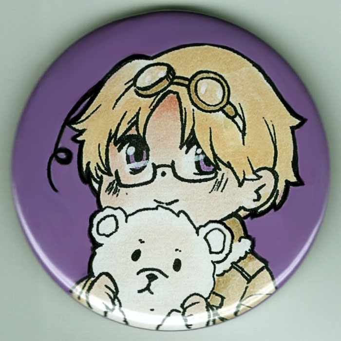
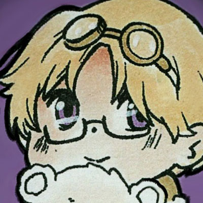
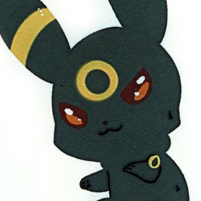
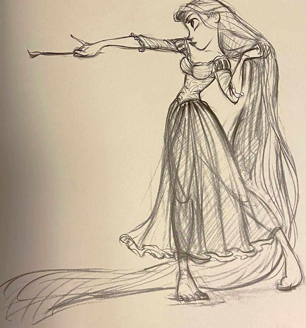
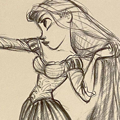
The artwork on the buttons was done by Hot Topic and an artist I met at UBCon, I unfortunately cannot remember their name. The art of Umbreon and Rapunzel was from another artist at UBCon, and a sketchbook made from Disney of old drawings for their movies!
I learned how to make a person blend into a different background, how to use the pen tool to get a good cut-out of an image, or how to use a magnetic tool to cut-out an image, as well as how to make a background form into letters.
The easiest part was probably getting the letters to take the flower background and form with the letters.
The most challenging part was definitely working to get the model’s hair to go well with the background, or to at least make it look like it wasn’t photoshopped together.
I definitely could have done better with my banana cut-out. There’s some white space from the original banana image when you have the background showing.
For improving the assignment for future classes, I’d say have a better explanation with the background eraser tool, because it was a bit confusing to work with at first.
I definitely plan to use the letter example, the magnetic tool and to try my best to work with the background eraser tool a bit better for later projects and assignments.
All photos used were sent by the professor.
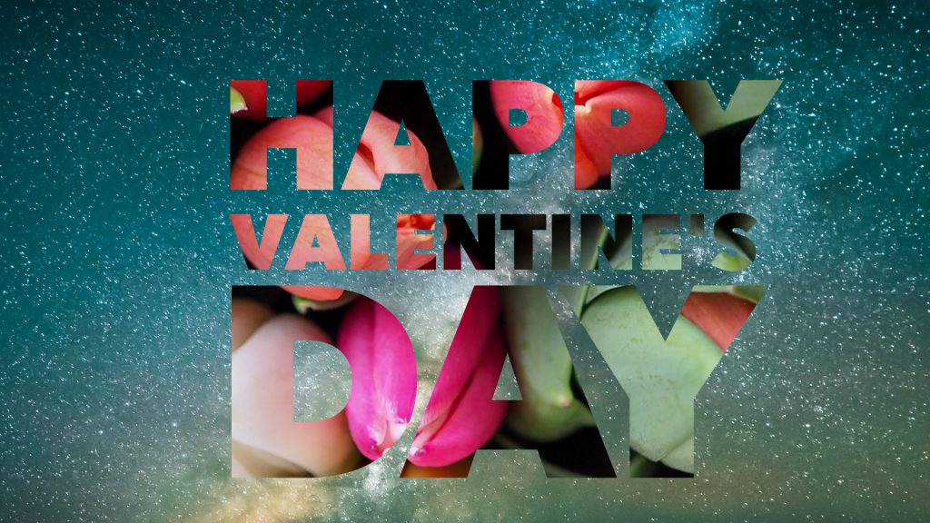
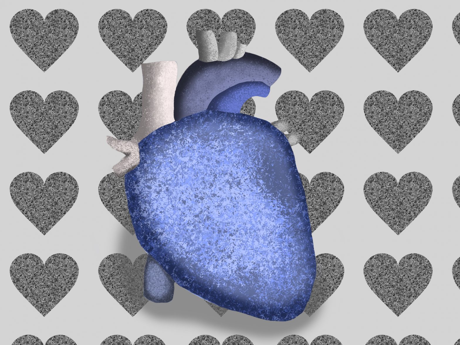
This fits perfectly for the fact that Valentine’s Day is coming up!
I learned how to use levels and curves to make a better looking image. I also learned a bit about the ranges in the levels, the clone pattern tool, and unsharp masks.
The easiest part was choosing my photos for this lab. I also had an easy time with exporting the images with save for web.
The most challenging part was the clone pattern tool, since some of the spots are odd, and some places are hard to blend.
My thumbnails could look a bit better, and I could have chosen a different photo that was scanned into the computer.
Thumbnails
Please check for spelling errors, I was confused on what iew > Proof Colors was for a solid 2 minutes. Other than that, I really didn’t have much trouble with it.
I definitely plan to use these tools for making my photos look better for not only online, but for printing as well. I really like the levels and curves and how they make a photo change to seem a bit more balanced.
The only reading that helped me was the labs page.
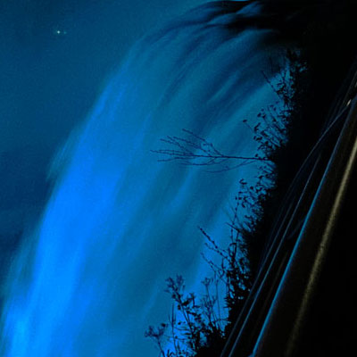
The difference between low-quality images and high-quality images.
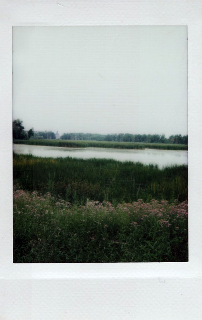
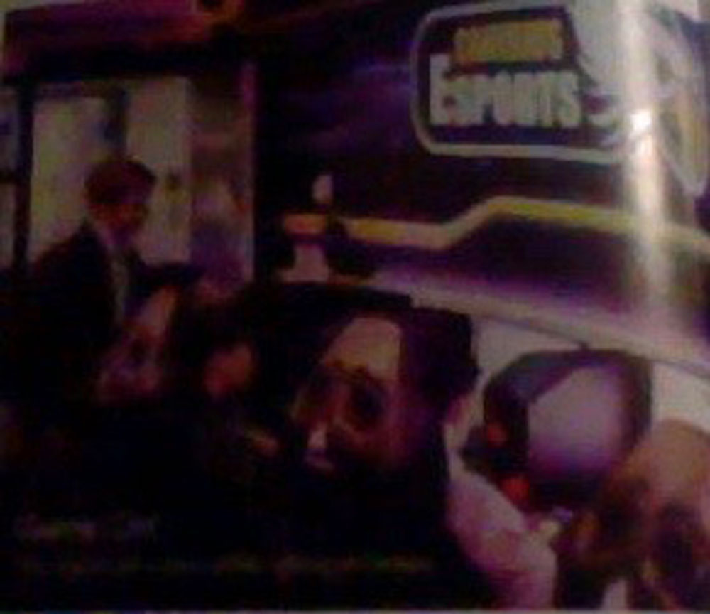
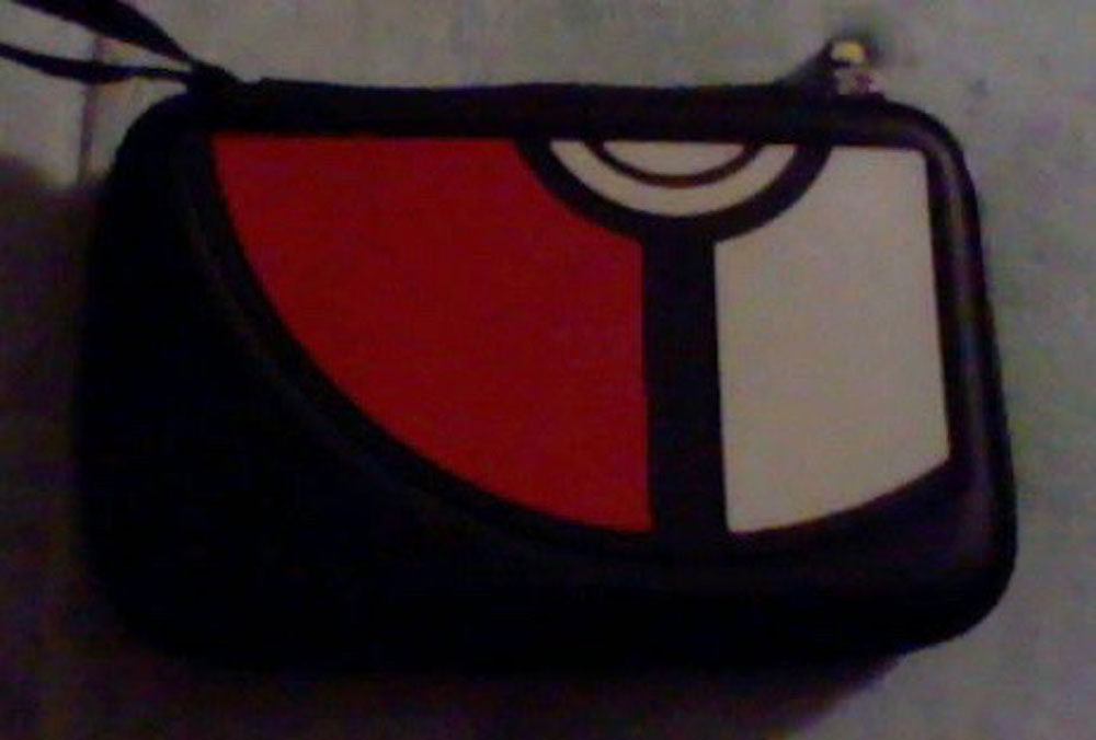
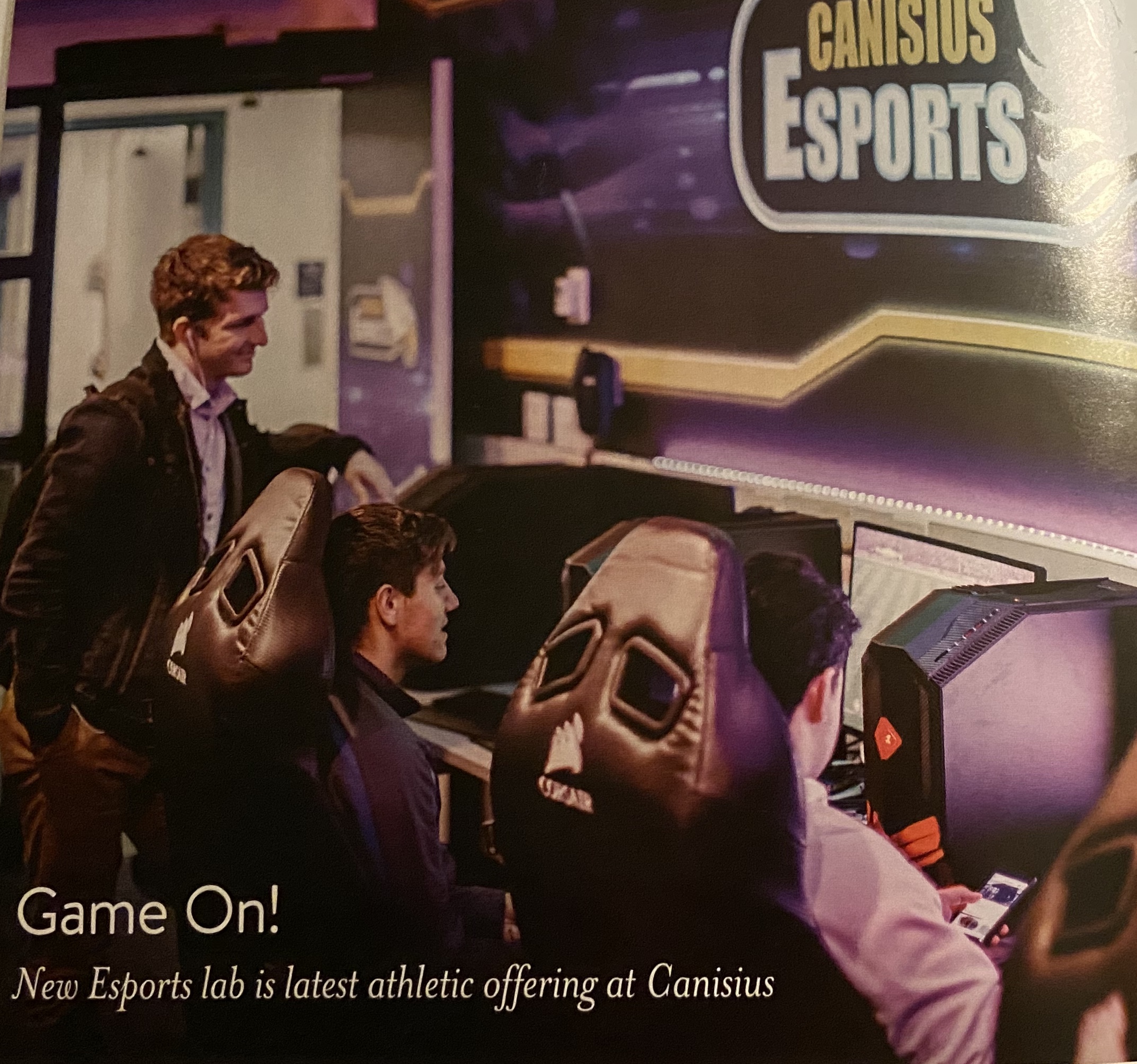
I did not have a high-quality camera I could use from the school for this part, so instead I made the comparison using an extremely old, low-quality camera such as a 3DS camera, and a better, higher-quality camera such as my iPhone 11 camera. The differences are very apparent; the 3DS camera creates smaller files, while also having poor lighting quality and blurred colors or details. A lot of the faces in the magazine are hard to see, and the colors are not clean or clear. Also, in the photo of my 3DS case, you can see it is quite grainy too. The camera is not meant for taking amazing photos. However, the photos taken by the iPhone 11 are clearer and cleaner. They do not blur colors together and the lighting shows the difference of angles and details. You can see where the item is closer to the light and where it is not.
3DS Photo3DS PhotoiPhone 11 PhotoiPhone 11 PhotoLow-quality VS. High-quality
The effect of scanned resolution on image sizes and more.
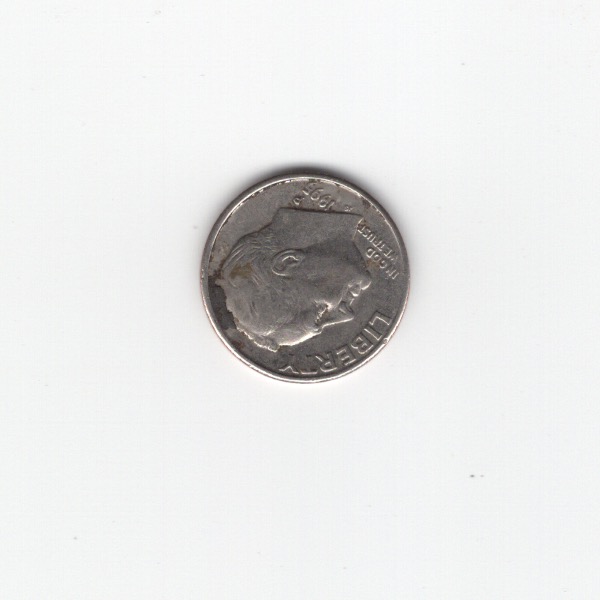
Some of the effects of scanning in something and the terms of the image size is: Some images are much more crisp or outlined if it is a harder material object, such as a coin. However, photographs or drawings tend to look extremely light when scanned, possibly because of the light hitting the paper and the paper being quite thin? When scanning in an item, to gain more focus on my item, in the scan menu I draw a box around the item I want to focus on, so if some images seem quite large it is possibly from that.
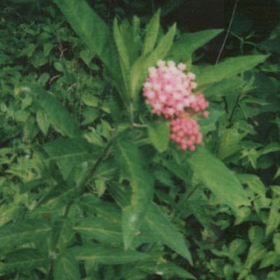
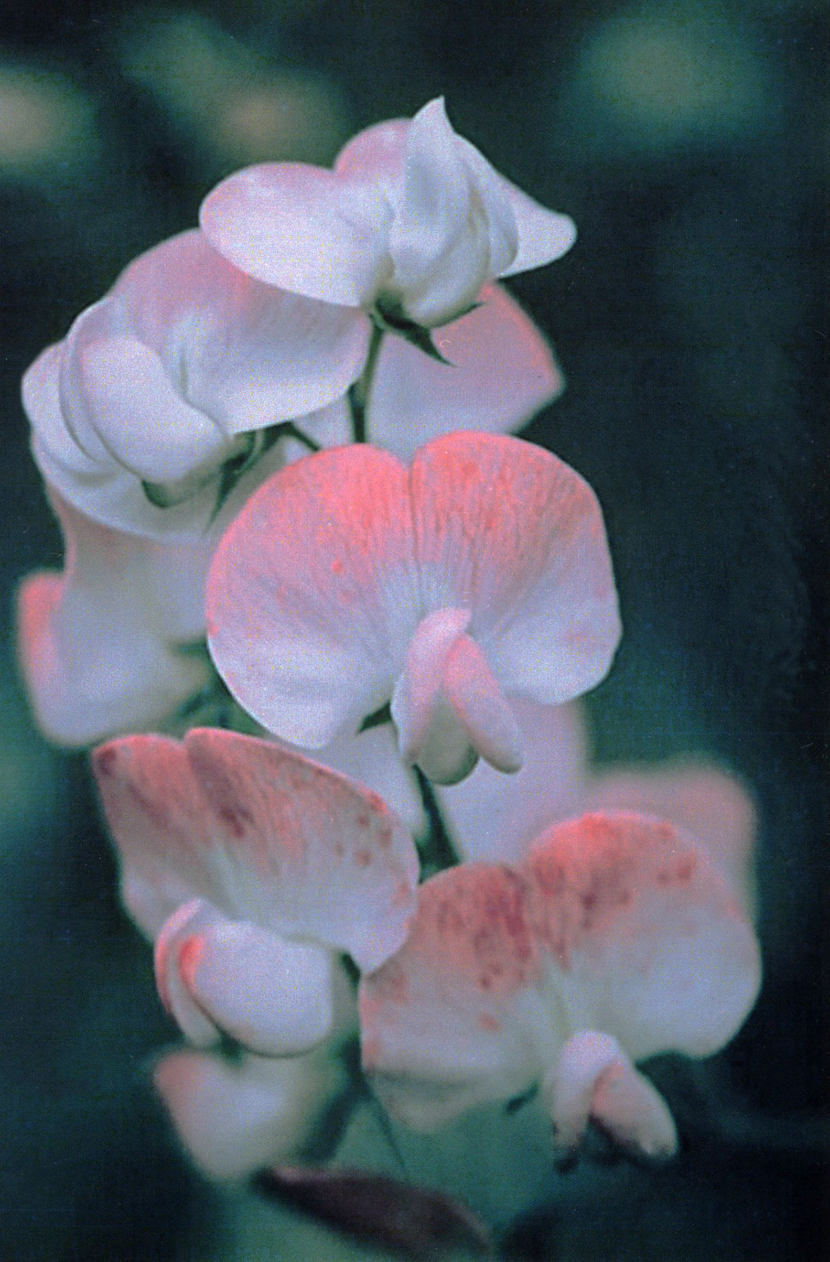
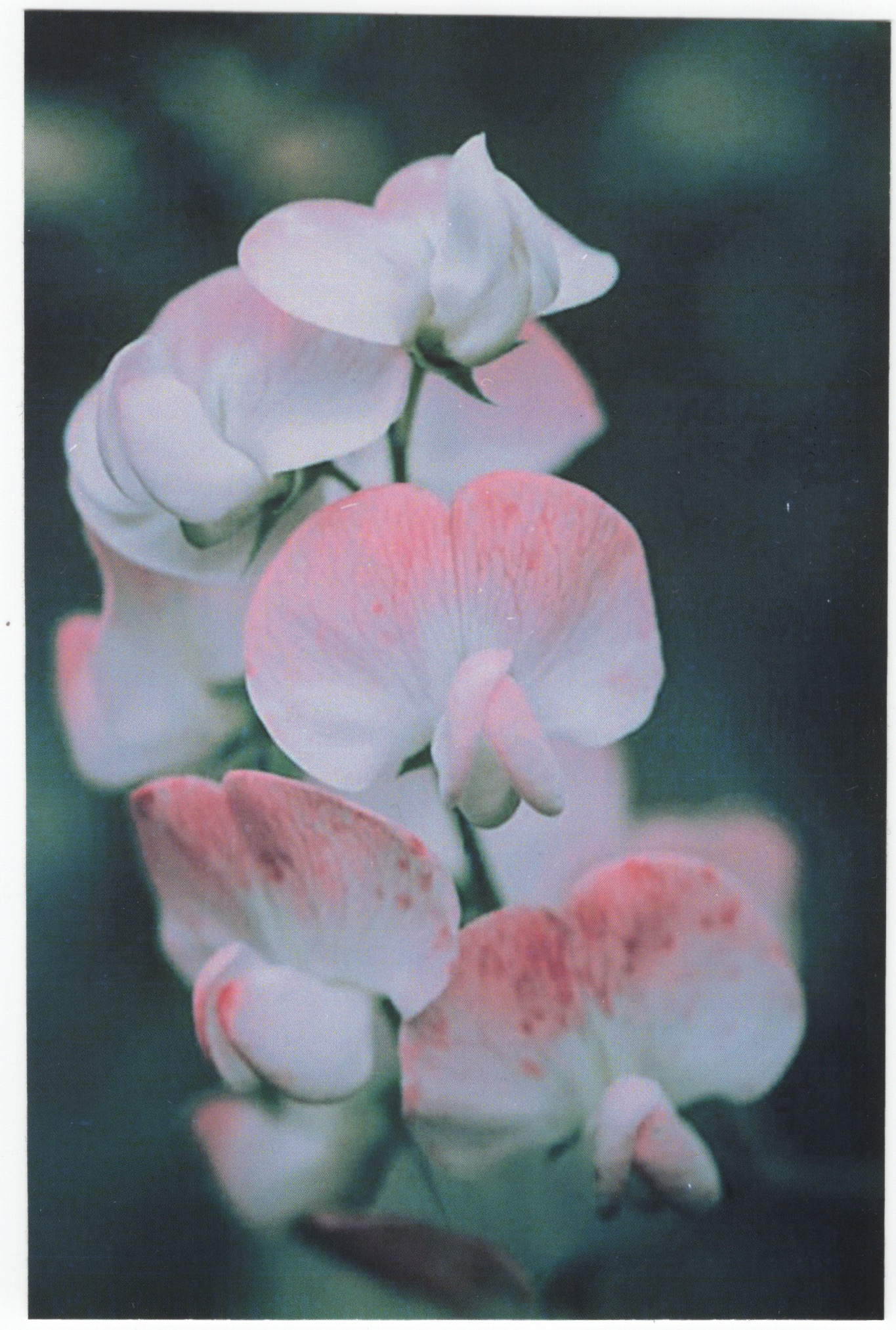
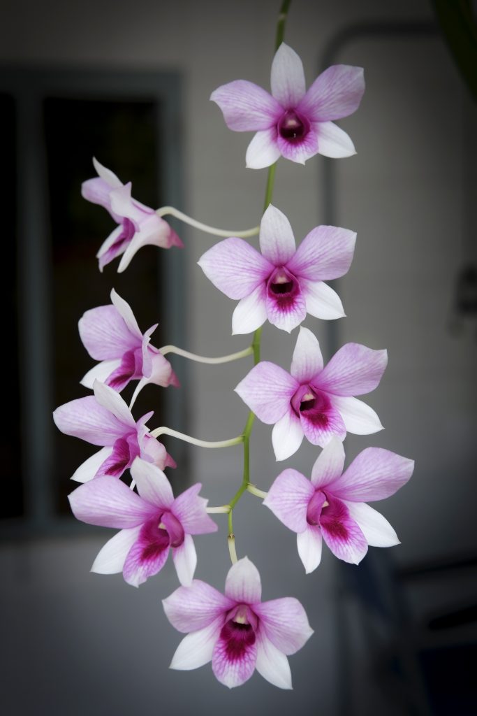
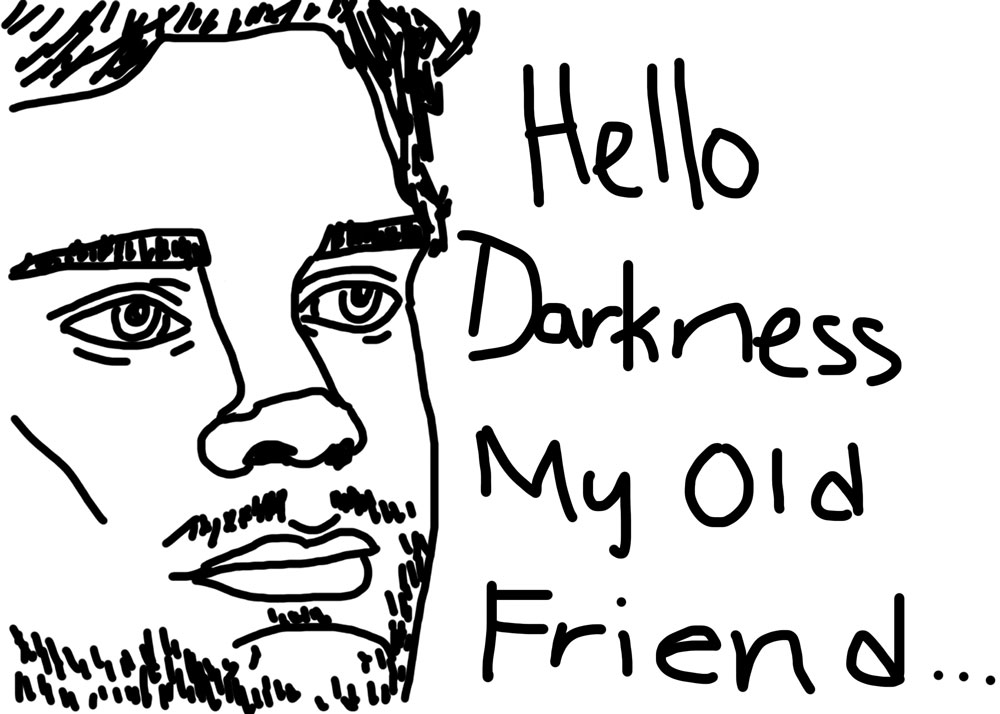
Scan of dime: It’s a dime.Scan of Drawn Image: It’s a doodle of me.Scan of Photo from Magazine: It’s some Canisius photo?Scan of photograph: It’s an orchid (Favorite Flower)Effects of Scanning in Items
How to setup a new file dimensions.
For setting up this files dimensions, I made sure that the picture wouldn’t be considered too large for the blog, but I also went based off of a meme image I had saved somewhere. Not only did I have a blast with this, but I also discovered that drawing with a mouse is horrible and that drawing tablets are an amazing thing. You may have to check a website’s rules on how big a file can be, or the size requirement for uploading a file. I made sure my file would not be more than 2 Megabytes (MB), which is bigger than a Kilobyte (KB) but smaller than a Gigabyte (GB)! Some websites may not upload your photos, and give you an error message saying “Photo couldn’t be uploaded since the size was too small/too big.” and may give you your minimum sizes and maximum sizes.
I learned how to take photos with a low-quality camera and a high-quality camera. I also learned how to correctly use a scanner for this lab. I learned a bit more about dimension sizes for a new file, as well as the different resolutions for scanned photos.
The easiest part was getting the photos and scanning them into the computer. It was also super easy taking the photos I needed.
I had a hard time finding objects to take photos of or items to scan in. I don’t really own any magazines, so I had to use a Canisius College magazine.
I could have used better objects for this lab for a fact, had I had access to better objects.
I actually had no issues with this lab.
I can use my knowledge of cameras and scanners later on for when I have to scan in work for a project and more.
I used a few works by other artists on unsplash, who took beautiful photos of orchids, which I currently can’t take photos of any since mine died by the paws of my cat.
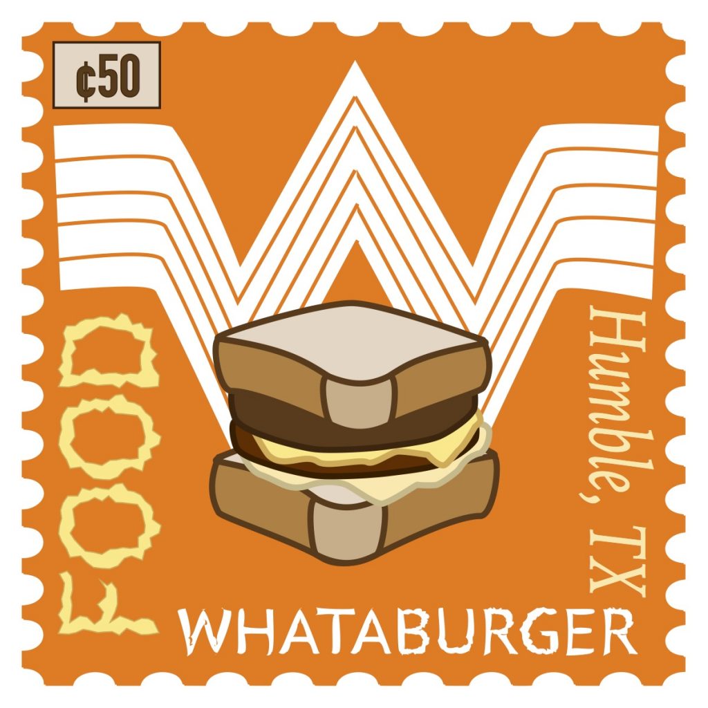
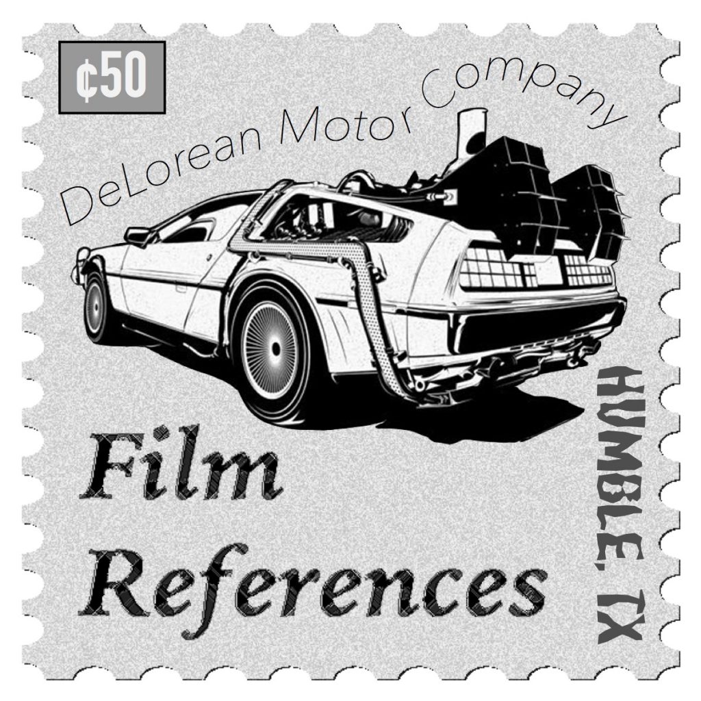
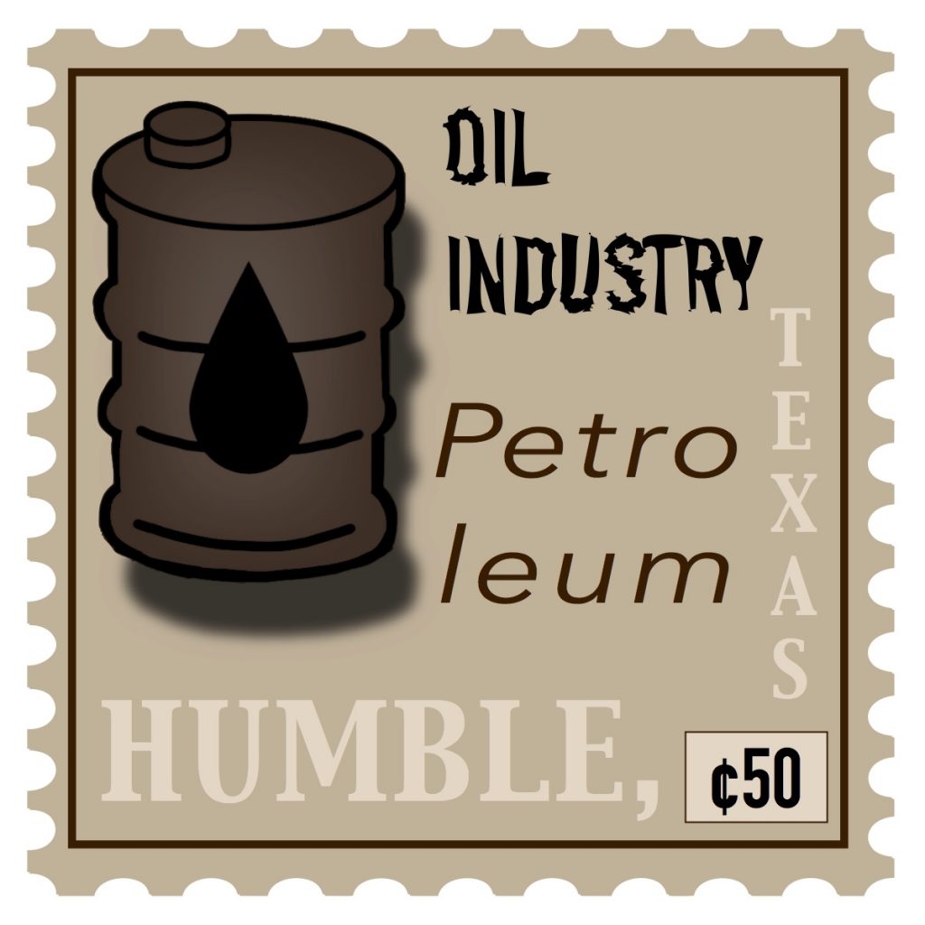
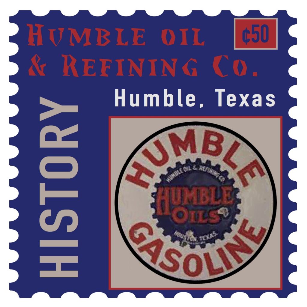
I learned how to differentiate between different fonts, as well as how to make my fonts type on a line, how to type them and roughen them (or even apply different effects to them like tweak or zig-zag), and I learned a bit more information about Humble, Texas. I also learned how to correctly make a vector image, which is a very nice skill to have!
The easiest parts of the project were deciding the place, finding the correct information, and then finding images that could go onto the stamps. I also managed to find a stamp template online that worked very well in Illustrator.
The most challenging part was deciding between Photoshop and Illustrator. I first started in Photoshop, not only with my images but also because I thought it was the easiest to do. Then, when that failed, I decided Illustrator was the best option.
How could your submission be improved? I think I could have done a bit more in terms of the background looking better, maybe should have added a few more details or images. I think it looks quite basic, but then again not many people will admire stamps.
I definitely suggest teaching about vector images! It’s a very helpful tool, as it’ll save people who draw their own art for the projects. Or even including a stamp template, or how to make it look like a stamp instead of it just being a square.
How might you apply your knowledge in future assignments or work scenarios? If I ever want to create my own stamps for mail, this seems like a wonderful thing to use in the future! I also plan to keep doing vector images and the typing style, as the typing style is super fun!
I honestly was inspired by my trip to Texas back in 2018. I originally was going to do Venice, Italy, but I was looking at some of the photos and videos I made with friends and I instantly decided on Humble, Texas. It’s right on the outside of Atascocita, Texas, and is quite close to Houston, Texas.
What I learned from this project is how to create patterns, and how to find some of the nature textures in Photoshop. I also learned how to correctly shade to try to make the heart look like a realistic heart of stone.
The easiest parts of this project were figuring out what colors to use, what tools to use to create the spotting for the stones, and using a reference image for the heart’s shape.
The challenging parts of this project were correctly shading the heart to make it look realistic, and finding a realistic texture in photoshop for the pattern used.
I could improve this a lot by making the background not so bright and irritating to the eyes compared to the colored foreground. I could also improve my shading and my pattern a bit more.
To improve the assignment for the next class, I suggest helping them find better realistic examples of these short metaphors, or even by allowing a bit of flexibility when a metaphor doesn’t always have a realistic looking image. (Mine was actually a bit hard to make look realistic, since the hearts aren’t really a human heart shape.)
I can apply the knowledge I gained from this project in future assignments or work scenarios by using the photoshop tools to correctly cut out an object (whether you use the magnetic lasso tool and then the select and mask tool, or if someone uses something different) and having it help with selections while filling in objects (like with drawings!)
For this project, I learned how to use gradient meshes, as well as how to use different brush types in order to make a galaxy or to make stars. I also learned all the different types of color combinations such as Analogous, Complementary, Split-Complementary and Triadic.
The easiest part about the project was knowing how to use shapes and coloring in Illustrator. I used Illustrator back in high school, so the knowledge I used in the past helped a lot with this project! I also enjoyed the advanced option for the toolbar, as I’m used to it from the past Illustrators.
The challenging part about this project was correctly using the mesh tool, as well as if certain objects had strokes, I wouldn’t be able to tell right away. What I also found difficult was just thinking about what colors I could work with. I’m grateful for the color guide tool, since it helped me with which colors I’d need with a certain color scheme.
I honestly wish I could have done some of the stars a bit differently in my Urban landscape. Maybe I could have used the brush options I discovered later on. How the assignment could be improved for the next class is by showing some of the students the different ways they could use the mesh tool, or that the color guide is a big help in showing the different groups if they want to use a specific color.
I plan to apply the knowledge from this project into other assignments or projects is by using the color guide to create eye-catching pieces, or to use it for other color schemes we may come across later on. I also like using the brushes, which I can definitely try out for a later project. The gradient mesh can help a lot with shading techniques, which I tend to struggle with, and maybe even some highlighted parts too.
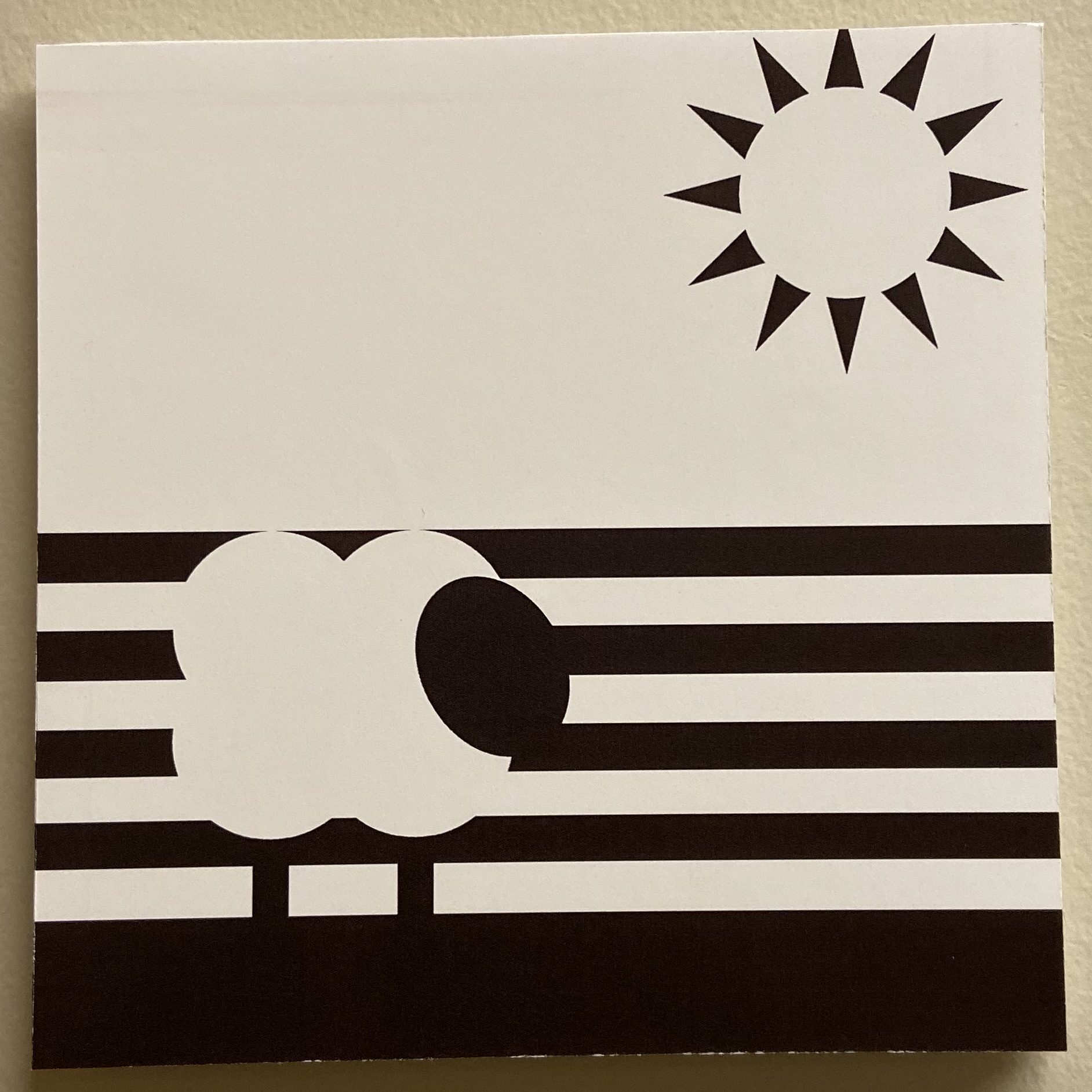
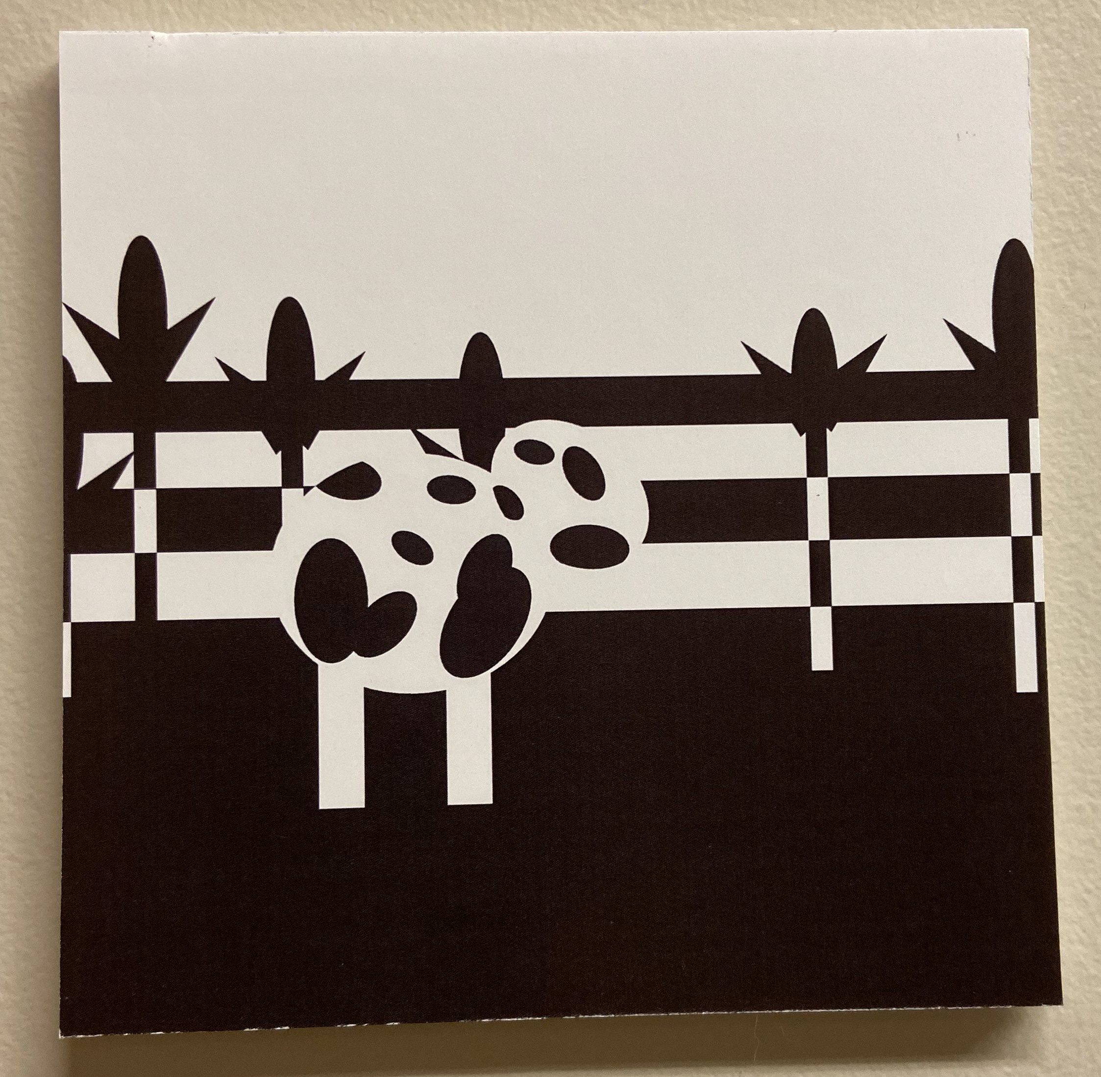
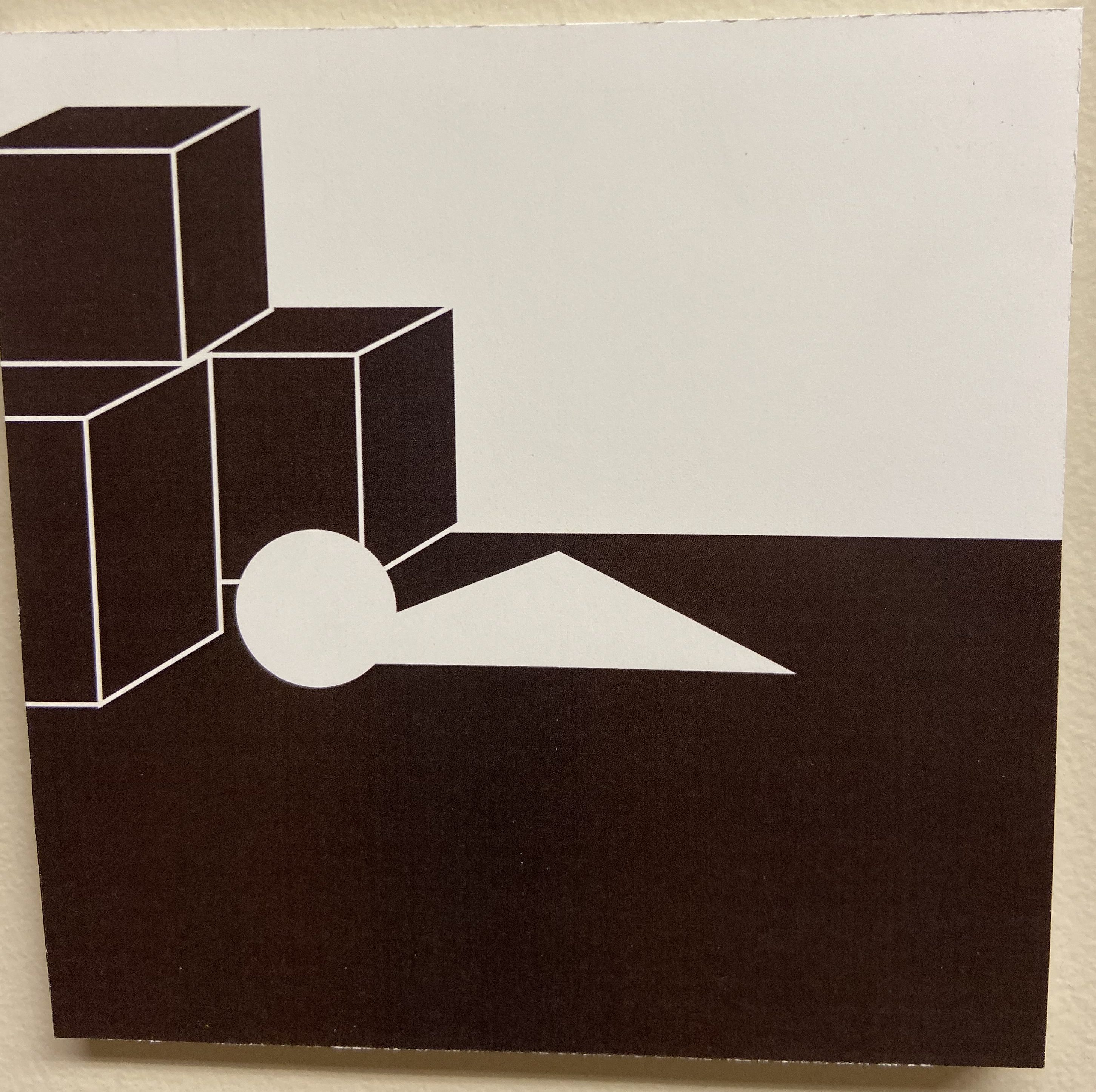
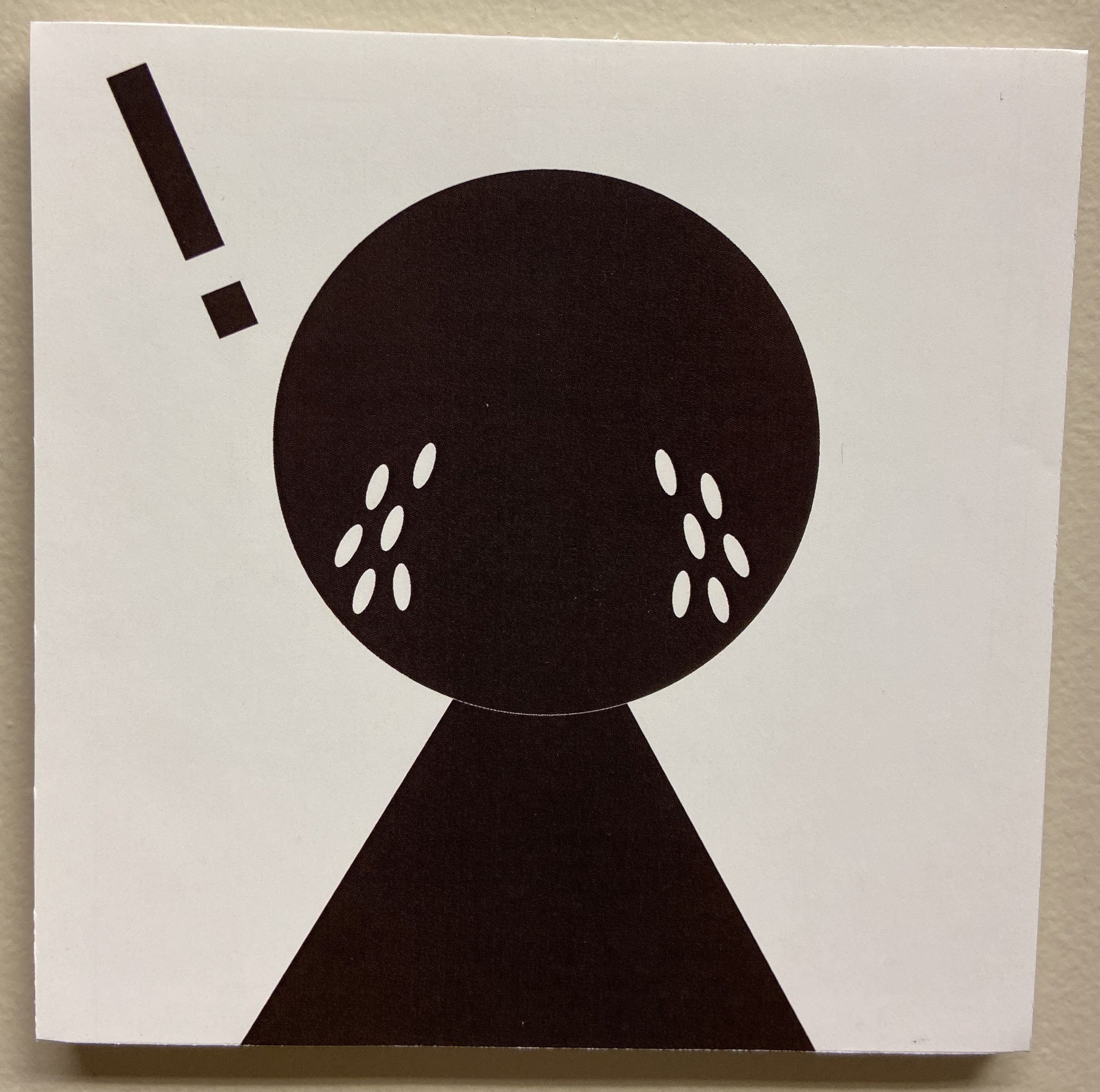
For this project, I worked in Adobe Illustrator. I did the nursery rhyme called “Little Boy Blue”. What I learned is the concepts of closure, continuation, multi-stability, and how to distinguish contrast in shape, and scale.
What I found easy was creating the shapes in Illustrator, filling the shapes, fixing the strokes of the shapes, and creating separate layers. In terms of printing and mounting, I found printing the artboards out easy as well as adding the sticky adhesive to the papers.
What I found challenging in this project was before, I was trying to think of a good nursery rhyme. Then, I had a hard time thinking of how I can successfully show this rhyme with shapes. In Illustrator, sometimes I had a difficult time doing closure or doing continuation. In terms of printing and mounting, I had a hard time with getting foam board and cutting it all out. It was hard trying to get the correct size and keeping the edges of each square straight.
How my submission could be improved is probably trying to use less shapes to interpret the rhyme, or maybe even moving the positions of the shapes. Scaling some shapes could help too. I believe putting the work on a black board could make it look amazing too.
In terms of improving the assignment for the future, I would include way more examples of how the nursery rhymes should look, or maybe even some help with how to successfully do closure or continuation in Illustrator/Figma. Shortcuts for the programs help as well!
How I’ll apply my knowledge to future assignments is that you can create something interesting with less shapes rather than making stuff very, very detailed. Closure can help with making logos or using continuation can help with creating logos for stuff too.
Some of the slideshows and the one example given from a past student helped me to get a better understanding of how a project could potentially look.
Little boy blue, come blow your hornThe sheep’s in the meadow,The cow’s in the corn.But where is the boy Who looks after the sheep?He’s under a haystack, Fast asleep.Will you wake him? No, not I – for if I do, he’s sure to cry.
From Project 3, I learned how to create a video-game with the application Unity. The easy parts of this project were finding the different textures for different items such as trees, grass and also creating the mountains for the game. The most challenging part of this was trying to find the correct files to make my game function properly. My submission could have been improved if I was able to submit it on time, unfortunately the files cause the game to not work at first, and so I had to seek out help. How I could improve the assignment for the next class is by adding in enemies to the game. Although, I don’t know how to do that just yet, I think I’d have a blast doing that. How I can apply my knowledge from this project to other projects is by knowing how to work with other game creating programs and being able to find all the textures and such. Any video games that I’ve played have helped inspire me to create the game that I did. I greatly enjoyed this project.
Vinny and I learned how to use many of the Adobe applications for this project. The easiest part about this project was probably making the music in garageBand and recording videos. The most challenging part of this project was editing the video and using Adobe Premiere. We could’ve added transitions, we could have included a better emotion for the project but I guess you could say this certainly fits the college experience. I know that if I were to use this for another class, I would certainly fix it. If I were to use my knowledge for future assignments it would certainly help with animation projects and editing these animation projects. For Vinny, it would probably help him out with film-making and such. The labs were helpful for this project.