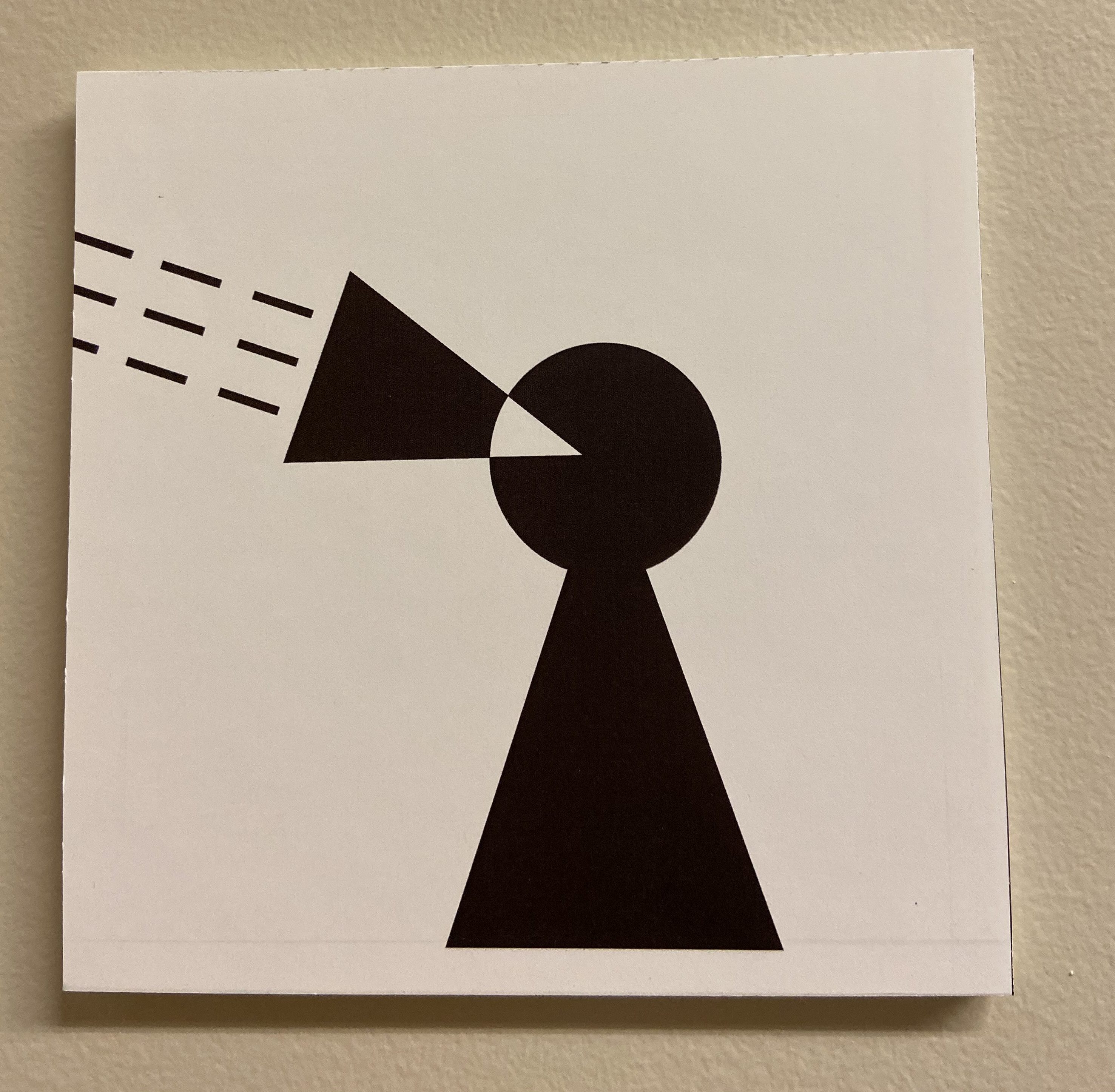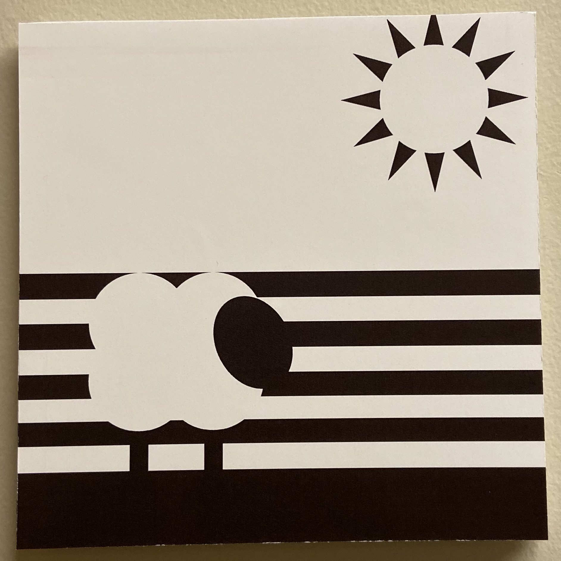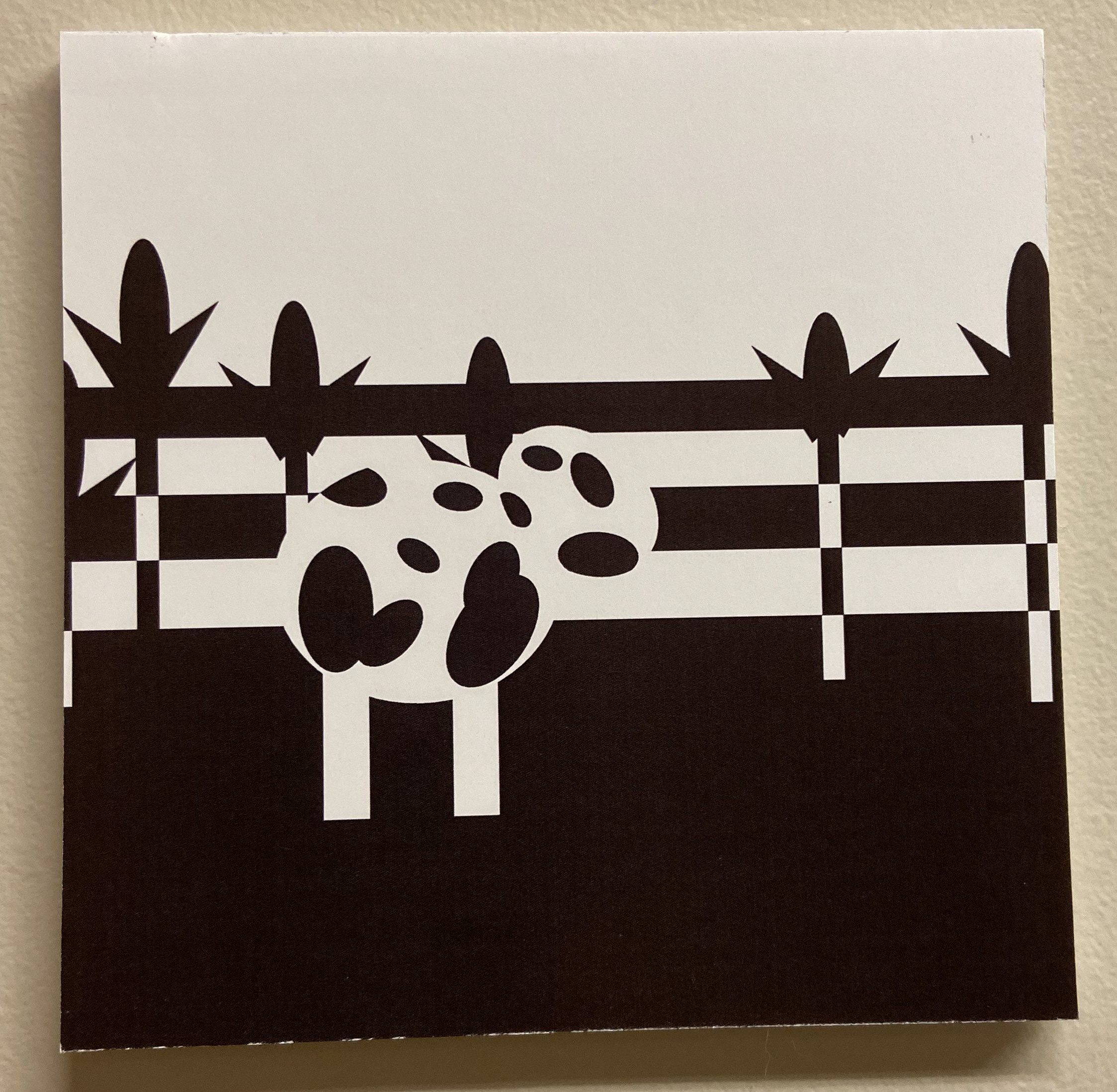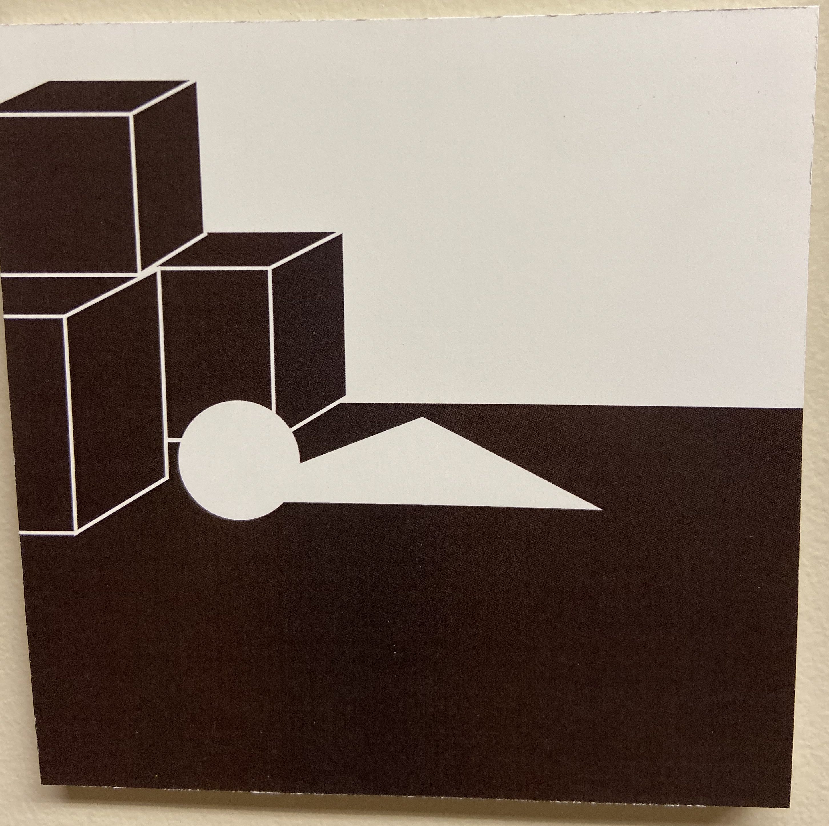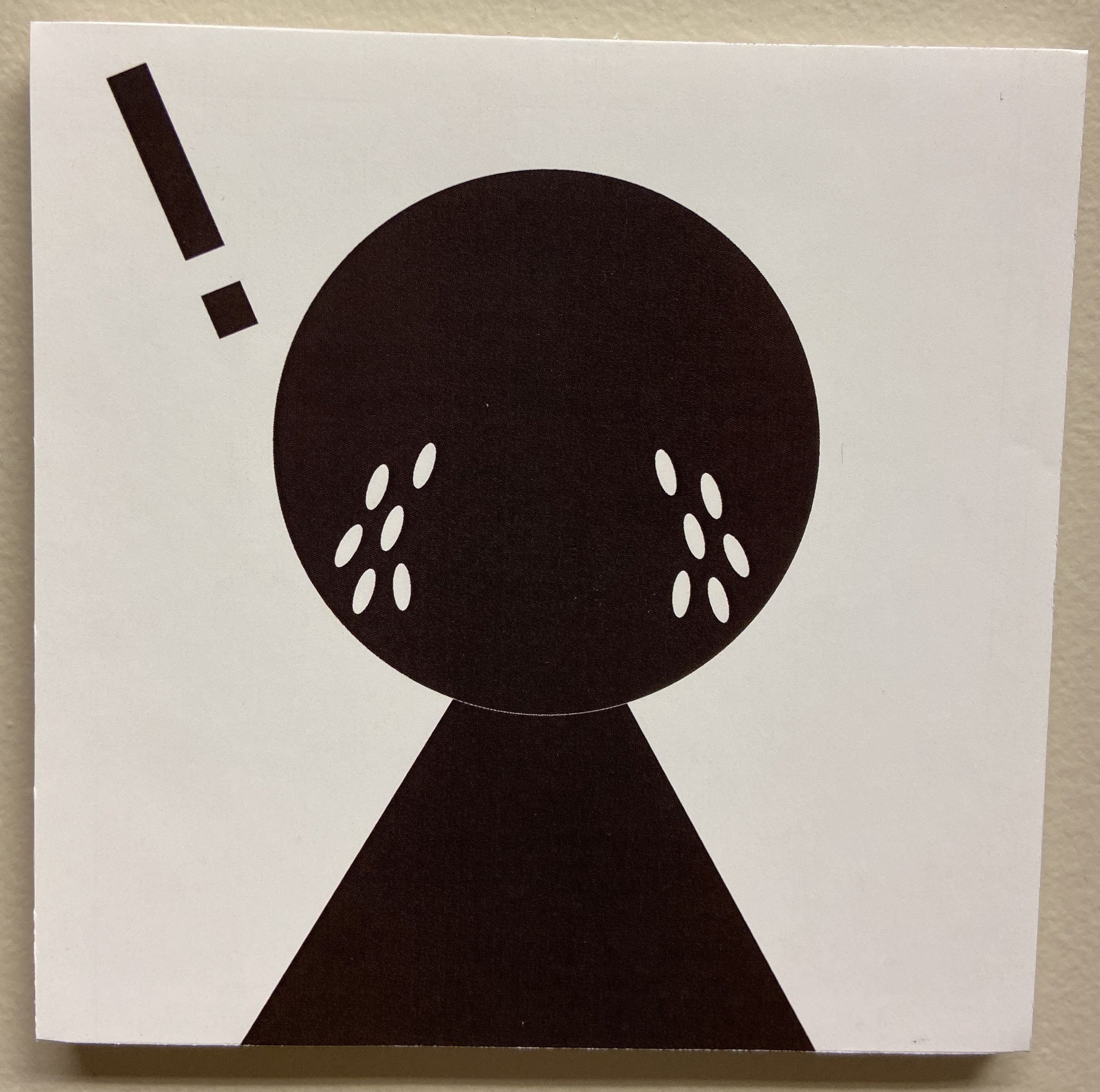
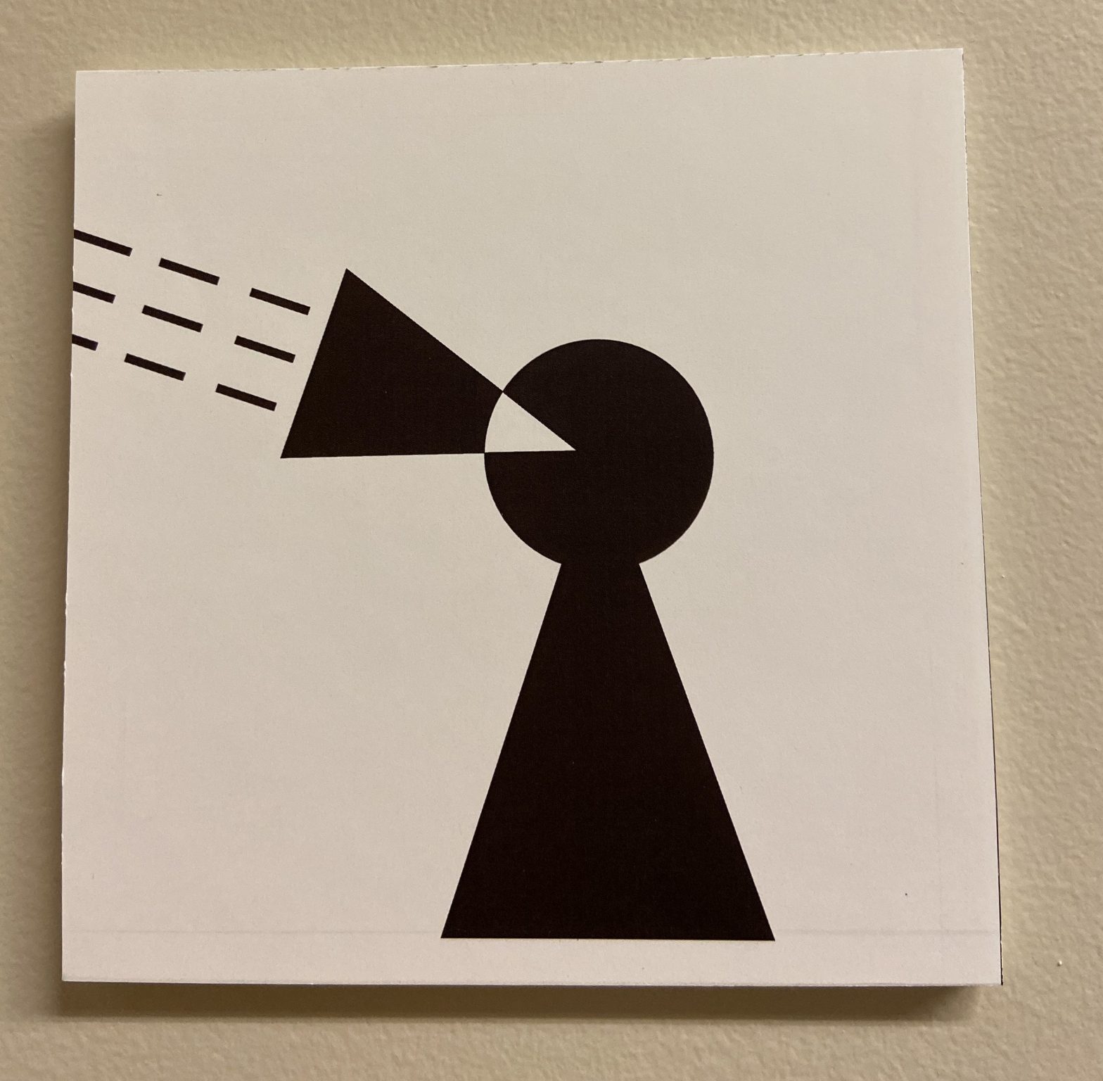
For this project, I worked in Adobe Illustrator. I did the nursery rhyme called “Little Boy Blue”. What I learned is the concepts of closure, continuation, multi-stability, and how to distinguish contrast in shape, and scale.
What I found easy was creating the shapes in Illustrator, filling the shapes, fixing the strokes of the shapes, and creating separate layers. In terms of printing and mounting, I found printing the artboards out easy as well as adding the sticky adhesive to the papers.
What I found challenging in this project was before, I was trying to think of a good nursery rhyme. Then, I had a hard time thinking of how I can successfully show this rhyme with shapes. In Illustrator, sometimes I had a difficult time doing closure or doing continuation. In terms of printing and mounting, I had a hard time with getting foam board and cutting it all out. It was hard trying to get the correct size and keeping the edges of each square straight.
How my submission could be improved is probably trying to use less shapes to interpret the rhyme, or maybe even moving the positions of the shapes. Scaling some shapes could help too. I believe putting the work on a black board could make it look amazing too.
In terms of improving the assignment for the future, I would include way more examples of how the nursery rhymes should look, or maybe even some help with how to successfully do closure or continuation in Illustrator/Figma. Shortcuts for the programs help as well!
How I’ll apply my knowledge to future assignments is that you can create something interesting with less shapes rather than making stuff very, very detailed. Closure can help with making logos or using continuation can help with creating logos for stuff too.
Some of the slideshows and the one example given from a past student helped me to get a better understanding of how a project could potentially look.