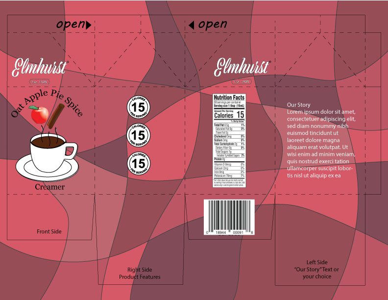
Here is my rendition of the Oat Apple Pie Spice Creamer container. The second I read apple, I thought of the color red so I instantly wanted to use a variety of red shades as the pattern. Besides that I just found some vector images from the site that was given that I thought looked nice. Overall, there isn’t much to say about the decisions I made. I took the advice of my peers and fixed the logo for the carton and changed the text to white, so that it would be easier to read with the darker background.