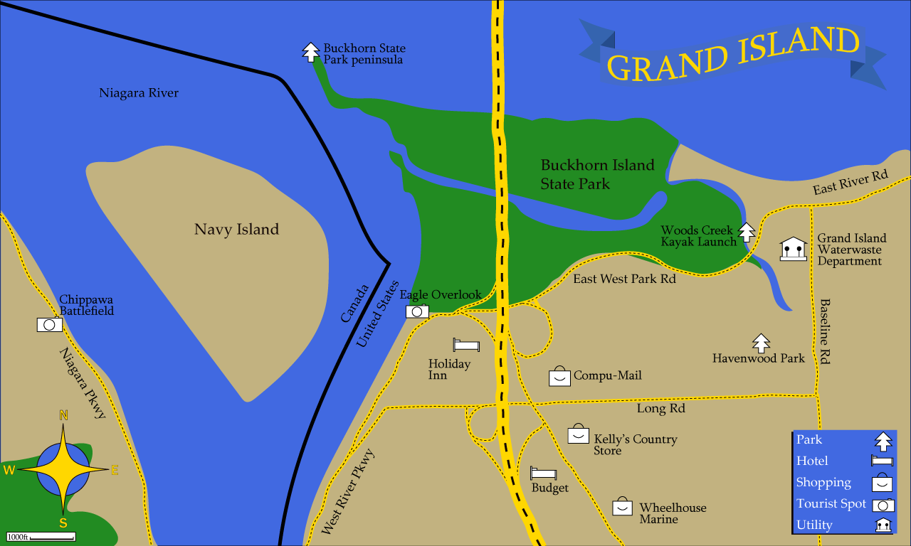
For my map info-graphic, I decided to do the northern part of Grand Island. I went with the blue and yellow colors to match the Grand Island School’s mascot. The hardest part of this entire process, was getting the right shape for Buckhorn Island State Park.
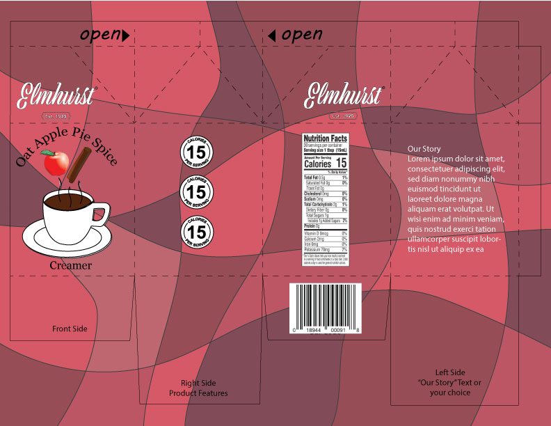
Here is my rendition of the Oat Apple Pie Spice Creamer container. The second I read apple, I thought of the color red so I instantly wanted to use a variety of red shades as the pattern. Besides that I just found some vector images from the site that was given that I thought looked nice. Overall, there isn’t much to say about the decisions I made. I took the advice of my peers and fixed the logo for the carton and changed the text to white, so that it would be easier to read with the darker background.
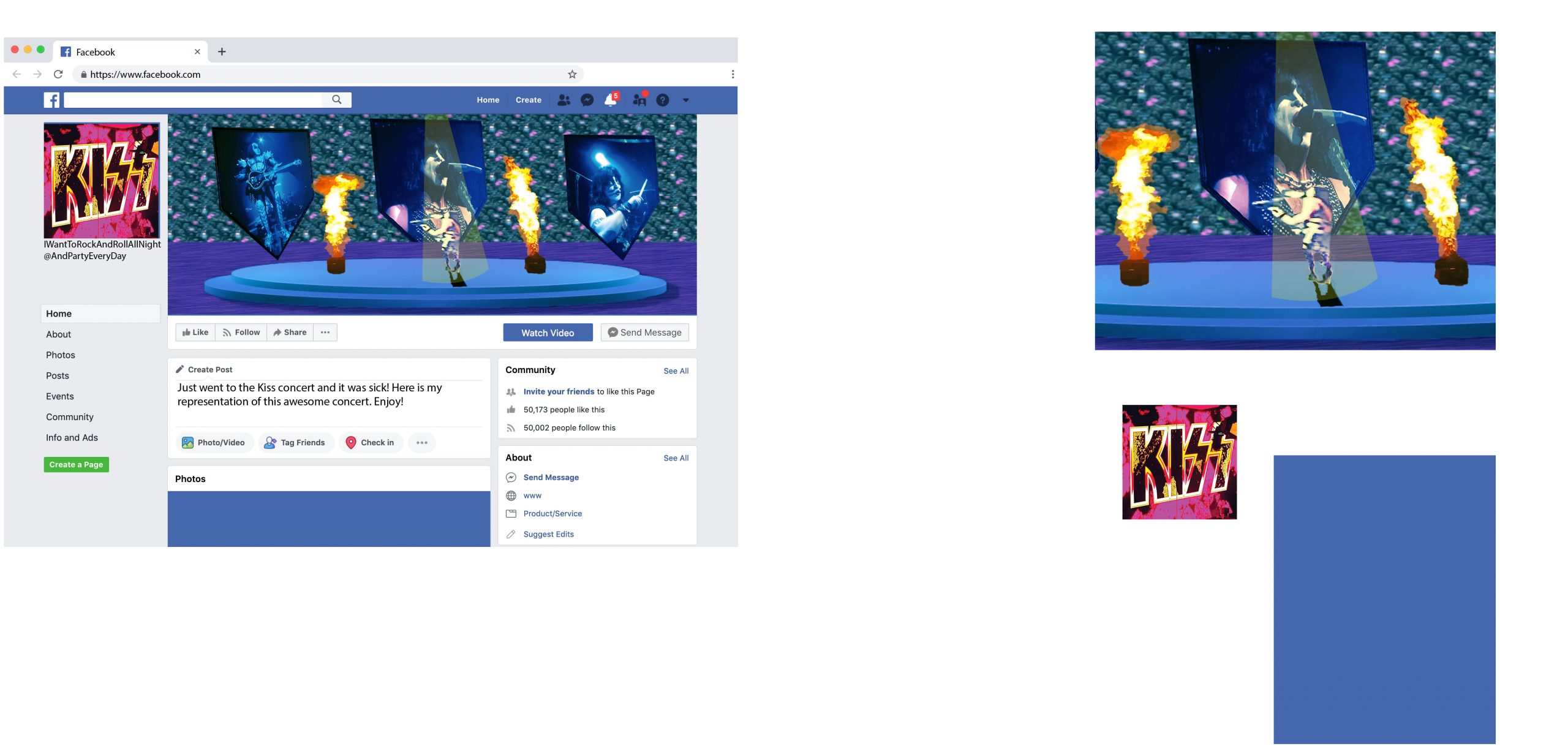
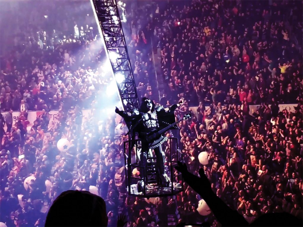
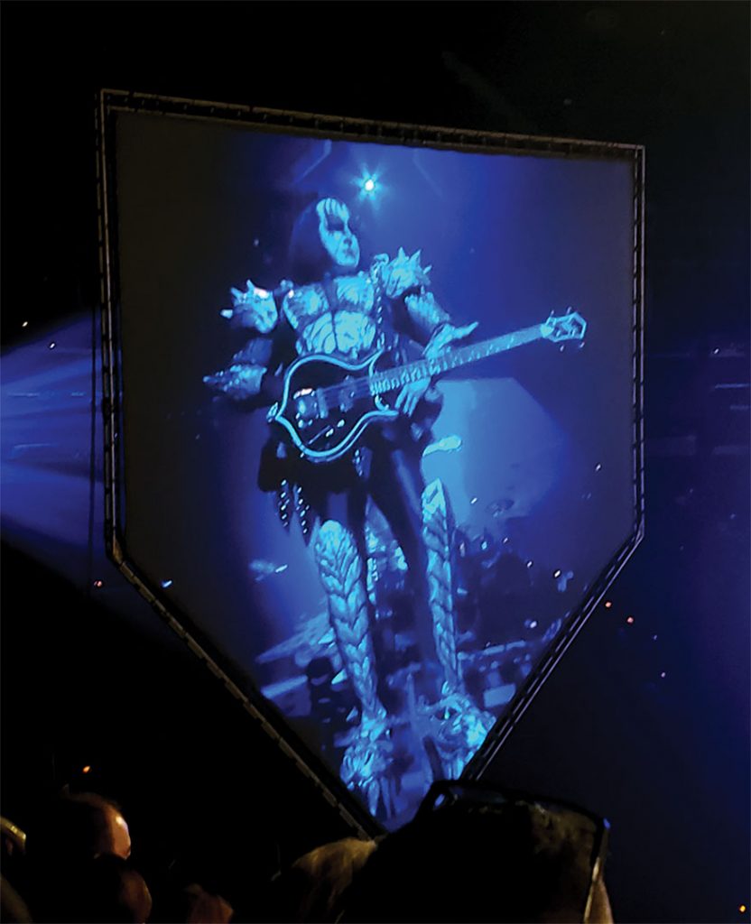
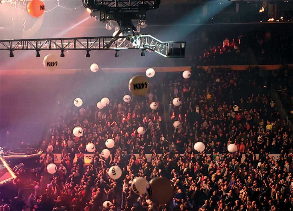
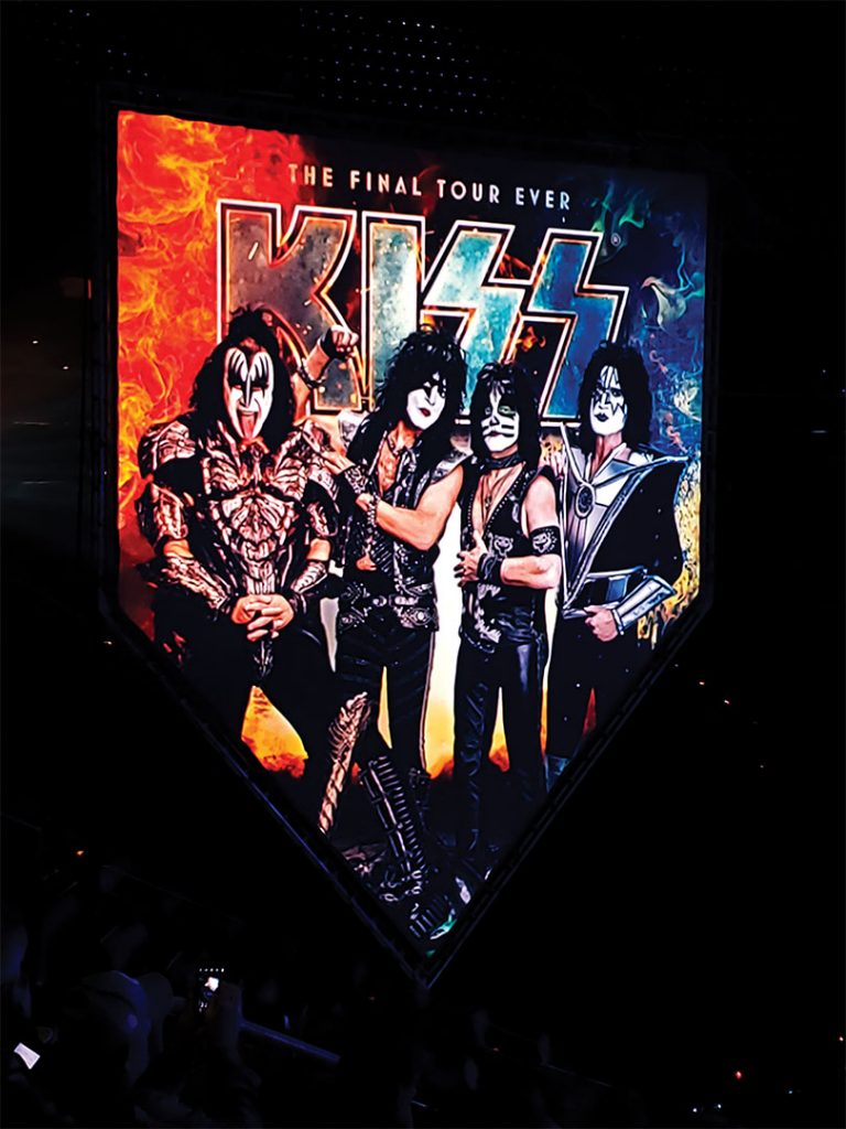
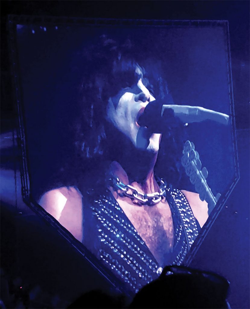
Here is my image composition based on the pictures that I touched up from Project 1. I decided to make it a “fan-made” picture rather than a realistic image composition. The hardest part of this project was coming up with the idea. All of the pictures I had were pretty blurry because it was a live concert and there was smoke and other things ruining the quality of the pictures. A clearly fake looking concert was really the only option I could take without producing a bad composition. Besides that, the actual making of the composition wasn’t too rough. Be sure to check the name of the fake Facebook profile that I made. I got a couple laughs out of that one.
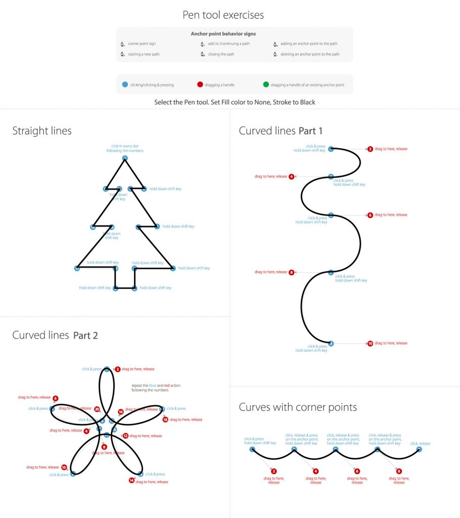
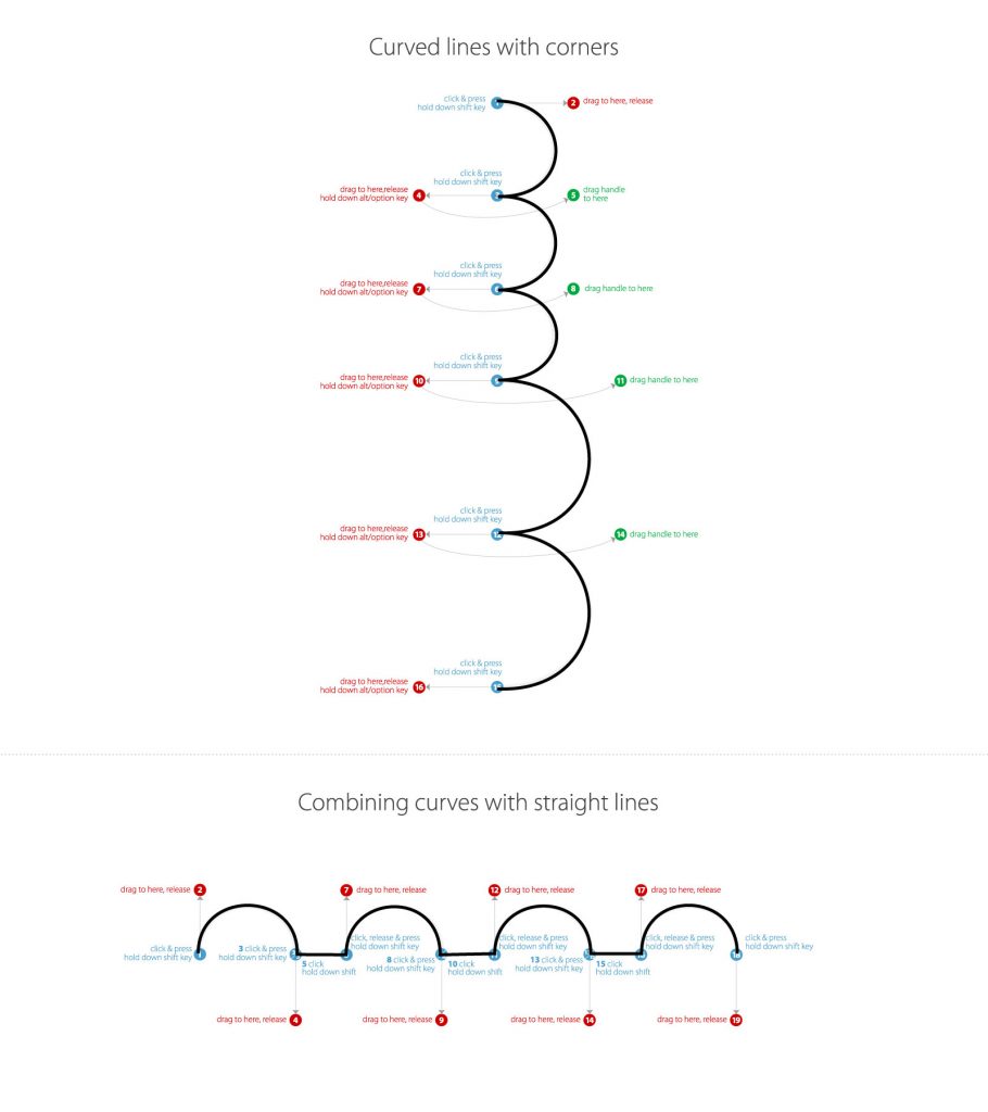
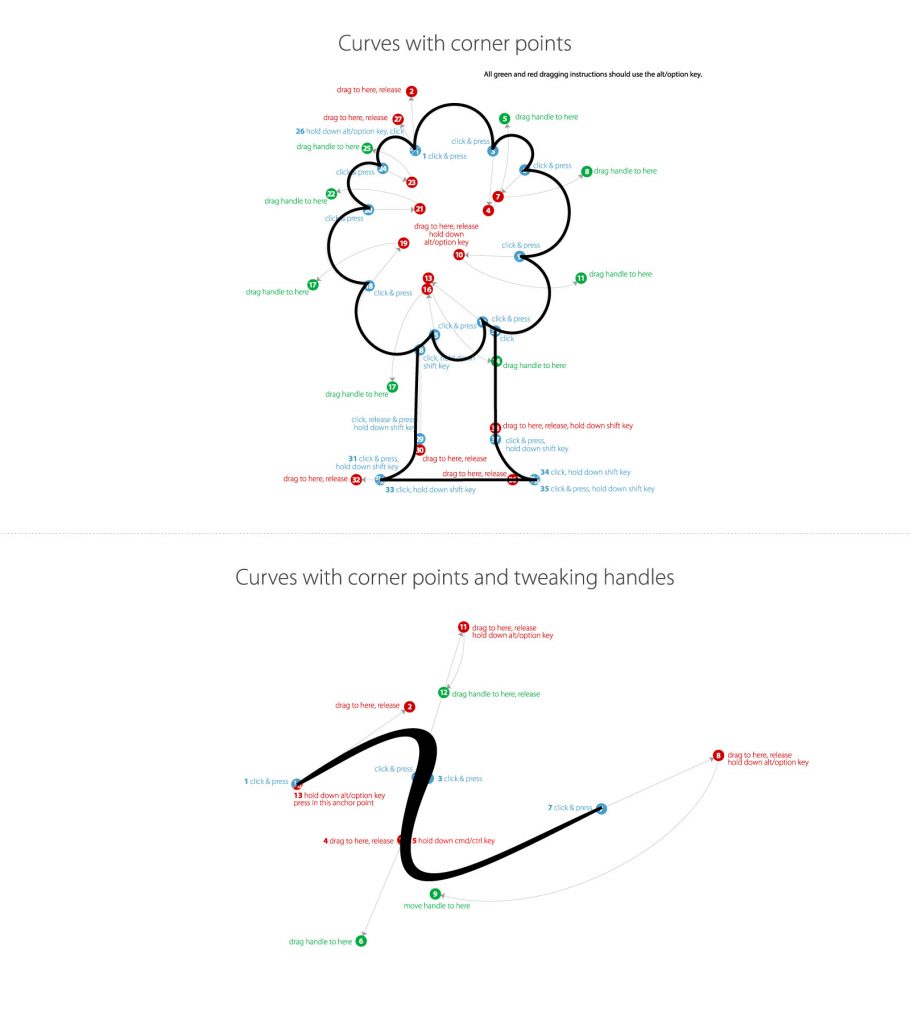
These exercises are exactly what I have been waiting for in this class. I’ve used photoshop and other similar programs for a small amount of time, and my biggest problem was trying to figure out the pen tool. After doing all 3 pages of these exercises, I can already see the improvement and I have already used these skills for the next project.The last two curves on the first exercise of this page I could not get doing the conventional way. The curves were too small no matter what I did, so I just moved further past the red points and it turned out good. Other than that, this page was pretty easy.The hardest part about these exercises was figuring out what the wording wanted us to do. While most of it was self-explanatory, there were a couple of specific directions that didn’t make sense. After roughly 10 minutes I managed to figure it out and I think it turned out pretty well.
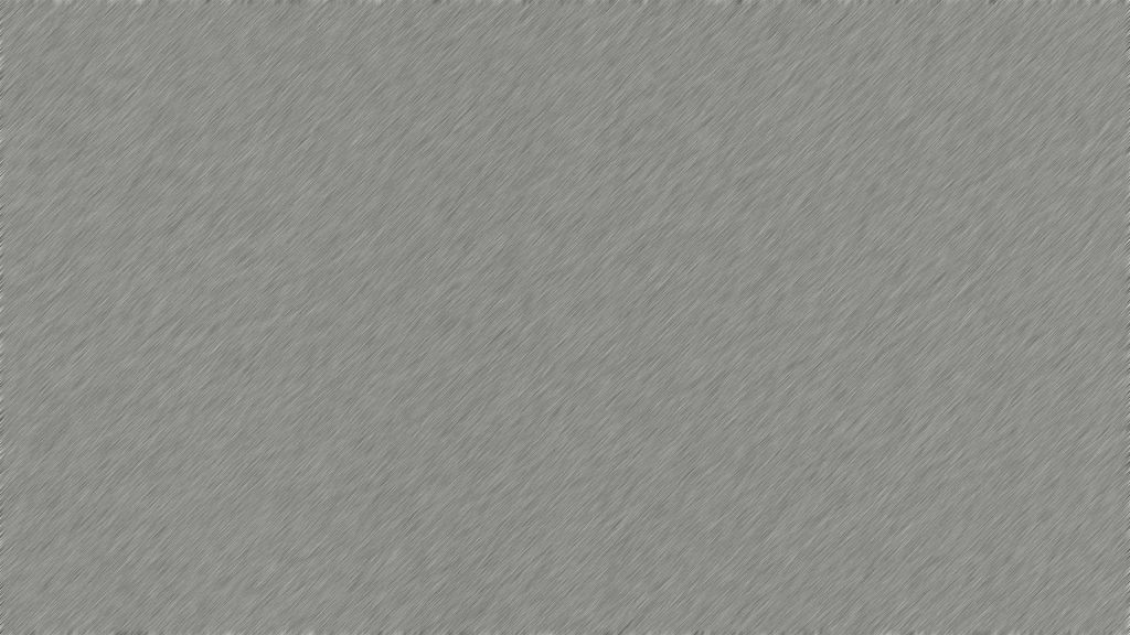
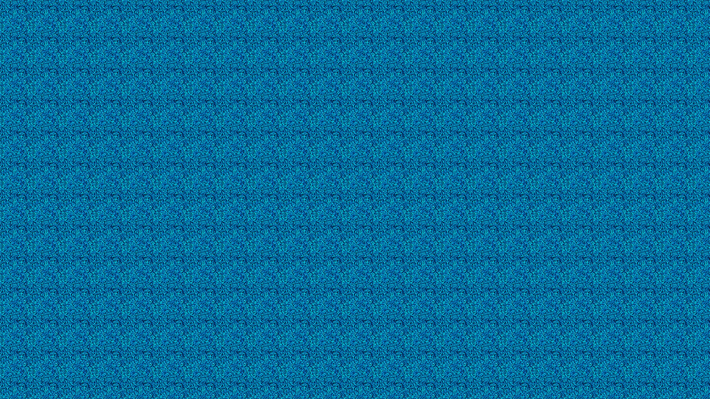
This is a combination of adding noise and a motion blur to create a brushed metal look. Looking at the texture now, I think i could have blurred it less. It looks more like just a cool background rather than metal. I do find it fascinating how you can combine all of these effects to create cool designs.This is a texture that I made with what I call “blue grass”. I got the image off of unsplash.com and took a small portion from it. I definitely think that I could have chosen a different area that had less drastic dark and light areas. While I did blur the edges, you can still see the square pattern to it.
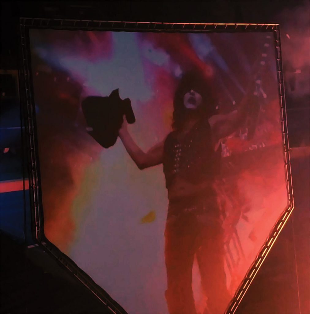
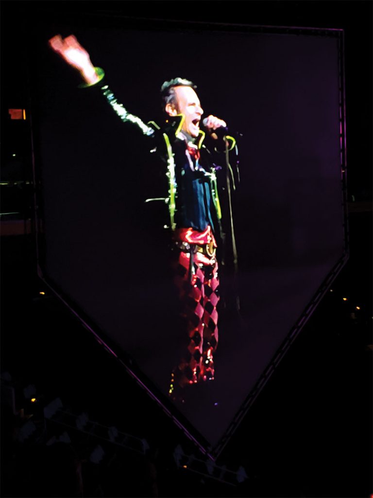
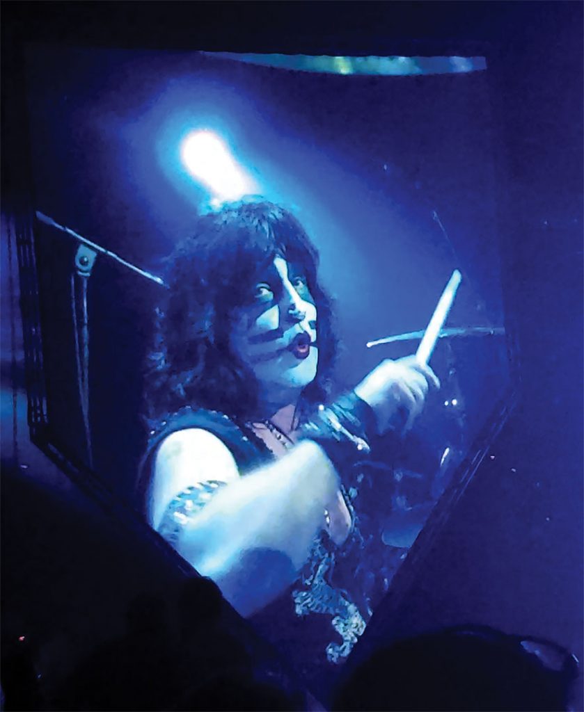
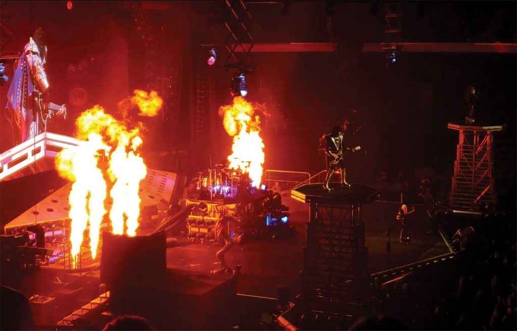
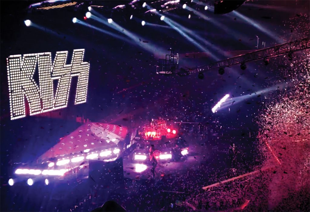
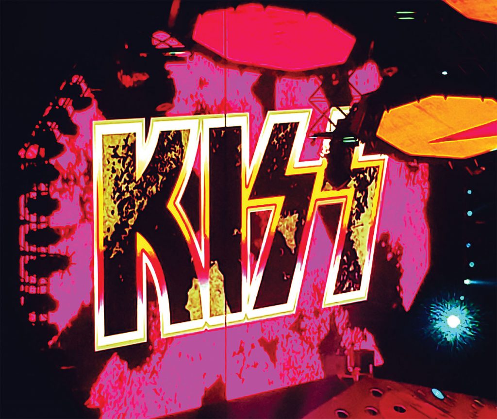
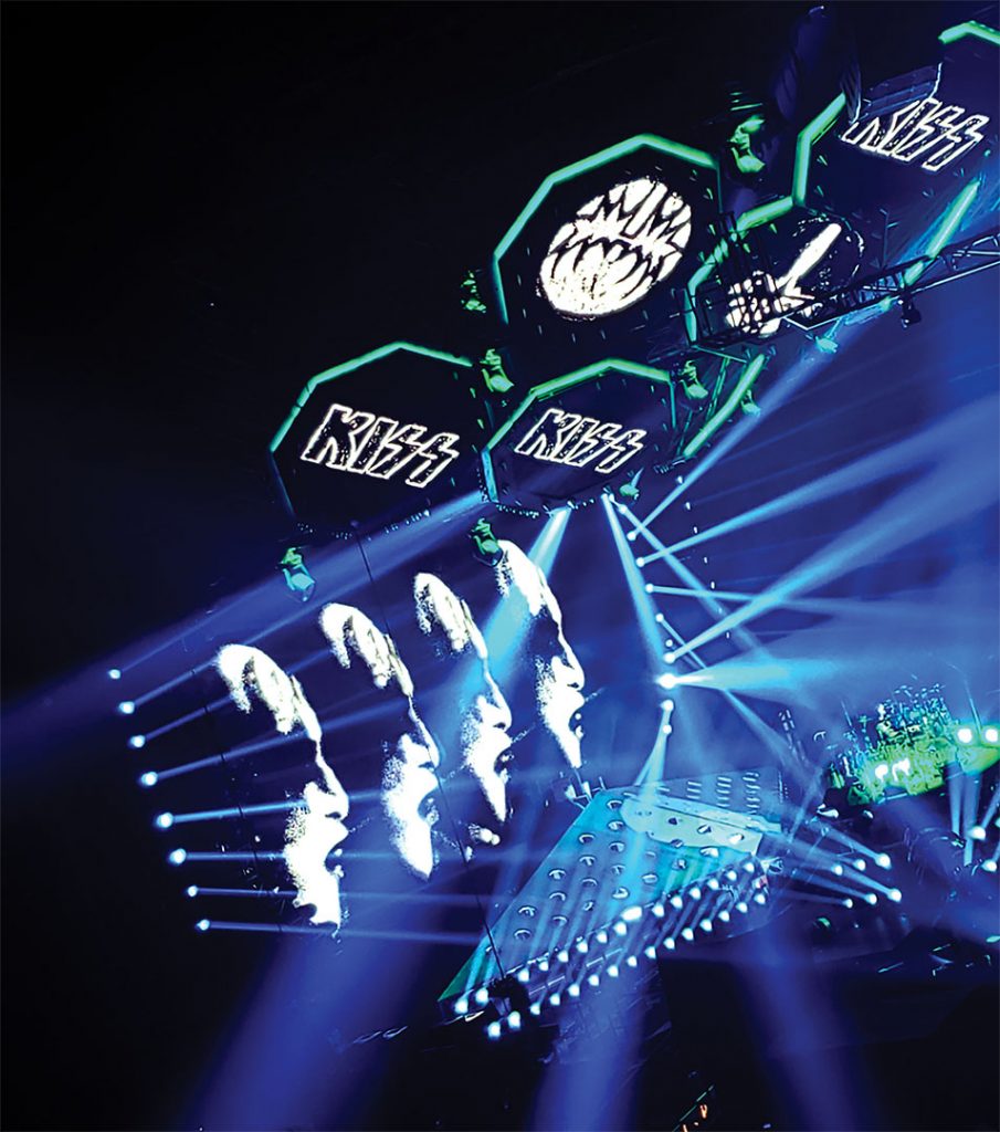
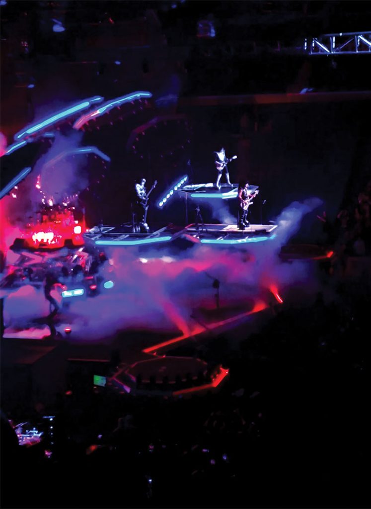
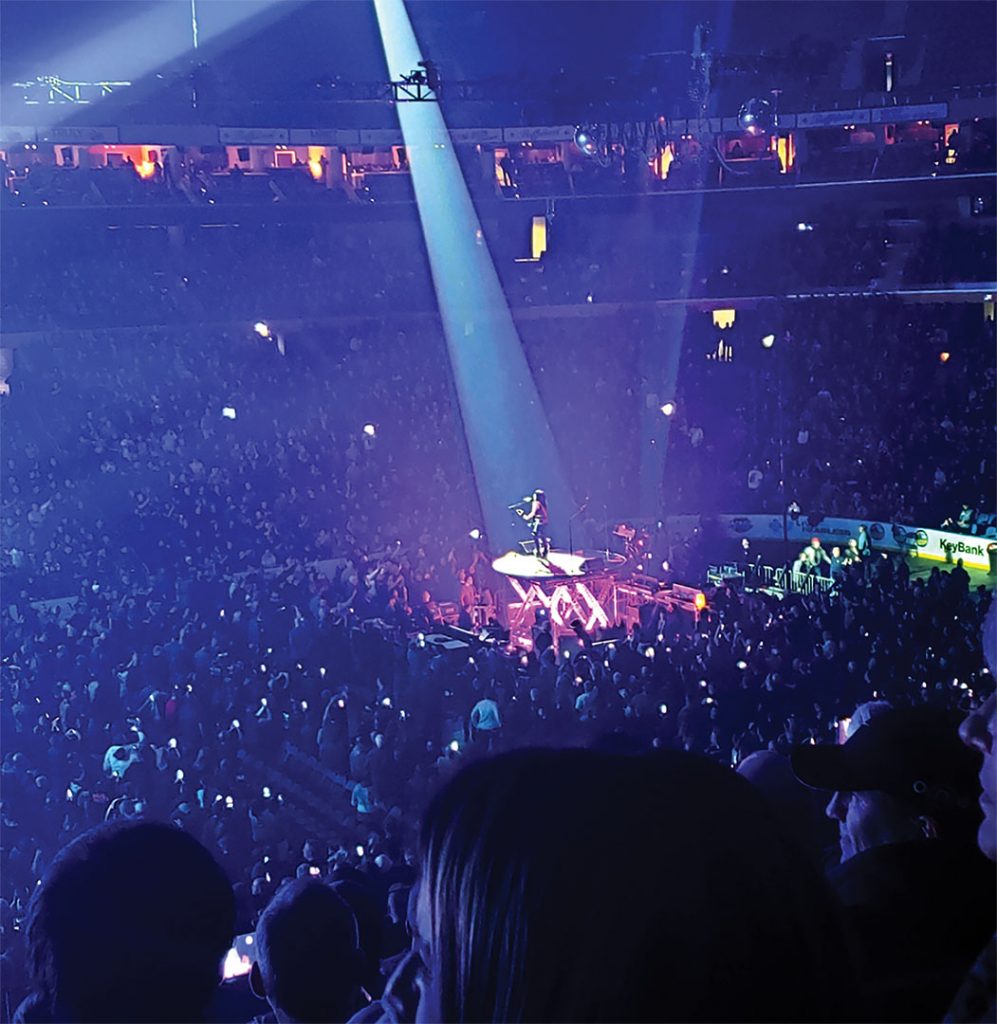
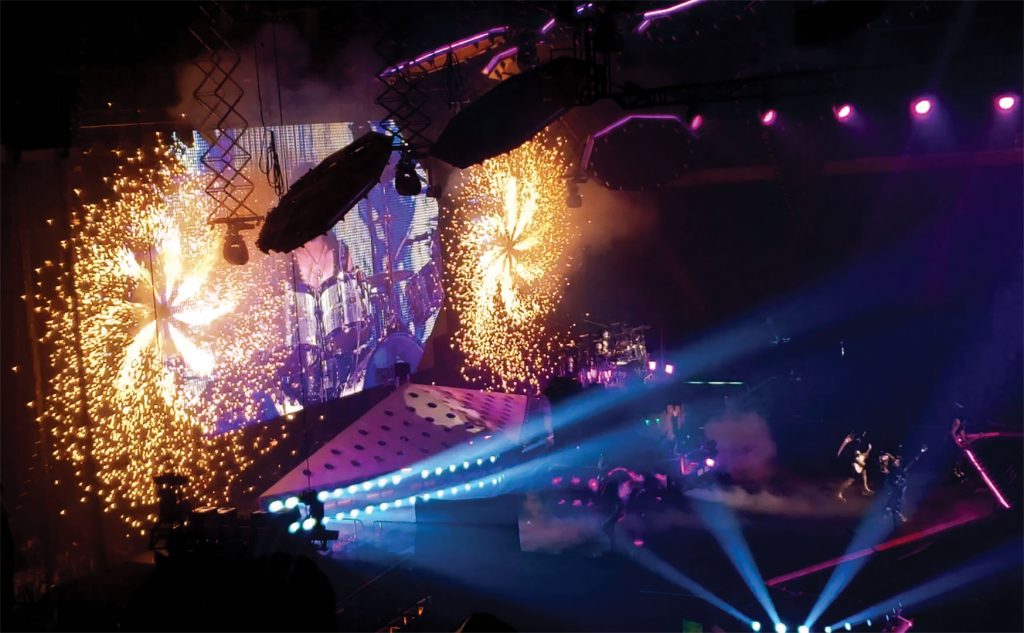
This Wednesday I went to the Kiss Concert. The show was great, with awesome music and cool stage effects. I felt that this would be the best topic to use for my project 1 gallery. I chose at least one picture for every part of the concert; from start to finish. However, the pictures shown aren’t in chronological order. The hardest part of this project for me was to get good enough quality pictures to touch up. By the end of the concert, I had roughly 50 pictures and videos to choose from. Unfortunately, many of them were unusable, due to the poor quality. There are still even a couple that I had to use, that were not the quality I wanted. One major cause of this was all of the smoke from their indoor fireworks display. Leaving the stadium was like driving through fog on an early morning. If I were to do this project again, I would probably avoid any event that will smoke up the stadium.
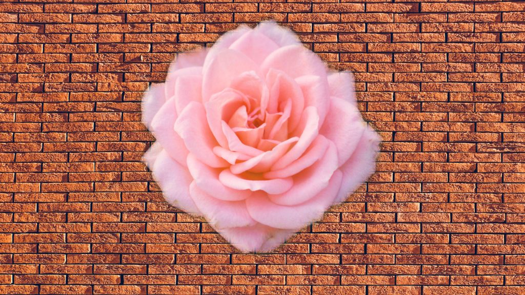
For this I had to use the magnetic lasso tool to select the outline of the flower. I then added a 10 pixel feather to when i deleted the rest of the picture to make sure that nothing but the flower was left.
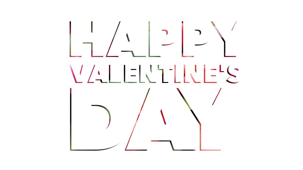
I actually reversed what I was supposed to do by selecting the letters as the mask for the background, rather than the other way around. Luckily, what came out of it was a really cool backdrop for the text.
These techniques that we learned how to do will definitely be useful going into further work. Besides that there isn’t much to be said, hopefully I will be able to effectively use what I learned to create something that I can be proud of.
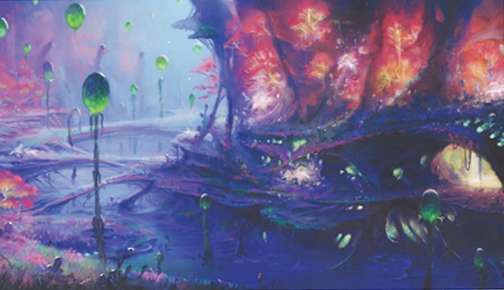
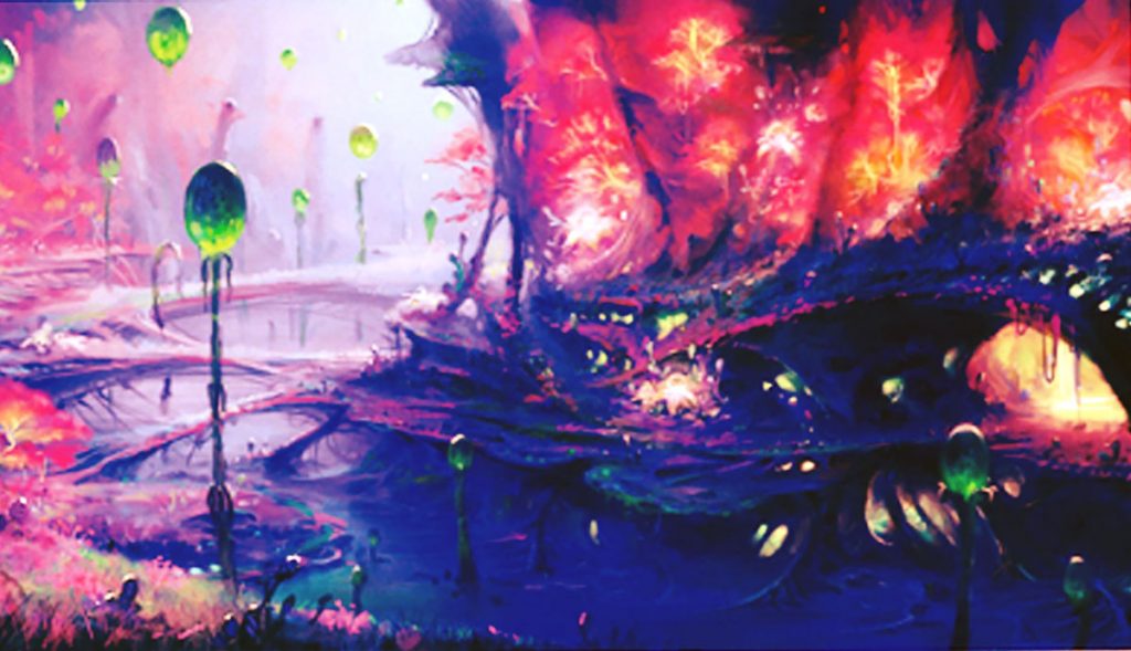
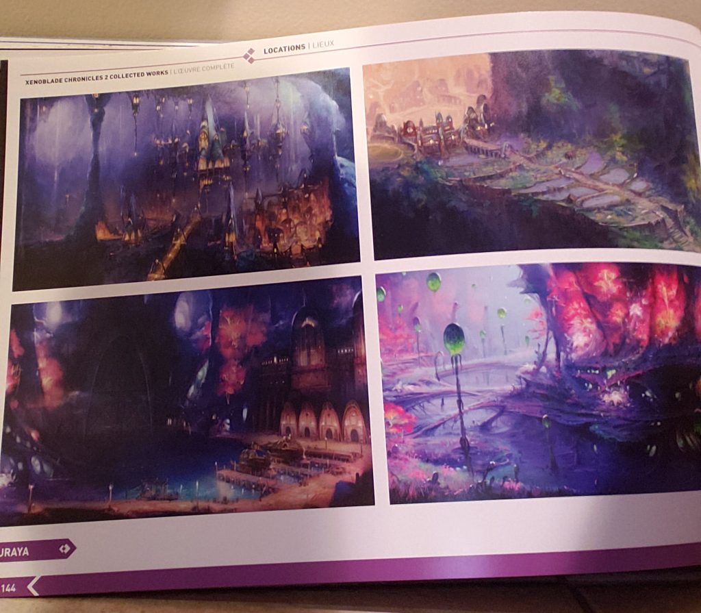
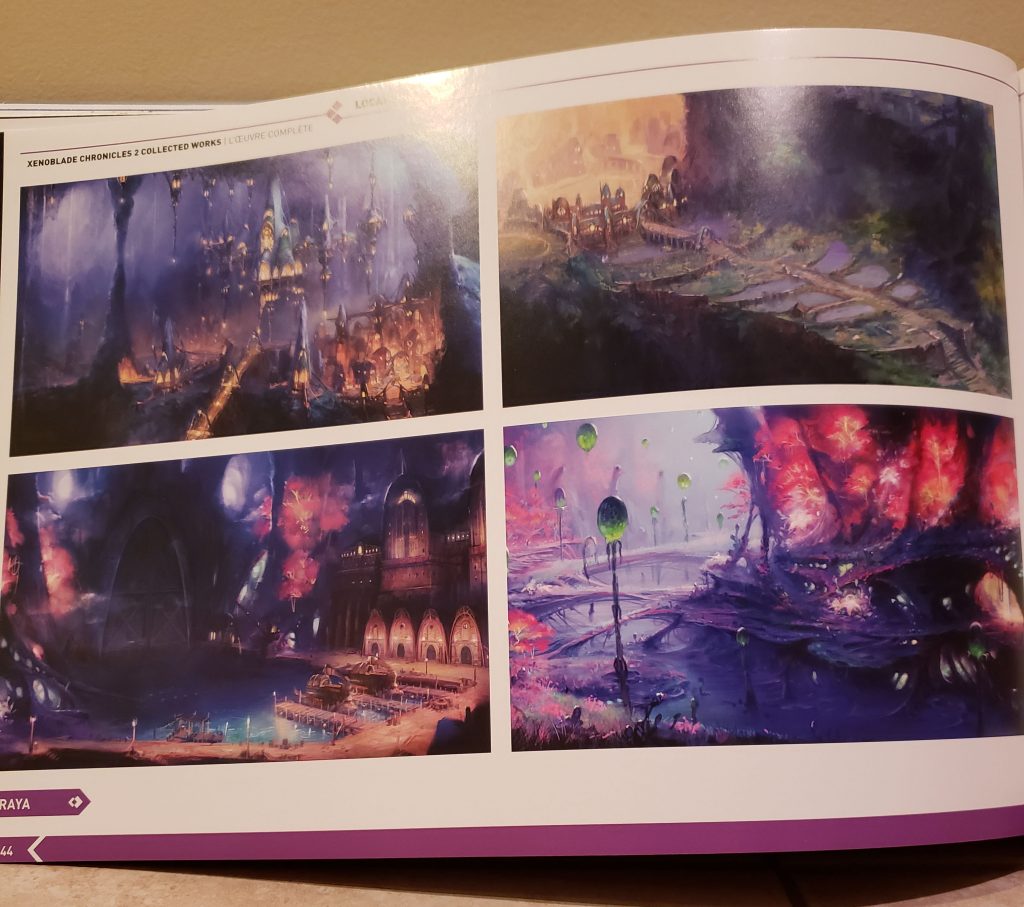
For this picture I chose the, if oriented correctly, bottom right scenery. I noticed that after scanning the picture it made the original picture’s colors more dull, so I decided to make the reds and blues more vibrant. This scenery out of the four got my attention the most with its contrast between the red and blue, with the green lights, so I wanted to accentuate it’s beauty.
Original / Cropped / Retouched
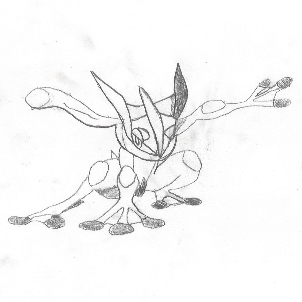
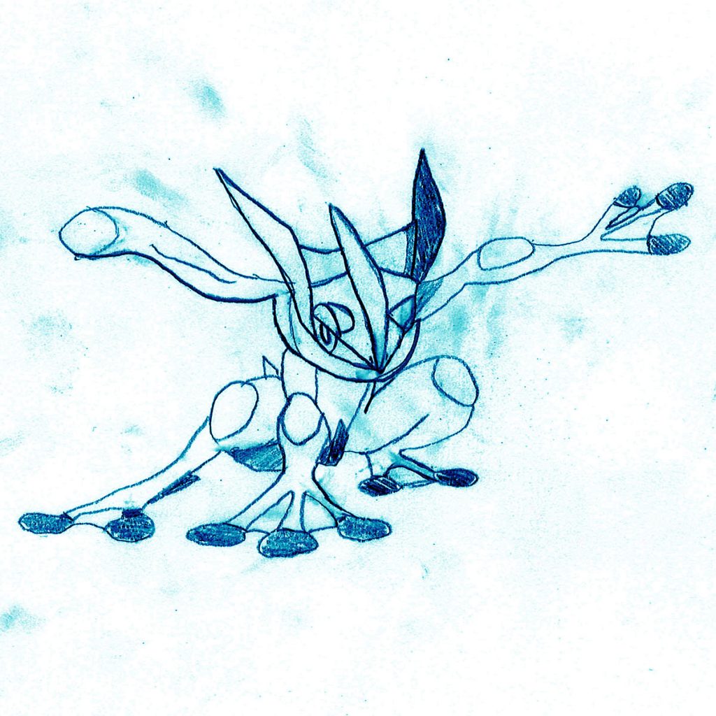
This is a self-drawn picture of my favorite Pokemon of all time, Greninja. I took me a couple tries to get some of the feature how I wanted them so you can notice some pencil smudges on the picture. I didn’t know what I wanted to adjust at first besides just removing those smudges. However, after making the decision to make the pencil marks blue, I actually decided to keep the smudges. In my opinion, the smudges now look like paint-like splatters, which I quite like, so I kept them.
I had to make some on the fly adjustments to the assignment to make sure I could come up with some substitutes to requirements. Since I didn’t have a high quality camera, I compared the front and rear cameras of my phone. I also don’t own any magazines, so instead I used an art book that I have from one of my favorite games.
Front camera / Rear camera
Front camera / Rear camera / Scanned
Scanned coin / Scanned print / Scanned drawingThis was downloaded off of unsplash.comThis was self made in photoshop
While the rear and front cameras aren’t too different in megapixels, you can start to tell a difference in resolution once you start to zoom in on the picture. You can also see that there is more contrast in the rear camera compared to the front camera. Then comparing the quality of the art book page, the one that was scanned in definitely was the best quality. Scanning gives better quality pictures than just using your phone, but getting pictures from the internet or making some on photoshop results in the best quality of picture. The reason I think that it is, is because the computer already formatted these pictures to look good on a computer, while using a camera or scanning an image, requires those devices to self-format and are not as efficient as others.