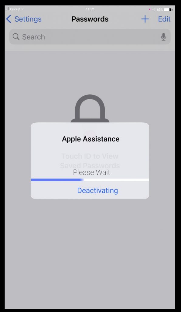
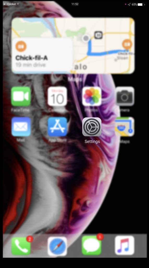
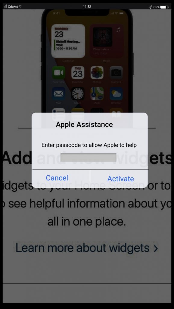
For Project One, we were given the option to create a media player or a plugin. I decided to act as an Apple developer and created two plug-ins. The first was screen share. Since the pandemic, the share screen feature on zoom has allowed teachers to successfully share their lessons. I think this feature can be useful in everyday life. Sharing screen can let students/friends and family members share how-to videos, photos and issues they are experiencing on their phone. Secondly, I created a Apple Assist app. I understand there are times others can not help or just do not know enough to help. If you login into apple assist, you can find the problem you are having. Apple then takes over your phone and then directs in the way to fix it. It focuses on the buttons that should be pressed to guide you and solve your issue.
I do think my idea is great but the presentation does seem as great as I would have liked. I think my design should be more consistent with Apples’ and better mobility. I just couldn’t figure it out using Figma. One thing I am proud of is the animations like loading buttons. I think it is a neat and realistic touch.Overall, I am proud but I would like to see other opinions and
make those changes.


