
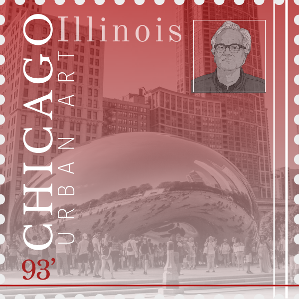
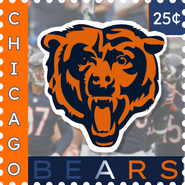
For project four, we were tasked with making stamps for food, architecture, sports and history-with typography being the main focus on this project.Unconsciously, I choose Chicago. I started with the Chicago beam and didn’t realize the Bear’s team was from Chicago. All other ideas came after realizing this pattern and trying to continue it.
I would say this is one of my favorite project to do and I think it turned it out very well. Executing my creative thoughts have always been a problem. I would say the cuisine one was one where I wasn’t able to do what I hoped. During this project, mentally, I was a little more creative than other project.
I like the aesthetics of the architecture one, its very subtle- which I enjoy. If given more time, I would try to think of more ways to make my stamps look like from one creator through style.
I find myself always avoiding grids for everything and I try to eyeball everything. After using grids, the stamps looked way more acceptable.
I appreciated the feedback from Ben and using the student examples were some of my inspirations.