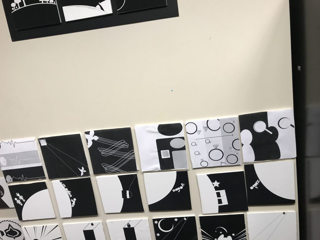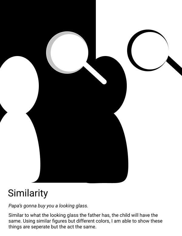
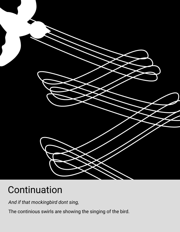
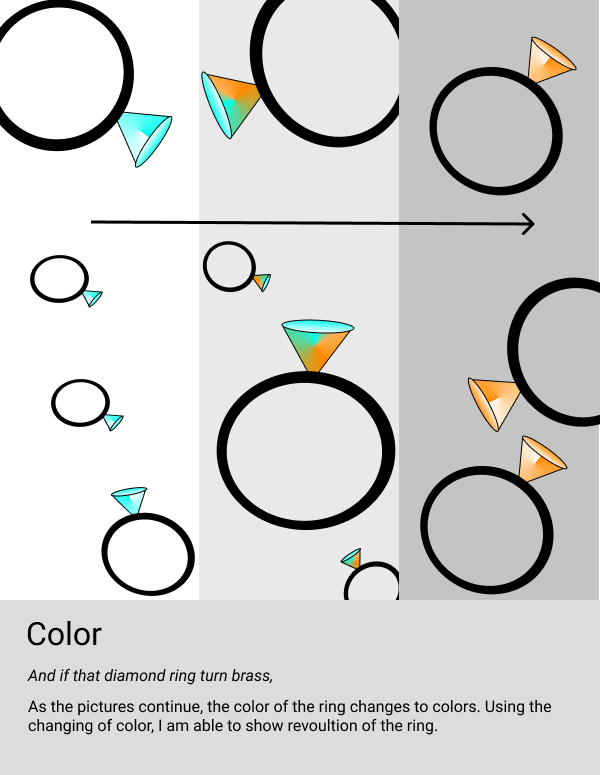
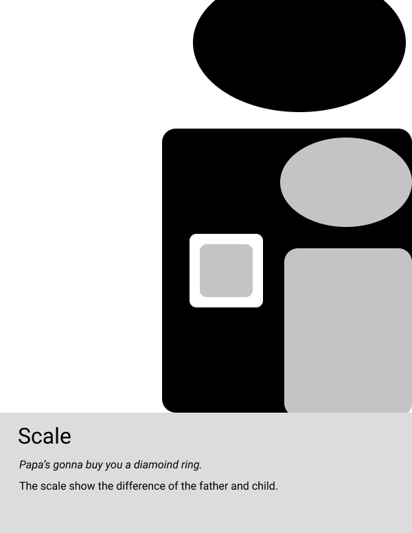
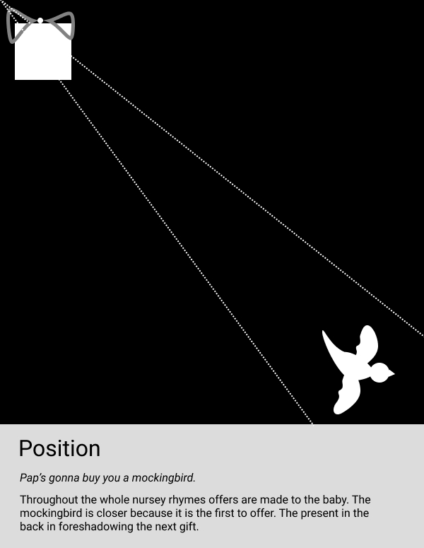
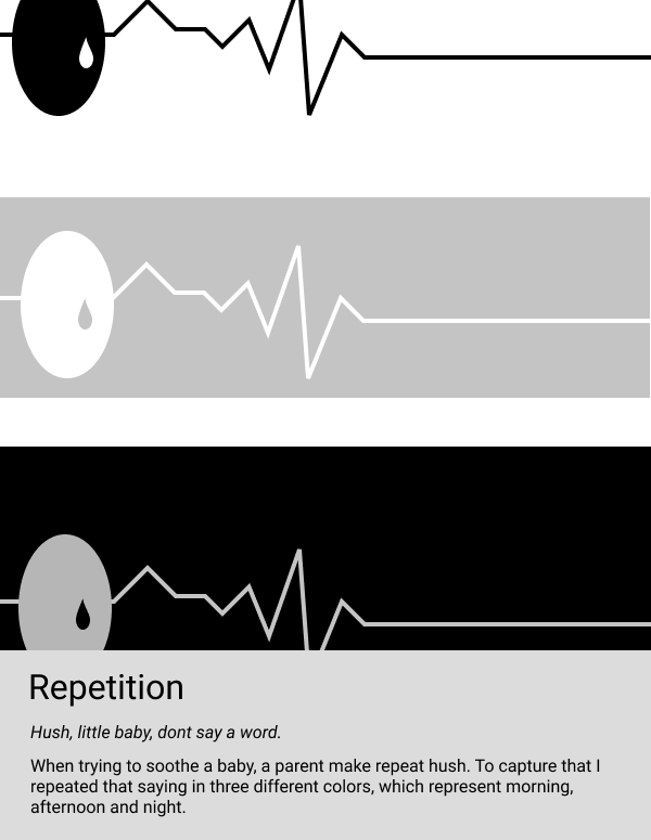
Project One seemed very simple at first but after starting I realized things were much harder. Trying to make a story out of very simple shapes was very hard. Using the examples from previous students, it gave me a little guidance.
The most difficult part of this project was trying to create a new theme for each line. If I had more time, I would search for an easier six-line rhyme. Some rhymes actually describe things that can be created.
From this project, I learned gestalt principles could be used for logo design and commercial use. The slides Professor Dunkle posted made it easier to identify each theme.
Gestalt principles uses human eye perception to make simplistic designs seem complete. This can help with marketing and quick video messages. I could see myself incorporating this techniques into other projects like commercial filmmaking and app design.
