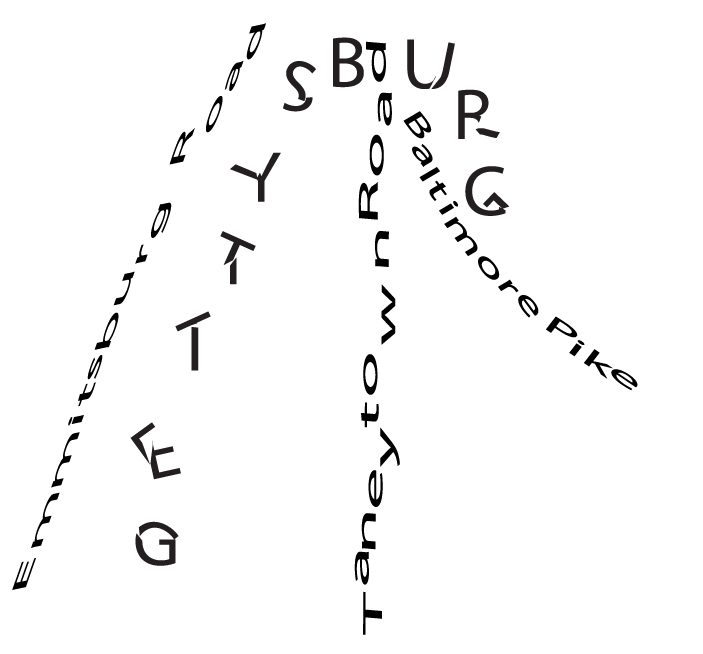
Since I heard about this project, i had a certain vision for how I wanted to do it, and I went about it in a very creative (as in this is only something I would do) type of way. I liked the concept of the text being shattered, and I wanted to do something along the lines of that. For this, I used one of my favorite movies, Gettysburg, and arranged the text in a way to mimic it.


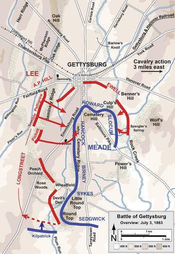
Using a map as reference, I matched the text for the word Gettysburg with what would’ve been the defensive Union Line during the battle, and matching similar text to show where the roads were also laid out to give a better understanding as to what the viewer is looking at. Since this is also a battle of the Civil War, I wanted the text to look “battle worn” in a sense. By cutting some of the letters and arranging the pieces accordingly, I feel as if I accomplished that.
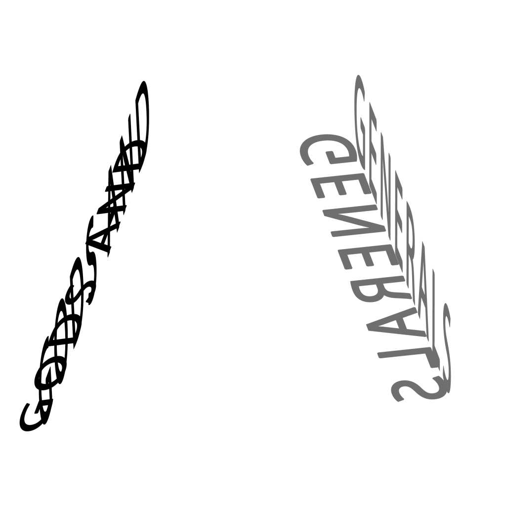
For the second one, I liked the idea of doing something reflective. I then decided to use another Civil War movie, Gods and Generals (an absolutely horrible film but I wanted to stick to a theme) and have them facing each other with the reflections being used as shadows. The idea being these are two rows of soldiers about to face off, such was the style of warfare for the time.
